You are using an out of date browser. It may not display this or other websites correctly.
You should upgrade or use an alternative browser.
You should upgrade or use an alternative browser.
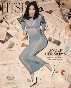
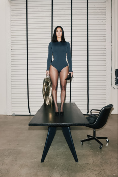
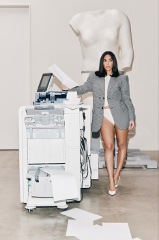
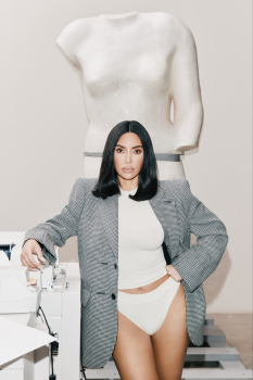
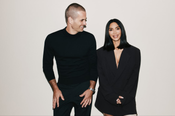
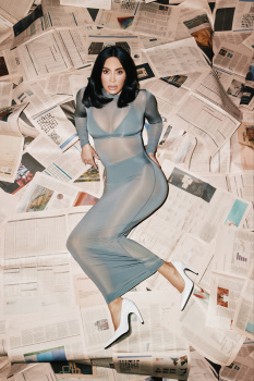
The Financial Times HTSI October 5, 2024 : Kim Kardashian by Vanessa Beecroft
- Thread starter vogue28
- Start date
fauxfashion
Well-Known Member
- Joined
- Oct 11, 2023
- Messages
- 1,001
- Reaction score
- 3,808
agreed, this is bad
D
Deleted member 1957
Guest
Terrible lighting, she looks like a vampire that has been hit by the sun. Anyone that watched AHS Delicate will tell you that its difficult to make her look bad, unfortunately they did here. The pose made her look shorter too.
MModa
Well-Known Member
- Joined
- Oct 19, 2023
- Messages
- 2,287
- Reaction score
- 3,063
I love the cover because it looks different. I like the contrast between Kim's total look and the newspaper background. She looks so good: love her hair and outfit. Her expression could have been better but it could have been worse.
Alquimista
Well-Known Member
- Joined
- Oct 1, 2023
- Messages
- 1,089
- Reaction score
- 3,163
She has become a cyborg. No life behind those eyes.
D
Deleted member 45369
Guest
She’s looks like Mr. Potato Head.
- Joined
- Jan 9, 2008
- Messages
- 36,920
- Reaction score
- 24,847
I like the cover, seen worse from Vogue over recent months. I'm also a fan of the newspapers and the simplicity of Kim's look here. This feels slightly akin to what WSJ. Magazine might produce, yet infinitely better than what WSJ has been producing lately...
GivenchyHomme
Well-Known Member
- Joined
- Sep 3, 2009
- Messages
- 5,481
- Reaction score
- 5,371
I would prefer not to see her boobs and butt for once. The shots of her covered are so much better.
Similar Threads
- Replies
- 2
- Views
- 934
- Replies
- 6
- Views
- 1K
D
- Replies
- 0
- Views
- 641
- Replies
- 102
- Views
- 14K
- Replies
- 1
- Views
- 975
Users who are viewing this thread
Total: 1 (members: 0, guests: 1)

