You are using an out of date browser. It may not display this or other websites correctly.
You should upgrade or use an alternative browser.
You should upgrade or use an alternative browser.
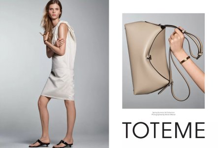
Toteme S/S 2024 : Ida Heiner by Steven Meisel
- Thread starter vogue28
- Start date
WinstonH20
Well-Known Member
- Joined
- Aug 5, 2021
- Messages
- 261
- Reaction score
- 1,202
She looks like a hunchback with short legs thanks to that dress. Steven should know better than that.
chrisand489
Well-Known Member
- Joined
- Oct 23, 2022
- Messages
- 1,042
- Reaction score
- 2,065
fenty
Well-Known Member
- Joined
- Sep 15, 2020
- Messages
- 656
- Reaction score
- 1,486
I'd rather meisel give 2007 vibes than 2024.Outdated, feels like 2007.
zacatecas570
Well-Known Member
- Joined
- Sep 27, 2008
- Messages
- 7,203
- Reaction score
- 1,091
Dull campaign dull model dull brand
D
Deleted member 141523
Guest
Second pic looks like the Meisel's Max Mara era. I thought Vivienne Rohner was part of this campaign as well, but seems it's a single girl ad.
- Joined
- Jul 14, 2017
- Messages
- 14,882
- Reaction score
- 22,191
Second pic looks like the Meisel's Max Mara era. I thought Vivienne Rohner was part of this campaign as well, but seems it's a single girl ad.
Vivienne's campaign was for Toteme's jewellery line, this is for the main clothes line.
D
Deleted member 141523
Guest
Thank you!
philophile
Well-Known Member
- Joined
- Dec 23, 2023
- Messages
- 531
- Reaction score
- 882
Toteme campaigns can be quite good, sadly this is not one of them. Boring AH. Maybe some of these old photographers should retire if they're not feeling inspired anymore. Times change and this kind of photography seems outdated already.
philophile
Well-Known Member
- Joined
- Dec 23, 2023
- Messages
- 531
- Reaction score
- 882
Come to think of it, the super safe styling is what might be ruining this and not the photography. Toteme is a solid brand for basics with a twist, yet it has absolutely stand out, eye-catching pieces. The choices were just wrong, IMO, the stylist doesn't appreciate the brand.
- Joined
- Jan 9, 2008
- Messages
- 36,920
- Reaction score
- 24,848
Must be extremely easily pleased lately, because despite the general consensus within this thread, I am OBSESSED with this. Instantly took me back to the glory days of American Vogue when Meisel would shoot those exquisite studio stories, which had such richness and depth. This feels like a modern and fresh interpretation of said stories... and I'm loving it! 

jeremydante
Well-Known Member
- Joined
- Jul 15, 2009
- Messages
- 3,725
- Reaction score
- 1,408
Im wondering what the inspo was for direction. As simplistic as it is, which can work; even with Meisel- it's flat.
And I really hate that we're all having to say that.
And I really hate that we're all having to say that.
D
Deleted member 141523
Guest
Who styled this campaign? Templer or MAS?
Similar Threads
- Replies
- 3
- Views
- 2K
- Replies
- 49
- Views
- 6K
- Replies
- 6
- Views
- 3K
- Replies
- 15
- Views
- 8K
- Replies
- 5
- Views
- 3K
Users who are viewing this thread
Total: 1 (members: 0, guests: 1)


