
You are using an out of date browser. It may not display this or other websites correctly.
You should upgrade or use an alternative browser.
You should upgrade or use an alternative browser.
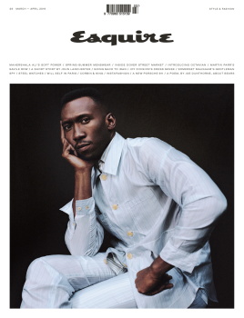
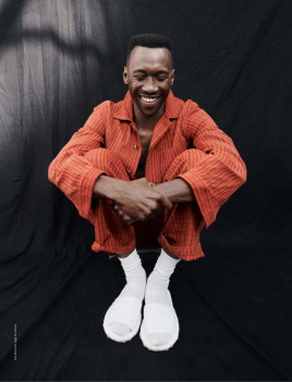
UK Esquire March 2019 : Mahershala Ali by Cass Bird
- Thread starter 8eight
- Start date

JPineapple
Well-Known Member
- Joined
- Jul 1, 2018
- Messages
- 2,701
- Reaction score
- 3,757
I LOVE IT!
Benn98
Well-Known Member
- Joined
- Aug 6, 2014
- Messages
- 42,531
- Reaction score
- 20,514
Nicking tips off The Gentlewoman then, let's see how far it will get them.
I think the shot is striking and the design is slick, very much up my street. I'll get it because I'd like to see where they go with this. But why him? Not in the least interested to read about this actor, which I actually find overrated. The styling does look stunning, there's that too.
I think the shot is striking and the design is slick, very much up my street. I'll get it because I'd like to see where they go with this. But why him? Not in the least interested to read about this actor, which I actually find overrated. The styling does look stunning, there's that too.
Nicking tips off The Gentlewoman then, let's see how far it will get them.
I think the shot is striking and the design is slick, very much up my street. I'll get it because I'd like to see where they go with this. But why him? Not in the least interested to read about this actor, which I actually find overrated. The styling does look stunning, there's that too.
Why him? he is one of the hottest actors at the moment. Who else then?
mistress_f
Hell on Heels
- Joined
- May 27, 2007
- Messages
- 7,239
- Reaction score
- 361
YES.
Can't wait to see the editorial.
Also looking forward to 'Martin Parr's savile row' report or whatever that is supposed to be
Can't wait to see the editorial.
Also looking forward to 'Martin Parr's savile row' report or whatever that is supposed to be
Benn98
Well-Known Member
- Joined
- Aug 6, 2014
- Messages
- 42,531
- Reaction score
- 20,514
Who else then?
Henry Golding or Joe Alwyn. But it's ultimately a matter of personal taste, so to each their own.
honeycombchild
Well-Known Member
- Joined
- Jan 22, 2009
- Messages
- 8,805
- Reaction score
- 630
Poor Esquire. It’s always appealed to me more than GQ but sadly this magazine is the Male Marie Claire. How it’s around still confuses me greatly. It isn’t even stocked in major supermarkets anymore, if you want it it really involves some looking for, yet it’s supposed to be rather mainstream.
Nice design. Hopefully it kicks it back to life.
Nice design. Hopefully it kicks it back to life.
TommysBaby
Well-Known Member
- Joined
- Feb 1, 2019
- Messages
- 184
- Reaction score
- 153
He's beautiful <3
Fiercification
Well-Known Member
- Joined
- Apr 17, 2008
- Messages
- 6,087
- Reaction score
- 919
Love the classic cover layout
Totally agree, love the bare and classy art direction of the cover.
honeycombchild
Well-Known Member
- Joined
- Jan 22, 2009
- Messages
- 8,805
- Reaction score
- 630
Saw this in store today. Cover price has gone up to £6, which for a magazine that rarely ever sold at its RRP of £4.95 in the first place, is steep. The scale has gone up too. Really nice magazine to look at and mix of papers, very Gentlewoman in design and scale. But the old version used to often be on sale for £2 and was floundering at that price!
Benn98
Well-Known Member
- Joined
- Aug 6, 2014
- Messages
- 42,531
- Reaction score
- 20,514
On the newsstand it just begs to be taken home, but it's really fool's gold. I felt duped. The editor needed a whopping 3 pages to introduce this issue! I've certainly never seen that in any magazine before. Anna takes up two at most, with images. What, some of you may wonder, could he possibly write about over three pages? Fluff, mostly. When it isn't one elongated sales pitch, that is. One can smell the desperation between the lines. 'I really hope this will work', 'please stick with us', 'we've changed, sort of, kind of.' He bangs on about the new size, the glossy pages, the fact that the design will be implemented across their various platforms (no sh!t), Cass Bird's debut with the cover, Jo Ellison, Martin Parr etc etc etc.
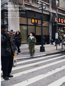
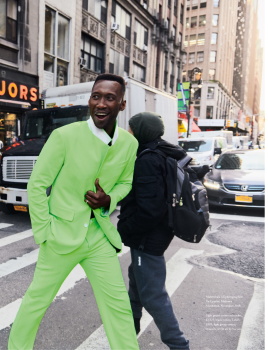
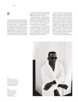
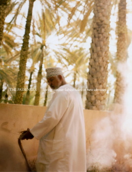
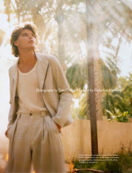
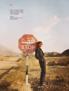
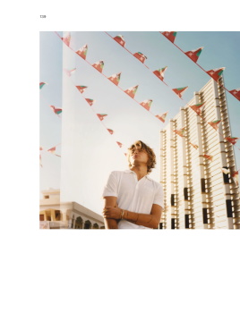
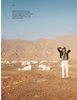
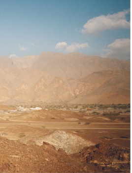
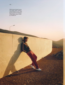
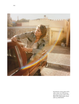
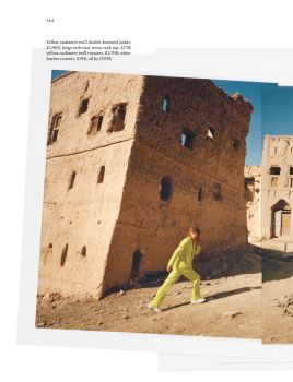
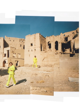
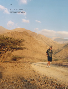
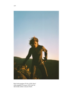
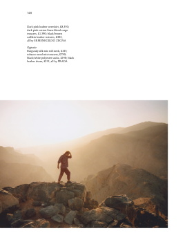
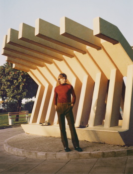
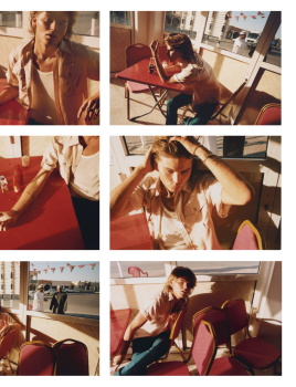
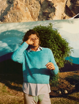
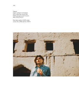
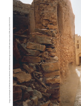
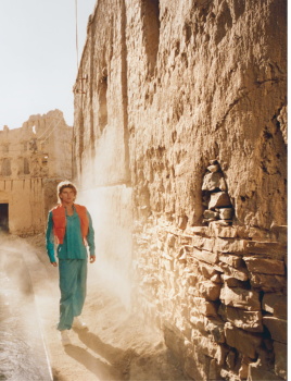
In layman's terms the major revamp, other than the obvious cosmetic changes, is mainly the fact that Esquire and Big Black Book (Esquire's equivalent of GQ Style which used to retail at 6 quid) are now merged. I think that's why the price and page count increased so drastically. This is also a March/April edition, the previous one was Jan/Feb, so the issues per year will naturally be less. Otherwise it's really business as usual. The magazine still publish Paris Review style long form articles like they used to, even for the front of the book. The fashion content comes in the form of a 22-page pictorial of Jordan Barrett in Saudi Arabia. Styling looks gorgeous, very unassuming which works for the location, but Jordan is perhaps a miscast. Some of the shots are stunning, but in others he's posing like he's in the streets of LA. There's not much of a link between him and the location. Mahershala's edit is a bit of a letdown too. 8 pages, and most of the full-length shots are shot in location in NY. Really hoped for a studio story in the vein of the cover. Also, Mahershala just appeared in last month's issue as a 'man to watch' and now he gets the cover? Certainly a very fast worker, if you ask me.
Another editorial of summer suits shot against a white studio, and Martin Parr visiting Savile Row rounds out the fashion edits. That is, in addition to the nauseating praise for Andrian Joffe/Dover Street Market and an accessories selection where zero care or props were taken to present the goods in a captivating manner.
There's not much of a marked departure in terms of aesthetic and fiercely identity, like we've seen with the new US GQ. The British Esquire male doesn't fetishize women the way the US edition does, and it also does not talk local or global politics in the same brashy tone as UK GQ. In fact, it doesn't engage in politics at all. The vibe is mature, cultured and very intellectual with a subdued heterosexual edge. The accessories, journalism and even the ads that. They've continued with the short stories instalment in this issue for instance.
I'll probably still buy it occasionally on impulse as I have for the past years because it's a good Sunday afternoon read and the journalism actually makes it worth keeping. But it belies all the marketing lingo and 'revamped' superlatives. It's just same old British Esquire, with more glossier pages and modern design fonts.
Last edited:
ellastica
Well-Known Member
- Joined
- Jul 7, 2010
- Messages
- 3,550
- Reaction score
- 336
Shouldn’t a magazine ‘incorporating’ another cause prices to fall?
Did the editor say anything about the state of print publishing? I’d appreciate an honest, frank account from somebody at the top with firsthand experience.
From what I’ve seen the revamp looks more like a book or catalogue. I don’t look at it and think “yeah I want to read this”. I get the impression it’s more of a collectible tome for reference rather than a timely update of what’s current in fashion, culture.
Liz Tilberis wrote a mean (succinct), funny, uplifting and relatable Letter from the EIC. I’m intrigued by Alex’s multi page letter.


Similar Threads
- Replies
- 4
- Views
- 4K
- Replies
- 15
- Views
- 5K
Users who are viewing this thread
Total: 2 (members: 0, guests: 2)
New Posts
-

-
-
-
-
 Chanel Eyewear S/S 2024 : Loli Bahia, Liu Wen, Alaato Jazyper & América González by Karim Sadli (5 Viewers)
- Latest: chrisand489