-
Share with us... Your Best & Worst Collections of Haute Couture F/W 2025.26
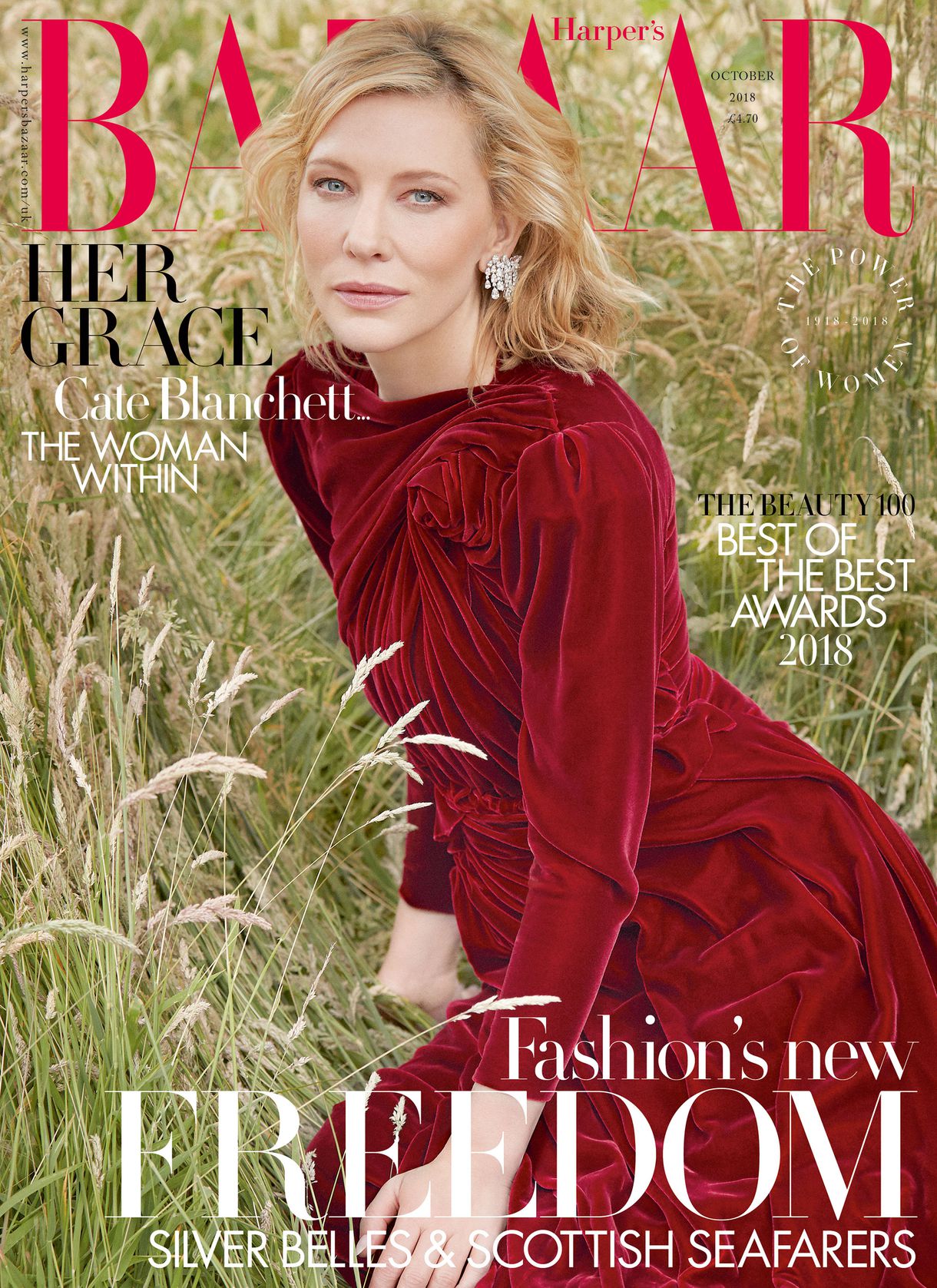
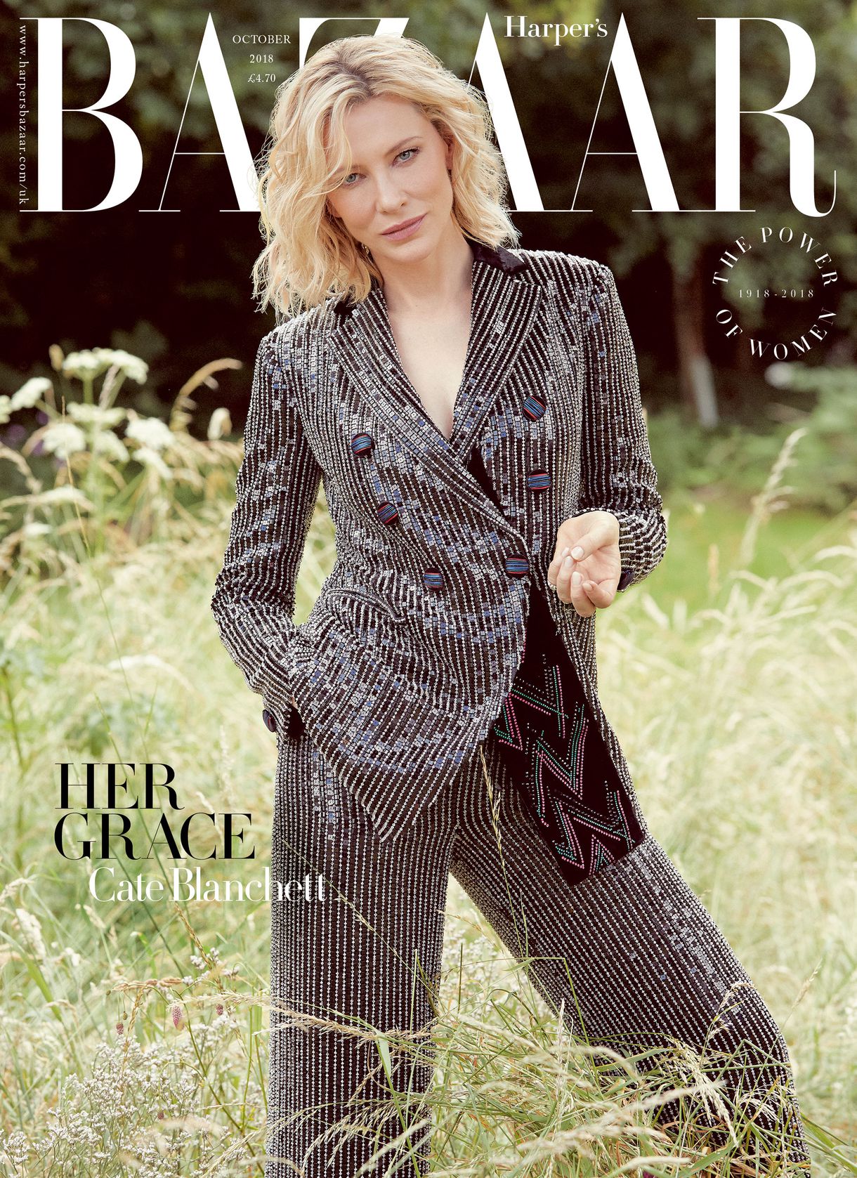
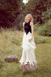
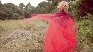
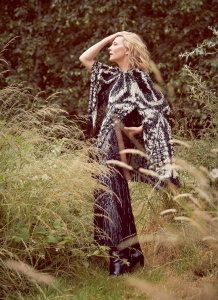
UK Harper’s Bazaar October 2018 : Cate Blanchett by Will Davidson
- Thread starter vogue28
- Start date
Share with us... Your Best & Worst Collections of Haute Couture F/W 2025.26