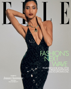
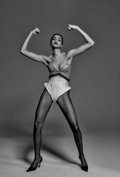
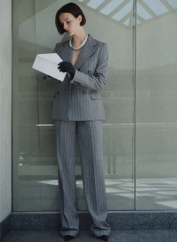
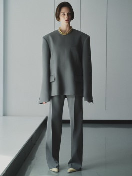
Needless to say, she’s beyond gorgeous and no lesser talent could ever diminish this.
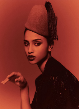
But what a lesser Chris is LOL The 2nd cover’s pathetic cut-and-paste against that hideous gradient is high school Photoshop class level of amateur cheapness. The tones and lighting don’t even match. Would have looked much more better-- at least profession, to just have the natural white seamless.
(That edit is a mess. It's all over the place with no distinct mood.)