You are using an out of date browser. It may not display this or other websites correctly.
You should upgrade or use an alternative browser.
You should upgrade or use an alternative browser.
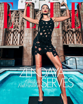
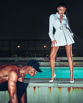
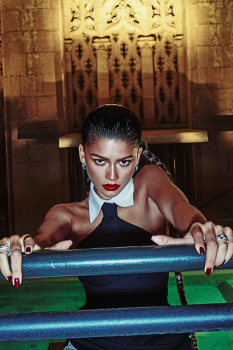
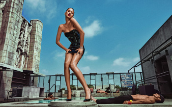
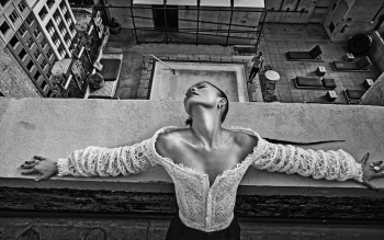
US Elle September 2023 : Zendaya by Steven Klein
- Thread starter vogue28
- Start date
avonlea002
Well-Known Member
- Joined
- Feb 10, 2020
- Messages
- 2,442
- Reaction score
- 8,482
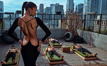
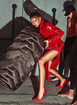
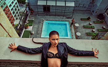
This girl is painfully boring. Second photo from the IG post is the best because you can't see her face in full view. Wasn't the roach supposed to retire?
Bertrando3
Well-Known Member
- Joined
- Mar 22, 2010
- Messages
- 5,462
- Reaction score
- 2,129
Love her and it looks good 

caioherrero
Well-Known Member
- Joined
- Sep 2, 2017
- Messages
- 2,937
- Reaction score
- 1,491
I wish it was styled by Alex
Benn98
Well-Known Member
- Joined
- Aug 6, 2014
- Messages
- 42,530
- Reaction score
- 20,571
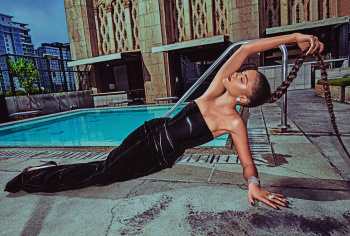
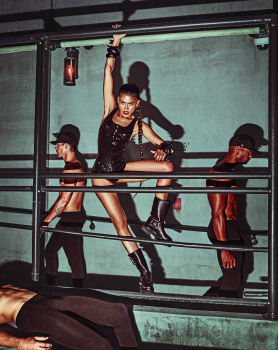
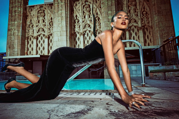
It's giving budget limitations. I don't think a rooftop was the right setting for this editorial. It needed a villa, something unapologetically lavish to really amplify the sex and excess. Also the last shot is skew, which I doubt is intentional.
The cover isn't good either. I've been noticing a lot of full-body covers lately but even that aside, there's too much clashing of design elements.
It's what you get when you allow a petty, overrated celebrity stylist to do your September cover.
The cover isn't good either. I've been noticing a lot of full-body covers lately but even that aside, there's too much clashing of design elements.
It's what you get when you allow a petty, overrated celebrity stylist to do your September cover.
DK92
Well-Known Member
- Joined
- Dec 17, 2018
- Messages
- 2,060
- Reaction score
- 3,736
I generally like Klein's work, but he really annoys me with this filter that makes everyone look like they haven't showered in a month.
The editorial is very classic coming from him, something we've seen a thousand times and it seems like something Vogue Italia would do, but I don't know if the choice of the famous favored the result... Zendaya is boring!
The editorial is very classic coming from him, something we've seen a thousand times and it seems like something Vogue Italia would do, but I don't know if the choice of the famous favored the result... Zendaya is boring!
BlueRuin
Well-Known Member
- Joined
- Sep 26, 2009
- Messages
- 435
- Reaction score
- 356
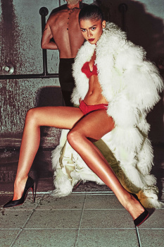
How awesome would it have been if they used the 3rd photo (with her in the red lingerie) as a cover?
I’m sure it would trigger all the “woke” folks and that really satisfies me!
lol what are you on about? It’s the non woke religious zealots that would be up in arms.
Benn98
Well-Known Member
- Joined
- Aug 6, 2014
- Messages
- 42,530
- Reaction score
- 20,571
"Powerful on a budget"
Lol. The art direction is also a mess. Zendaya. Guides to Fall Fashion Serves.
Guides to Fall Fashion should have been placed elsewhere.
Taken straight from the Glenda Bailey playbook of coverlines lol. Actually now that I look at the cover again, it's taking me back to those awful Terry Richardson years at US Bazaar.
Lola701
Well-Known Member
- Joined
- Oct 27, 2014
- Messages
- 11,452
- Reaction score
- 24,514
The shot of her in the Mongolian fur and red lingerie is fabulous…
I’m not sure about the cover. She is the face of Vuitton and the cover had to be Vuitton but I wonder if Law Roach couldn’t have chosen better options…
‘Maybe it’s the photo itself that is weird. She doesn’t embody the power she is supposed to portray.
You really need some intensity and strength to really mesh with Steven Klein’s universe.
I’ll wait for the whole ed though.
‘It seems like Zendaya and Law Roach comes as a package now. He is styling her campaigns, editorials and RedCarpet appearances…Not too bad as she is the face of Lancôme, Vuitton and Bulgari.
The issue here is that it’s all quite one-dimensional…
Kenny
Well-Known Member
- Joined
- Jul 27, 2021
- Messages
- 181
- Reaction score
- 515
I like Zendaya and sure this cover is powerful but you can't even see "ELLE" unless you come near it. It would have been nice (in my opinion) if they shot her in the pool kinda like Hailee Steinfeld's Cosmo cover just to avoid that background she's in on this cover.
kokobombon
Well-Known Member
- Joined
- Oct 7, 2007
- Messages
- 18,644
- Reaction score
- 2,007
I hate the pose on the cover, she´s not even flexing  but I like everything else...
 but I like everything else...
Similar Threads
- Replies
- 32
- Views
- 6K
- Replies
- 5
- Views
- 2K
- Replies
- 19
- Views
- 3K
- Replies
- 40
- Views
- 15K
- Replies
- 1
- Views
- 659
Users who are viewing this thread
Total: 2 (members: 0, guests: 2)


