You are using an out of date browser. It may not display this or other websites correctly.
You should upgrade or use an alternative browser.
You should upgrade or use an alternative browser.
US GQ December 2023 : The Men of the Year Issue
- Thread starter Marc10
- Start date
kokobombon
Well-Known Member
- Joined
- Oct 7, 2007
- Messages
- 18,645
- Reaction score
- 2,008
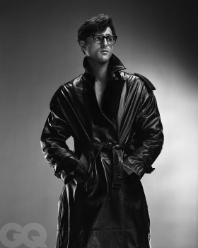
Are they hinting at a Superman movie with those glasses? 

mepps
Well-Known Member
- Joined
- Mar 31, 2014
- Messages
- 1,590
- Reaction score
- 1,598
He's a waking wet dream, and one of the few actors who looks like he belongs on the cover of GQ.
Austin was a more convincing Elvis, but Jacob has more masculine allure. He's gonna be a big star,
as long as he stays away from capes and green screens.
Austin was a more convincing Elvis, but Jacob has more masculine allure. He's gonna be a big star,
as long as he stays away from capes and green screens.
MModa
Well-Known Member
- Joined
- Oct 19, 2023
- Messages
- 888
- Reaction score
- 794
I thought of Tom Ford as well while looking at this cover.Tom Ford’s wet dream.
D
Deleted member 141523
Guest
I see more Elvis Costello (my favorite one, look at my avatar) meets Saint Laurent than Presley, ha. From the Euphoria cast, him and Hunter are the only ones I tolerate see everywhere.
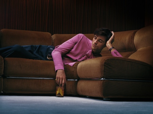
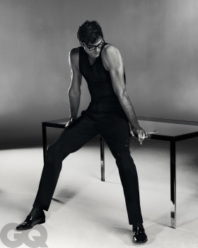
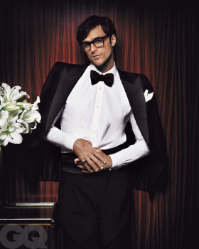
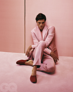
Here's the ed:


US GQ Facebook.
The Jeremy Allen White cover story won't be shared? I don't see his name on the cover.
Here's the ed:


US GQ Facebook.
The Jeremy Allen White cover story won't be shared? I don't see his name on the cover.
susseinmcswanny
Well-Known Member
- Joined
- May 7, 2020
- Messages
- 2,326
- Reaction score
- 6,208
Cocteau Stone
Well-Known Member
- Joined
- Feb 12, 2022
- Messages
- 1,560
- Reaction score
- 3,496
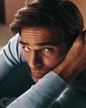
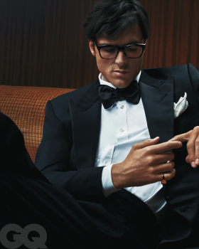
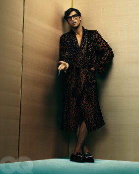
Styling is a little bit Halston, or 70s Yves Satin Laurent. He's got such a pointy face, a little bird like and it throws me off. But it's all pretty decent, with great styling and set dressing even if it is pretty minimal. The ed is a little disjointed, so they should have just stuck with one direction and go ham with it.
Bertrando3
Well-Known Member
- Joined
- Mar 22, 2010
- Messages
- 5,462
- Reaction score
- 2,129
They did him dirty with that cover, it's a way too close close-up.
The editorial is AMAZING !!! Love it : strong, masculine, great styling, love the 70's vibe.
They could have chosen any other image from that story. Damn these editors are useless.
I think he's one of the most intriguing actors of this generation.
Much better than Timothée Chalamet.
The editorial is AMAZING !!! Love it : strong, masculine, great styling, love the 70's vibe.
They could have chosen any other image from that story. Damn these editors are useless.
I think he's one of the most intriguing actors of this generation.
Much better than Timothée Chalamet.
WinstonH20
Well-Known Member
- Joined
- Aug 5, 2021
- Messages
- 241
- Reaction score
- 1,078
George Cortina's men's styling is always well done, but I feel like he's always drawing from the same 70s references, it gets predictable and boring really fast. Jacob's editorial is no different. That close up in the blue sweater is a stand out though! He's giving me shades of a young Alain Delon in that shot, minus the brown eyes of course.
I'm not really a fan of this photographer's post production work, everyone (Kim included) tends to look oily and orange. I get that he's going for that glossy 90s look, but....not my cup of tea.
I'm not really a fan of this photographer's post production work, everyone (Kim included) tends to look oily and orange. I get that he's going for that glossy 90s look, but....not my cup of tea.
Similar Threads
- Replies
- 1
- Views
- 665
- Replies
- 12
- Views
- 3K
- Replies
- 21
- Views
- 5K
- Replies
- 19
- Views
- 3K
Users who are viewing this thread
Total: 4 (members: 0, guests: 4)


