You are using an out of date browser. It may not display this or other websites correctly.
You should upgrade or use an alternative browser.
You should upgrade or use an alternative browser.
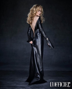
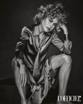
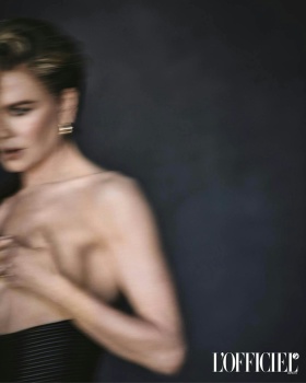
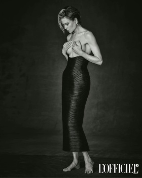
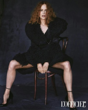
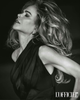
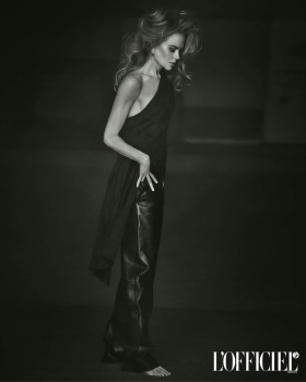
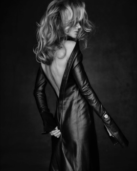
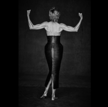
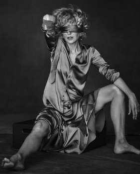
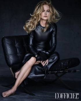
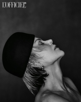
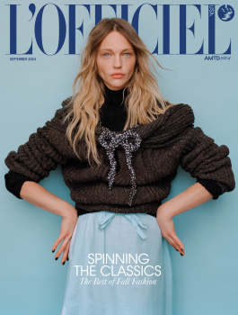
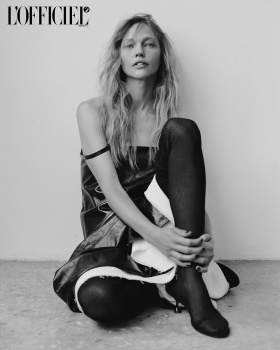
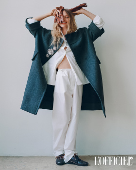
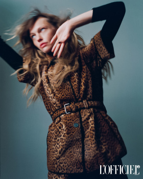
US L'Officiel September 2024 : Nicole Kidman by Matthew Brookes
- Thread starter vogue28
- Start date
Bertrando3
Well-Known Member
- Joined
- Mar 22, 2010
- Messages
- 5,462
- Reaction score
- 2,129
Are they kidding with that shot for a cover???
And reprinted 15 000 times???
The photo is bad :
- horrible hair
- the pose is so awkward
- the dress doesn't fit
- it's way too obscure
- the layout doesn't work with that shot
= it's a NO.
NEXT !
And reprinted 15 000 times???
The photo is bad :
- horrible hair
- the pose is so awkward
- the dress doesn't fit
- it's way too obscure
- the layout doesn't work with that shot
= it's a NO.
NEXT !
Toni Ahlgren
Well-Known Member
- Joined
- Aug 29, 2020
- Messages
- 1,300
- Reaction score
- 3,758
Now where did they dig up her old face? Kinda like how her back isn't too polished.
- Joined
- Jan 9, 2008
- Messages
- 35,414
- Reaction score
- 20,596
Better than most offerings from Vogue this month! I like it, it's a strong and commanding cover shot. I was instantly reminded of the mockup cover of Runway Anne Hathaway comes across toward the end of The Devil Wears Prada. I love the dark colours, the composition, the angle, the voluminous curls on Kidman - everything!
MModa
Well-Known Member
- Joined
- Oct 19, 2023
- Messages
- 926
- Reaction score
- 825
I agree! I like both cropped versions. I also think that this is the magazine's strongest cover image featuring an actress since they began publishing in the USA. Overall, their editorial content is also very good.Better than most offerings from Vogue this month! I like it, it's a strong and commanding cover shot. I was instantly reminded of the mockup cover of Runway Anne Hathaway comes across toward the end of The Devil Wears Prada. I love the dark colours, the composition, the angle, the voluminous curls on Kidman - everything!
Last edited:
Toni Ahlgren
Well-Known Member
- Joined
- Aug 29, 2020
- Messages
- 1,300
- Reaction score
- 3,758
Oooff.. just noticed how the watch is on top of her sleeve.
jeremydante
Well-Known Member
- Joined
- Jul 15, 2009
- Messages
- 3,106
- Reaction score
- 582
Always happy to see Nicole on anything.
But cannot wait for the Demna Balenciaga era to be dead and gone.
Bone straight hair would've been more fire.
But cannot wait for the Demna Balenciaga era to be dead and gone.
Bone straight hair would've been more fire.
blueorchid
you soft and only
- Joined
- Apr 4, 2009
- Messages
- 11,146
- Reaction score
- 10,305
I can’t pretend this is good, just because most Vogues are worse.
fauxfashion
Well-Known Member
- Joined
- Oct 11, 2023
- Messages
- 677
- Reaction score
- 2,067
GivenchyAddict
Well-Known Member
- Joined
- Feb 5, 2012
- Messages
- 2,185
- Reaction score
- 5,166
Well she is one of my favorite actresses so I may be bias. she has an undeniable charisma so she made it much better than they could imagine.
She deserves better than this magazine… the cover is really not the best shot.
She deserves better than this magazine… the cover is really not the best shot.
Bertrando3
Well-Known Member
- Joined
- Mar 22, 2010
- Messages
- 5,462
- Reaction score
- 2,129
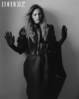
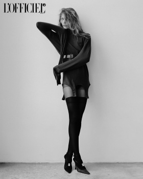
Yikes, the shoot is equally bad.
They wanted the Peter Lindbergh glow but they got this instead.
They wanted the Peter Lindbergh glow but they got this instead.
BalkaniStaCouture
Well-Known Member
- Joined
- Mar 6, 2024
- Messages
- 2,072
- Reaction score
- 1,785
She seems so desperate to be visible. She looks scary. Cover and shoot are just awful!!!
tigerrouge
don't look down
- Joined
- Feb 25, 2005
- Messages
- 18,356
- Reaction score
- 8,257
There is the potential for an interesting shoot - using silk or leather like a second skin against the contours of her body. But what they've done is too messy to have a strong impression.
TaylorBinque
Well-Known Member
- Joined
- Apr 4, 2010
- Messages
- 2,879
- Reaction score
- 1,142
It has all the right moodboard but lacks execution skills. Like we get it, she's an OMEGA ambassador. The styling is so bad. The only good thing is that Nicole actually brought it so at least it's better than it would have been.
phungnam96
Well-Known Member
- Joined
- Jul 7, 2011
- Messages
- 1,139
- Reaction score
- 769
they made her to be a B-rate celebrity… Everything looks so cheap and tacky.
D
Deleted member 1957
Guest
The editing on the cover reminds me of Netflix promo pics. They made her look like a vampire. The editorial is not bad but there's no stand out image that can be a cover shot. They needed a clean classic shot with the dark background and curly hair for the cover.
Similar Threads
- Replies
- 0
- Views
- 414
- Replies
- 62
- Views
- 18K
- Replies
- 20
- Views
- 8K
- Replies
- 39
- Views
- 10K
Users who are viewing this thread
Total: 2 (members: 0, guests: 2)


