V Magazine #57 Spring Preview 2009 : Grace Jones by Jean-Paul Goude

LET THERE BE LIGHT by Nick Knight -without light-


lilydonaldson.com
 
Last edited by a moderator:
Let There Be Light #2


same
 
Last edited by a moderator:
:ninja: There is something awfully wrong with Lily's eyes in that editorial. Totally spoils it for me.
 
There isn't so much a problem with Lily's eyes than it is her eyebrows. They've been dyed super blonde, so it looks like she doesn't have any brows. I've looked at the Lily edit several times and I'm quite puzzled at the photog's choice to get artsy with a photoshoot that could've done fine without the effects. I'm not familiar with Nick Knight's work, so I'm going to assume that he does this with all his edits?


:shock:
 
I think Lily looks great, several of those shots would have made a good cover aswell, but im glad its Grace on it.
 
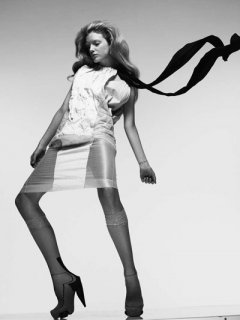
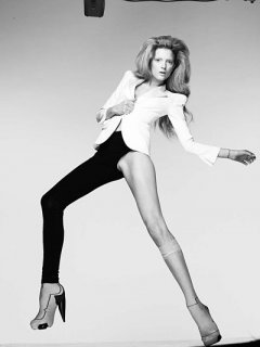
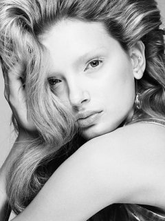
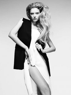
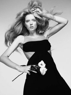
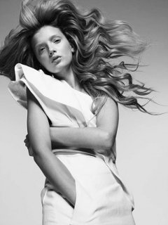
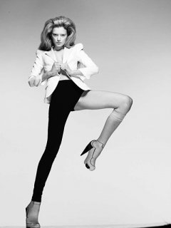
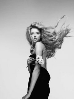
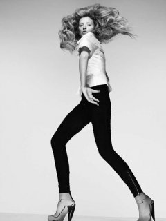
more un-retouched pics

Gorgeous!
Here is the full gallery.

lilydonaldson.chicfans.com
 

Attachments

  • LetThereBeLight10.jpg
    LetThereBeLight10.jpg
    24.9 KB · Views: 16
  • LetThereBeLight15.jpg
    LetThereBeLight15.jpg
    20.8 KB · Views: 24
  • LetThereBeLight26.jpg
    LetThereBeLight26.jpg
    52.5 KB · Views: 10
  • LetThereBeLight35.jpg
    LetThereBeLight35.jpg
    26.6 KB · Views: 11
  • LetThereBeLight39.jpg
    LetThereBeLight39.jpg
    30.8 KB · Views: 12
  • LetThereBeLight55.jpg
    LetThereBeLight55.jpg
    35 KB · Views: 14
  • LetThereBeLight17.jpg
    LetThereBeLight17.jpg
    19 KB · Views: 17
  • LetThereBeLight41.jpg
    LetThereBeLight41.jpg
    22.4 KB · Views: 18
  • LetThereBeLight42.jpg
    LetThereBeLight42.jpg
    20.5 KB · Views: 13
Last edited by a moderator:
I hope the effects are more like the mdc pic...I like when the work is done around the model not in the clothes.....
 
i love watching models in action
its amazing to see how u get a photograher
and model work together to produce something amazing
 
Your right, it's her eyebrows :ninja: Which is a real shame, because her poses are stunning.
& How long is the editorial? :rofl:
 
LOVE Lily's ed; the poses and movement is wonderful from the outtakes. I can't wait to see the rest with the effects.
 
i love watching models in action
its amazing to see how u get a photograher
and model work together to produce something amazing
Me too,Lily is a complete pro.:heart:
User.n. thanks for posting the links to the videos.:flower:

ps:Alex is super cute.^_^
 
Last edited by a moderator:
I don't know if what Nick Knight did with that Lily Donaldson editorial is necessarily good. It looks like something an arts student would do in their folio, no?

what he did is so typically Nick Knight i can hardly imagine these images to come up another way. still i do think the pictures they did were pretty good and intense enough to live their own life without overweighting them with Knight's love for digital watercolors...
anyway this seems to be a rather strange issue of V. not a single STRONG editorial yet. and the cover seems really outdated (maybe it's because of the cheap sparkles on Grace's hat. wonder if it's a Stephen Jones creation or something?). as far as i love GJ and Goude, this simply isn't that good.B)
 
I think the unshopped images from lilys eds are the best. the effects take away from the clothes and the poses
 
Well, I think that with or without the effects the pictures are great. I prefer without them, but I think that what makes Nick Knight's photography special is the use of graphic effects.
 

Users who are viewing this thread

New Posts

Forum Statistics

Threads
212,573
Messages
15,189,573
Members
86,468
Latest member
littlelous
Back
Top
monitoring_string = "058526dd2635cb6818386bfd373b82a4"
<-- Admiral -->