You are using an out of date browser. It may not display this or other websites correctly.
You should upgrade or use an alternative browser.
You should upgrade or use an alternative browser.
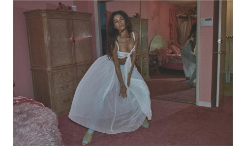
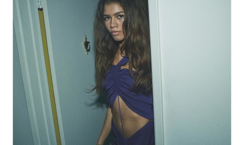
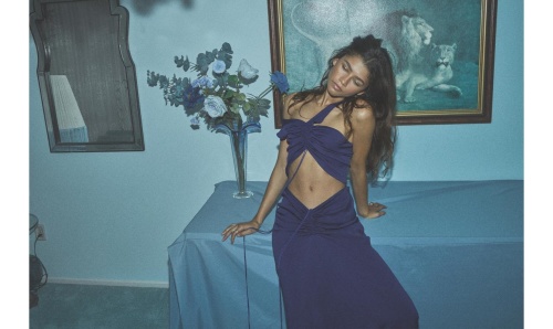
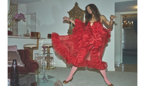
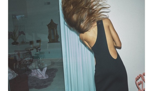
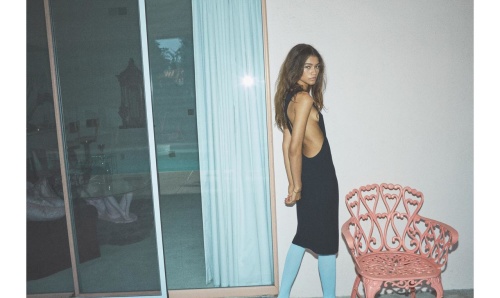
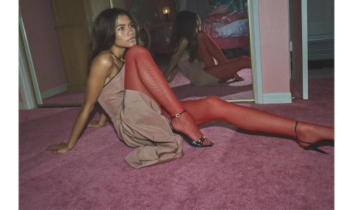
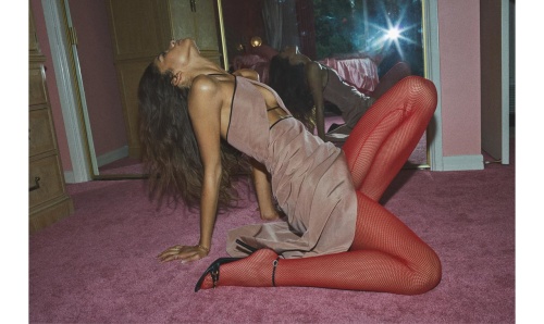
Vogue Australia March 2020 : Zendaya by Daniel Jackson
- Thread starter Marc10
- Start date
- Joined
- Jul 14, 2017
- Messages
- 14,824
- Reaction score
- 22,036
That shade of green... hate the layout and the font and I'm not sure that picture would be my final choice, but it's not bad. Certainly better than most of Zendaya's other covers... She looks quite good here, despite the questionable styling.
Vogue Australia needs an immediate re-design, it's 2020 and it's criminal that their creative direction looks like this.
Vogue Australia needs an immediate re-design, it's 2020 and it's criminal that their creative direction looks like this.
D
Deleted member 1957
Guest
I saw the editorial and its her most model like work to date
Miss Dalloway
Well-Known Member
- Joined
- Mar 3, 2006
- Messages
- 25,698
- Reaction score
- 1,005
Triple awful, awful shot of her, awful styling, and awful art direction, nice! And people wonder why magazines don't sell anymore!
slayage
Well-Known Member
- Joined
- Mar 20, 2019
- Messages
- 198
- Reaction score
- 200
I love this. After last month’s pedestrian-looking cover I was expecting something similar for March but THANK GOD they finally produced imagery that cannot be found on the pages of Marie Claire and something more fashiony.
thenewclassic
Well-Known Member
- Joined
- Mar 6, 2013
- Messages
- 807
- Reaction score
- 859
I kinda like this a lot.
JPineapple
Well-Known Member
- Joined
- Jul 1, 2018
- Messages
- 2,907
- Reaction score
- 4,067
I like it. I guess they did the shoot the same time GQ photographed her for the men of the year edition just look the third photo.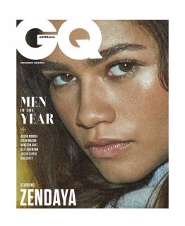
I guess they’re in some kind of crisis because is the second time in months they do that. Remember Adut Akech and Alton Maston for their anniversary issue, the editorial also appeared on GQ MOTY edition and VA january cover.
Source: Daniel Jackson Instagram

I guess they’re in some kind of crisis because is the second time in months they do that. Remember Adut Akech and Alton Maston for their anniversary issue, the editorial also appeared on GQ MOTY edition and VA january cover.
Source: Daniel Jackson Instagram
Benn98
Well-Known Member
- Joined
- Aug 6, 2014
- Messages
- 42,582
- Reaction score
- 20,744
Looks dirty and grimy, and not in a sexy way. Jackson only excels in the studio.
I don't know why Christine Centenara just leave Vogue Australia altogether because I don't really get what she brings to the table. VA is not at that prestige level where they can get exclusives with their name alone so they don't need her to secure talent, she styles less than 6 covers per year, all the issues where she's had no input were beyond solid. Stick to hanging out with Kim, Kanye and Virgil.
I don't know why Christine Centenara just leave Vogue Australia altogether because I don't really get what she brings to the table. VA is not at that prestige level where they can get exclusives with their name alone so they don't need her to secure talent, she styles less than 6 covers per year, all the issues where she's had no input were beyond solid. Stick to hanging out with Kim, Kanye and Virgil.
GivenchyHomme
Well-Known Member
- Joined
- Sep 3, 2009
- Messages
- 5,467
- Reaction score
- 5,320
He took a risk by shooting this in a new style, unfortunately it didn't work for him. He's very lucky he had Zendaya. Anyone else would have never been able to pull it off. A word of advice, leave the candid style photography to Juergen thanks!
- Joined
- Jan 9, 2008
- Messages
- 36,841
- Reaction score
- 24,563
^My sentiments exactly! I would never of guessed Daniel Jackson had shot this, purely because it's so harsh and untypical of Jackson's usual work. The cover shot is hideous, hate the styling from Christine Centenera, the set, the mood and that deeply unattractive font.
mikel
Well-Known Member
- Joined
- Sep 30, 2005
- Messages
- 26,850
- Reaction score
- 6,177
He also failed when he tried something similar with Doutzen for Dutch Vogue a couple of months ago.^My sentiments exactly! I would never of guessed Daniel Jackson had shot this, purely because it's so harsh and untypical of Jackson's usual work. The cover shot is hideous, hate the styling from Christine Centenera, the set, the mood and that deeply unattractive font.
Similar Threads
- Replies
- 16
- Views
- 4K
- Replies
- 40
- Views
- 17K
- Replies
- 5
- Views
- 3K
- Replies
- 19
- Views
- 4K
- Replies
- 4
- Views
- 2K
Users who are viewing this thread
Total: 1 (members: 0, guests: 1)

