You are using an out of date browser. It may not display this or other websites correctly.
You should upgrade or use an alternative browser.
You should upgrade or use an alternative browser.
Vogue Australia October 2008 : Natasha Poly by Inez van Lamsweerde & Vinoodh Matadin
- Thread starter Ohdior
- Start date
XavierRaphael
Active Member
- Joined
- Aug 15, 2008
- Messages
- 2,144
- Reaction score
- 56
The Vogue Nippon cover was better, just the lighting mainly but I'm glad there's no letters on her face.
XavierRaphael
Active Member
- Joined
- Aug 15, 2008
- Messages
- 2,144
- Reaction score
- 56
That looks much better Bianca! Thanks!
MissMagAddict
Well-Known Member
- Joined
- Feb 2, 2005
- Messages
- 26,621
- Reaction score
- 1,346
I love it... and don't mind the reprint.
Thank you for posting the detailed ytd cover info *Bianca*
Thank you for posting the detailed ytd cover info *Bianca*

yeah! That editorial of Solange is in this months Vogue Aus.I think this Solange editorial is from this issue
[FONT=Arial, Helvetica, sans-serif]chic[/FONT]
 If I havent gotten it mixed up with Harpers, theres also this really hoodly-doohdly loooong editorial which just seems to go on for ages!
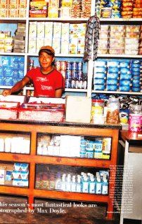
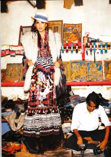
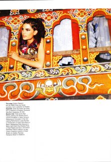
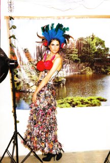
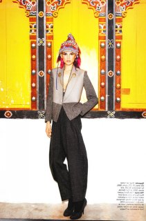
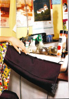
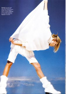
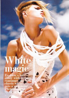
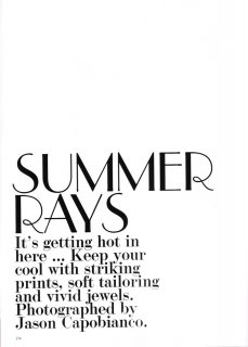
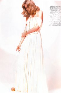
More scans, this is the first editorial of the batch  scanned by me:
 scanned by me:
Attachments
MissMagAddict
Well-Known Member
- Joined
- Feb 2, 2005
- Messages
- 26,621
- Reaction score
- 1,346
Similar Threads
- Replies
- 8
- Views
- 5K
- Replies
- 25
- Views
- 7K
- Replies
- 25
- Views
- 8K
- Replies
- 13
- Views
- 1K
Users who are viewing this thread
Total: 1 (members: 0, guests: 1)




















 oh well, what a fierce cover!