You are using an out of date browser. It may not display this or other websites correctly.
You should upgrade or use an alternative browser.
You should upgrade or use an alternative browser.
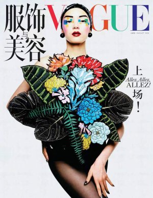
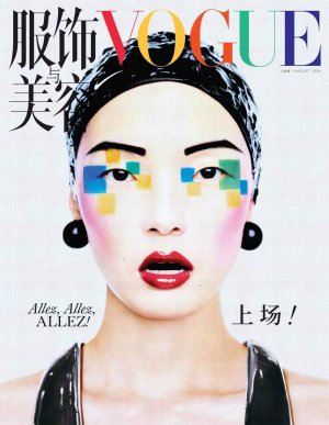
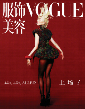
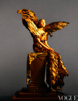
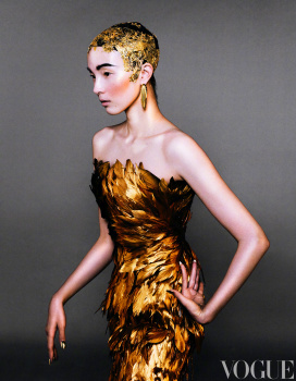
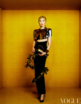
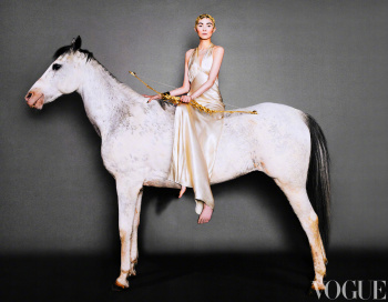
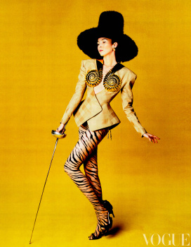
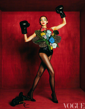
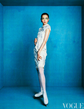
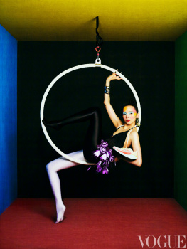
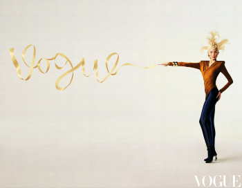
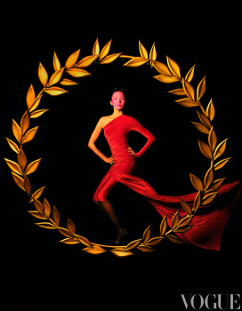
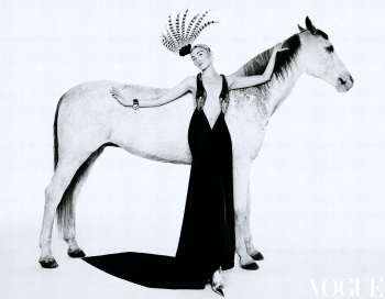
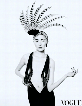
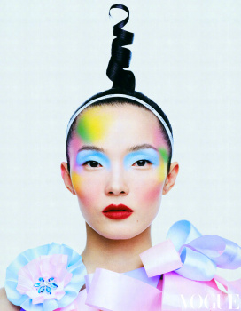
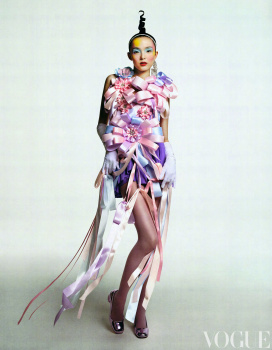
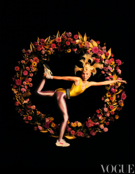
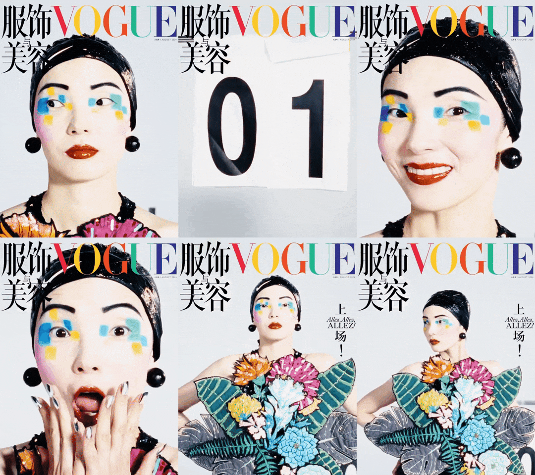
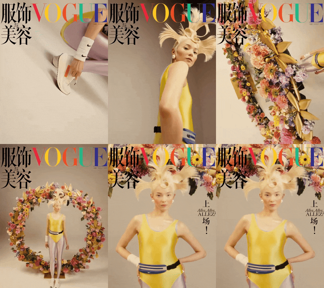
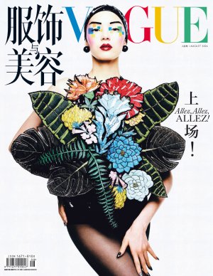
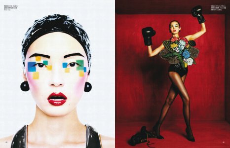
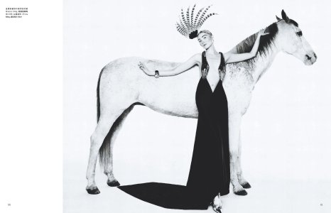
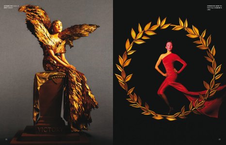
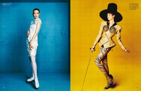
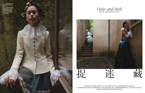
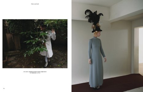
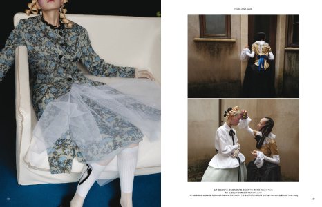
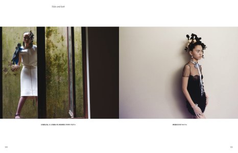
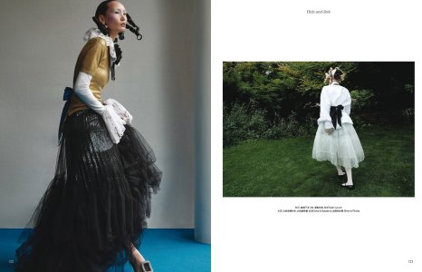
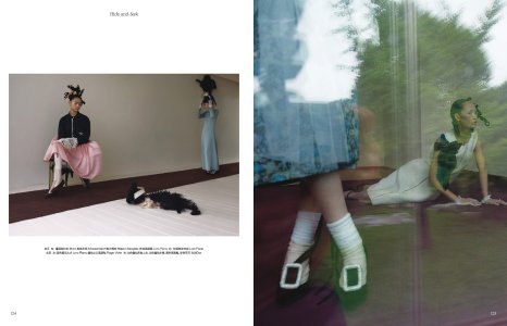
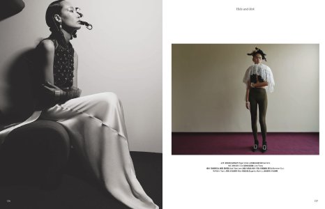
Vogue China August 2024 : Xiao Wen Ju by Leslie Zhang
- Thread starter crmsn
- Start date
fauxfashion
Well-Known Member
- Joined
- Oct 11, 2023
- Messages
- 657
- Reaction score
- 1,938
blueorchid
you soft and only
- Joined
- Apr 4, 2009
- Messages
- 10,898
- Reaction score
- 9,813
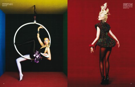
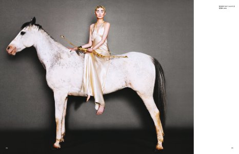
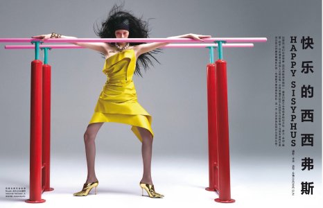
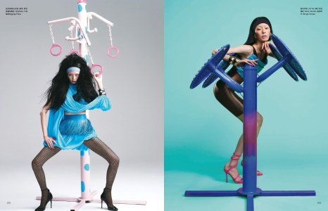
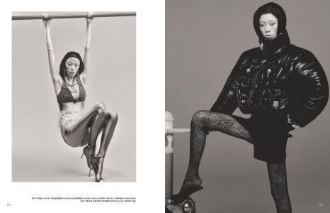
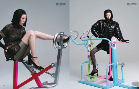
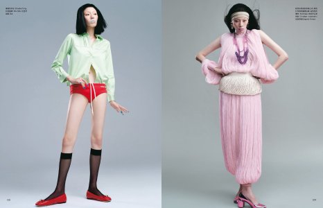
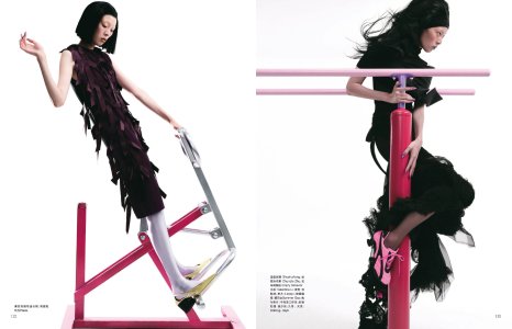
It'll get praise, but it's too static and referential for me.
avonlea002
Well-Known Member
- Joined
- Feb 10, 2020
- Messages
- 2,442
- Reaction score
- 8,482
Why is it so hard for them to put together a cohesive story? It's always the same instagram feed like compilation of images that are "cool" enough to use.
TomBlanksFullFatMiuMiu
Well-Known Member
- Joined
- Apr 29, 2024
- Messages
- 856
- Reaction score
- 1,794
Looks like a lot of up-and-coming creatives working together at the same shootWhy is it so hard for them to put together a cohesive story? It's always the same instagram feed like compilation of images that are "cool" enough to use.
They all have their egos and want to showcase their skill set, they wouldn't compromise with each other
On top of that, the stylist has too many ideas and can’t control everyone on set
It is the same old story over and over again, you need someone bossy in this kind of situation, either the photographer or the stylist calling all the shots. Vogue China currently has no EIC and do they run throughs like America?
Alquimista
Well-Known Member
- Joined
- Oct 1, 2023
- Messages
- 605
- Reaction score
- 1,406
They have creatives with egos? The west has egos with no creativity. Lol
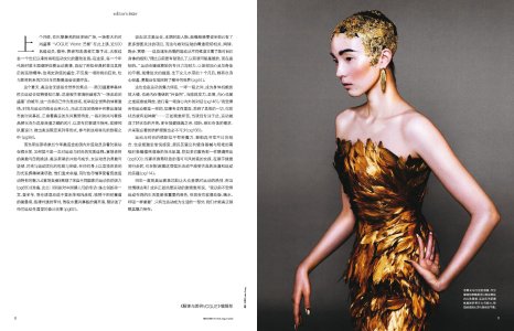
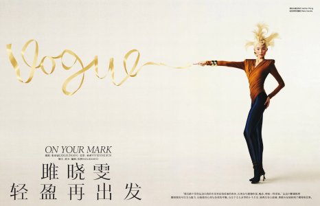
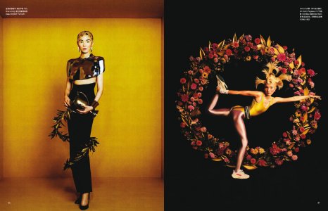
These are very good images. The cover, the editorial. I just don't understand why western magazines can't make something good this way anymore; good is already too high of a bar rn.
These are very good images. The cover, the editorial. I just don't understand why western magazines can't make something good this way anymore; good is already too high of a bar rn.
philophile
Well-Known Member
- Joined
- Dec 23, 2023
- Messages
- 510
- Reaction score
- 785
👏👏👏They have creatives with egos? The west has egos with no creativity. Lol
blueorchid
you soft and only
- Joined
- Apr 4, 2009
- Messages
- 10,898
- Reaction score
- 9,813
Neither does the east judging by what Chinese, Korean, Japanese, etc. magazines seem to churn out each month.They have creatives with egos? The west has egos with no creativity. Lol
I legitimately don't see what's praiseworthy about this mediocre editorial. It's like when people praise Vogue Arabia for being gLaMoUr. I mean, come on, lol...
Alquimista
Well-Known Member
- Joined
- Oct 1, 2023
- Messages
- 605
- Reaction score
- 1,406
It does what it does really well. In total contrast to western magazines that can't execute a simple thing like a portrait of a athlete.Neither does the east judging by what Chinese, Korean, Japanese, etc. magazines seem to churn out each month.
I legitimately don't see what's praiseworthy about this mediocre editorial. It's like when people praise Vogue Arabia for being gLaMoUr. I mean, come on, lol...
VogueDisciple93
Well-Known Member
- Joined
- Jun 24, 2011
- Messages
- 2,058
- Reaction score
- 782
I would change the makeup but otherwise the first cover is great! The editorial makes very little sense together but there are some great shots so give it a pass.
- Joined
- Jan 9, 2008
- Messages
- 35,323
- Reaction score
- 20,333
After last month's drab, dull and lifeless covers, this feels like a sight for sore eyes. Very much into how vibrant, graphic and stark the covers with the white background are. A massive step in the right direction from Vogue China...
Phuel
Well-Known Member
- Joined
- Feb 18, 2010
- Messages
- 5,719
- Reaction score
- 8,699
tourbillions
Well-Known Member
- Joined
- Dec 19, 2020
- Messages
- 1,493
- Reaction score
- 3,692
the "story" reminds me of many typical asian crazy movies where you never know where it goes. for example... everything everywhere all at once. Its a very asian style i think.Why is it so hard for them to put together a cohesive story? It's always the same instagram feed like compilation of images that are "cool" enough to use.
Similar Threads
- Replies
- 13
- Views
- 3K
- Replies
- 10
- Views
- 2K
- Replies
- 3
- Views
- 3K
- Replies
- 10
- Views
- 2K
Users who are viewing this thread
Total: 2 (members: 0, guests: 2)


