You are using an out of date browser. It may not display this or other websites correctly.
You should upgrade or use an alternative browser.
You should upgrade or use an alternative browser.
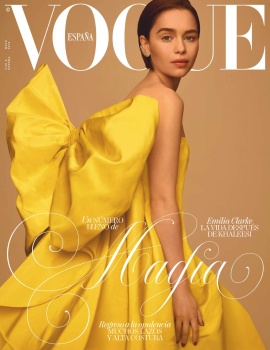
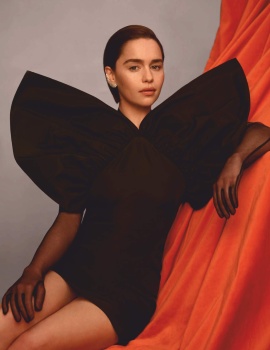
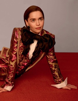
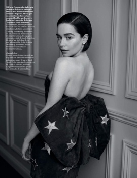
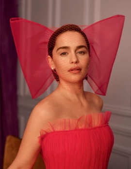
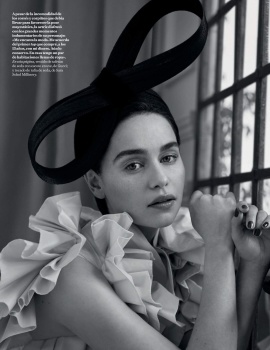
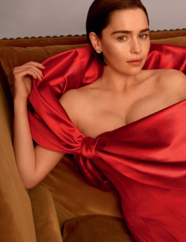
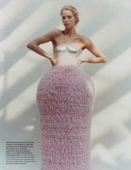
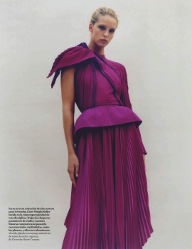
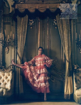
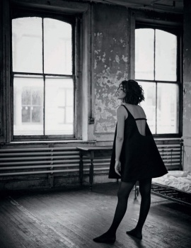
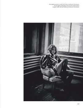
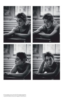
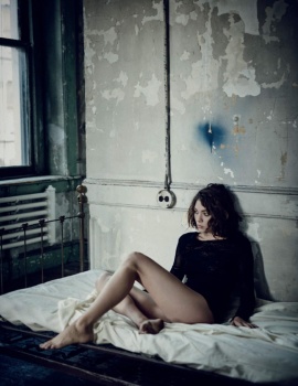
Vogue España May 2019 : Emilia Clarke by Thomas Whiteside
- Thread starter anaa lpz
- Start date
Benn98
Well-Known Member
- Joined
- Aug 6, 2014
- Messages
- 42,530
- Reaction score
- 20,572
I really like what they tried to go for here. The yellow is perfect for the beige backdrop. But for such a simple and classic cover, why that font?
I also agree that her expression could be more defined, and definitely her makeup as well, especially against that white masthead. For such a classic setup you need something eye-catching otherwise the entire thing just looks dull.
I hope this wasn't her big cover, although I'm happy for her because it's yet another international Vogue behind her palm. Rare feat for actresses, nowadays.
Miss Dalloway
Well-Known Member
- Joined
- Mar 3, 2006
- Messages
- 25,704
- Reaction score
- 997
See, a model would have carried this, an actual model, not the insta ones! But i still can't help, and not hate it, for once she doesn't look confused, just a little uncertain.
So strange she hasn't landed a single huge US cover!
So strange she hasn't landed a single huge US cover!
JPineapple
Well-Known Member
- Joined
- Jul 1, 2018
- Messages
- 2,762
- Reaction score
- 3,865
I love Emilia, I love the concept and ce composition. But the problem with her, is the same that (almost) all of us have with Alicia Vikander: She's so stunning, but her facial expressions don't make her justice.
honeycombchild
Well-Known Member
- Joined
- Jan 22, 2009
- Messages
- 8,841
- Reaction score
- 727
So strange she’s here and not one of the major US covers. Perhaps they’re saving her for the finale in June? Emilia is one of those beauties who, like Alicia Vinkander, just doesn’t translate well into print at all. I think Emilia is a real beauty but for me no photographer has yet to really capture it correctly.
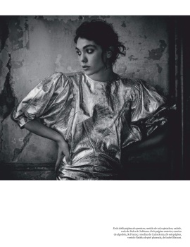
I do like the idea of the image a lot however, the dress in profile is so strong.
I do like the idea of the image a lot however, the dress in profile is so strong.
tigerrouge
don't look down
- Joined
- Feb 25, 2005
- Messages
- 18,328
- Reaction score
- 8,177
In print, she comes across as so ordinary, right down to her fingertips. That doesn't detract from her acting nor her appeal, but it means there's nothing 'there' when it comes to a fashion shoot.
Similar Threads
- Replies
- 22
- Views
- 6K
- Replies
- 13
- Views
- 4K
- Replies
- 1
- Views
- 2K
- Replies
- 4
- Views
- 2K
Users who are viewing this thread
Total: 2 (members: 0, guests: 2)


