You are using an out of date browser. It may not display this or other websites correctly.
You should upgrade or use an alternative browser.
You should upgrade or use an alternative browser.
Vogue España May 2019 : Emilia Clarke by Thomas Whiteside
- Thread starter anaa lpz
- Start date
caioherrero
Well-Known Member
- Joined
- Sep 2, 2017
- Messages
- 2,939
- Reaction score
- 1,492
The best thing is the Juan’s edit
- Joined
- Jan 9, 2008
- Messages
- 35,361
- Reaction score
- 20,453
Never rated Emilia Clarke on the covers of fashion magazines and it’s obvious that not even Vogue Spain or Thomas Whiteside (who has been doing wonderful portraits for American Marie Claire of late) could do Emilia justice.
The colours are nice here and I can appreciate the minimal text but that dress swamps Emilia and the stiff pose along with the vacant expression just make for a lifeless cover overall.
The colours are nice here and I can appreciate the minimal text but that dress swamps Emilia and the stiff pose along with the vacant expression just make for a lifeless cover overall.
EricGallais
Active Member
- Joined
- May 5, 2014
- Messages
- 113
- Reaction score
- 40
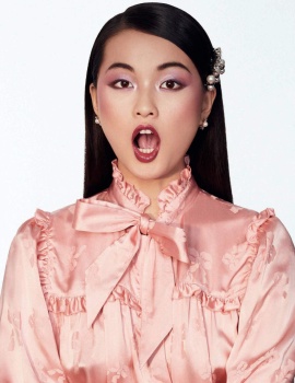
2019... and all these ruffles! Boring... like the girls un the pictures
Benn98
Well-Known Member
- Joined
- Aug 6, 2014
- Messages
- 42,530
- Reaction score
- 20,572
2019... and all these ruffles!
So true! In their defense, they're only showing what designers (the brands who keep these magazines afloat with advertising) want us to see. It was either this route, or the Gucci-template where the clothes are still inherently saccharine, but it is packaged with grit and irony to cloak it. Even Vogue Paris who don't particularly subscribe to hyper-femininity was forced to capitulate with those three April covers.
Similar Threads
- Replies
- 22
- Views
- 6K
- Replies
- 13
- Views
- 4K
- Replies
- 1
- Views
- 2K
- Replies
- 4
- Views
- 2K
Users who are viewing this thread
Total: 2 (members: 0, guests: 2)


