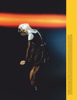
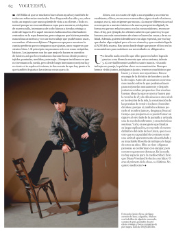
her expression is too severe for the cover but the editorial is pretty. a little bit too much ‘just staring’ at the camera though... also, it’s nice to see her back.
Exactly this morning I thought of her when I saw the Gucci SS 1998 campaign, because she is the one who made G-String memorable. And the injustice is that she didn’t get that campaign.
I’m glad she is on the covers of Spanish magazines again.
I'd argue she looks better now than in her prime. Kind of reminds me of Kim Basinger who I also think is stunning.
Two wishful notes: changing up her facial expression - the lower half of her face is frozen.
And the photos, a few of those totally redundant, like they needed to pick a few that are less bad as fillers. And the cape-like styling makes it look like she's auditioning to a superwoman movie (which she would totally rock).
I genuinely cannot complain about a single element with regards to the cover. What's not to love? It's Esther, the image is far more deserving of the front cover of Vogue, as opposed to last month's eyesore and the red masthead and minimal cover lines make for a great cover, all round.
The premises of the main editorial is a little silly...tree-house ladders and hawks on shoulders. Yet somehow it sort of works thanks to that eternally desirable late 90s cool that Esther brings to her work. She's always intrigued me, and here elevates typical post-Covid level fashion content to something a little better.
I love all this but... maybe because she's a woman and she's been forced to use heels for most of her life, her feet and toes look super gnarly. Especially in that red sequin dress. Sorry, I still love you Esther.
This site uses cookies to help personalise content, tailor your experience and to keep you logged in if you register.
By continuing to use this site, you are consenting to our use of cookies.