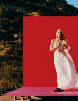
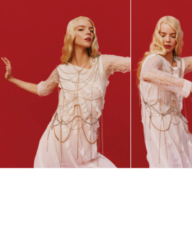
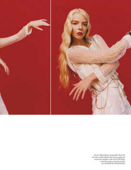
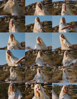
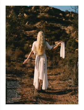
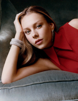
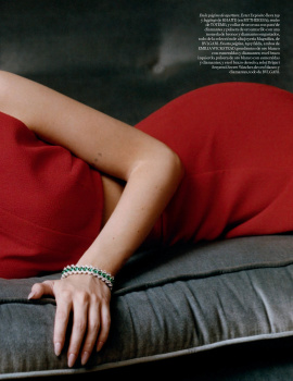
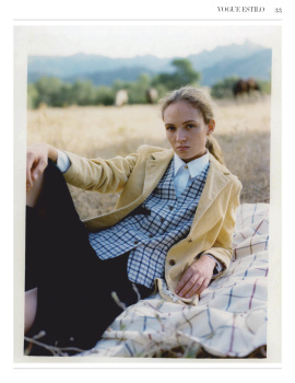
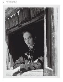
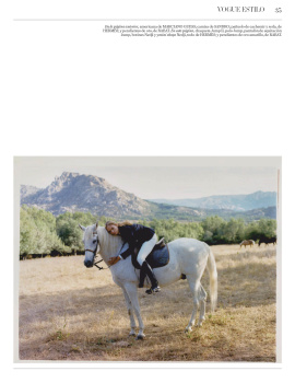
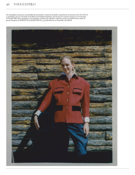
The Mexican covers with the red background would've worked even better with this font and layout. I like this regardless, but I'm also still in denial that Vogue is so caught up in their global mess to the point where certain editions barely scrape together two original editorials per issue. So, so upsetting.
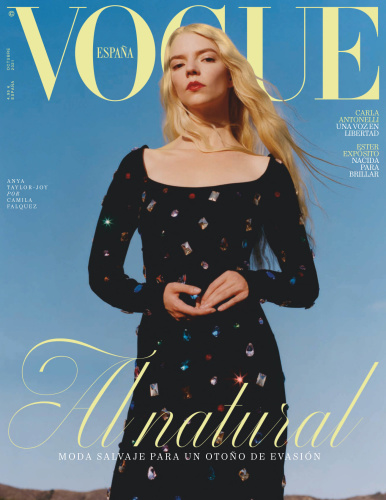
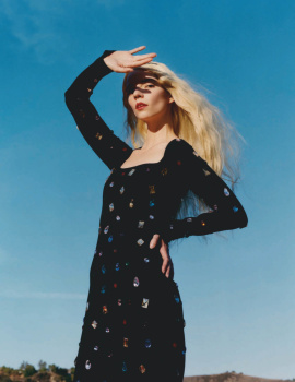
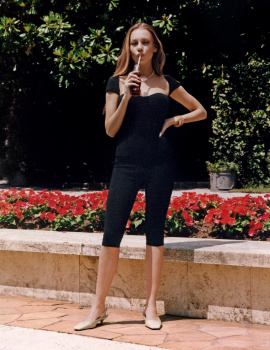
The cover image feels like a breath of fresh air, love the clear blue sky backdrop, the pale yellow Vogue masthead and how the black dress is at the forefront. The beauty styling could've been better but still a minimal and inoffensive cover that I cannot grumble over.
This site uses cookies to help personalise content, tailor your experience and to keep you logged in if you register.
By continuing to use this site, you are consenting to our use of cookies.