Vogue Germany April 2022 : Badmómzjay by Thomas Lohr

dfl-001

Well-Known Member
Joined
Aug 16, 2005
Messages
1,931
Reaction score
1,230
zTv0tOT4_o.jpg


source: meine-zeitschrift.de
 
Obviously had zero clue who Badmonzjay was until a quick Google search and can see I haven't been missing anything. I'm here for Edward Enninful promoting German talent on Vogue Germany, which of course makes sense, but these naffer than naff covers just ain't it.
 
Would have been better with her arms showing imo...
 
There's no power in looking like a Jessica Rabbit impersonator that's being held hostage.
 
The no-arms choice makes her look like the Venus of Willendorf.

Some people have Wes Craven movies. Other people, Stephen King books. Me, I get horrified the most by Vogue covers. I feel special.
 
I’ll raise the bar, the no arms look reminds me of that ‘Boxing Helena’ movie.
big no.
you don’t use this image for a cover, you use it for an inside shot at most.

have no idea who she is and won’t bother with it. all I can see is another celebrity/ artist getting a cover instead of a model.

also that purple, lilac red combo of colours… I don’t know.
 
It looks like a cut and paste of Vogue Japan and Vogue France, but who am I kidding?
Most Vogue editions aren't as unique as what they were a decade ago. *cough* VF and VI *cough*
 
Didn't Tyra always criticize models when their limbs were hidden like this in photos on ANTM (lmao)? Because that's what I immediately thought of when I saw this cover. It totally is a Boxing Helena look, @WAVES!!
 
^Yet Brittani won Season 16 even though most of her best shots made her look like an amputee.
I don't understand Tyra's criticisms sometimes.
 
Fair enough, I quit watching after cycle 10 or something. :rofl: The photo just reminded me of that critique.
 
^Yet Brittani won Season 16 even though most of her best shots made her look like an amputee.
I don't understand Tyra's criticisms sometimes.

But she gave her a pass because Brittani always ‘sold it’ with her eyes. LOL

I think aside from the questionable pose, what’s with the layout? At this point, Conde Nast must have hired a plethora of interns instead of professionals because I can’t fathom how the latter would produce covers like this.
 
I have no idea who she is, but she looks like a teenager on her way to Ladies' Night in a small town disco.
Whom are they trying to appeal to?
 
I don't know who's she but looks like a bad copy of Jessica Rabbit.
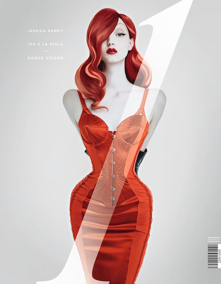
If only they went all out with the Jessica Rabbit vibe it may have been stunning. I also have no idea who this person is or if they're worthy of cover, but visually the red and silhouette will stand out on the newsstand.
Thought Vogue Germany would've ditched this dull white backdrop by now seeing Arp is no longer there, but alas.

What's the massive 'stand up, speak out' all bout? I don't really care for coverlines without context.
 
Against what, this magazine and whoever is running it to the ground?
 
Cover feels like a cheap knockoff of this UmnO cover with Codie Young from a while back:

Ce6SL8j9_o.jpg

source: fashiongonerogue.com
 
Well, at least she doesn't look like an amputee in her other photos.
 

Users who are viewing this thread

New Posts

Forum Statistics

Threads
212,548
Messages
15,188,654
Members
86,440
Latest member
Hannafransson
Back
Top
monitoring_string = "058526dd2635cb6818386bfd373b82a4"
<-- Admiral -->