You are using an out of date browser. It may not display this or other websites correctly.
You should upgrade or use an alternative browser.
You should upgrade or use an alternative browser.
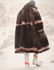
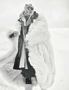
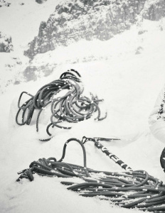
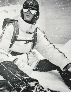
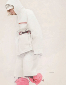
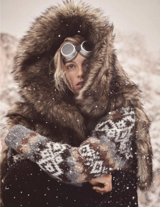
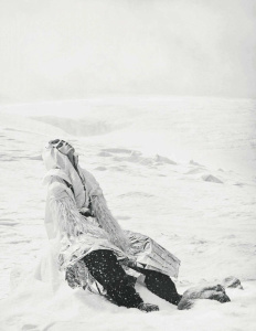
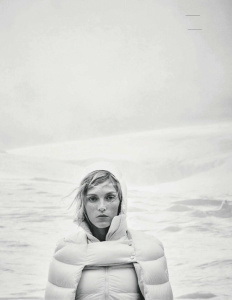
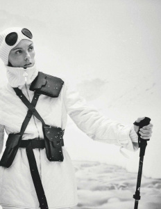
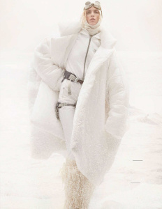
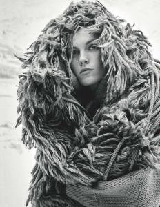
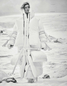
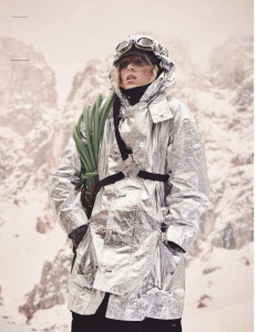
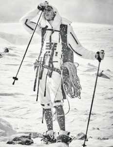
Vogue Germany December 2018 : Anja Rubik by Giampaolo Sgura
- Thread starter TZ001
- Start date
Piet Retief
Well-Known Member
- Joined
- Jan 7, 2016
- Messages
- 703
- Reaction score
- 352
I really adore this cover, but to be fair I always love Anja for Vogue Germany 

Benn98
Well-Known Member
- Joined
- Aug 6, 2014
- Messages
- 42,582
- Reaction score
- 20,744
This cover could've been done justice with more detail. Perhaps a dust of snowflakes on the pieces, and definitely zoomed out showing a snow-covered background. Just paint more of a clearer picture and add some production value.
So he ACTUALLY shot on location, but none of that was shown on the cover!?! Lol, ok. The editorial had potential to be great, but I'm not sold on Anja's poses and his cropping. If it depended on me I'd have pushed for the Moncler x Pierpaolo puffer bolero set to be on the cover, and try to get a cheque out of them for it. The white look on white snowy backdrop would've been way better and less cluttered. With a frosty blue font. Done. It would also be somewhat unique because everyone else are either doing festive colours or summer/studio settings for December. Arp missed the boat.
It's the only highlight based on what's posted so far. The rest is uneventful. Thanks for posting, @Scotty

- Joined
- Jan 9, 2008
- Messages
- 36,839
- Reaction score
- 24,556
Another letdown of a cover from Vogue Germany! What a disappointing way to end 2018, especially due to the fact the magazine's proved themselves on multiple occasions in the past of being able to produce a stunning and festive December cover (2008 and 2010 immediately springing to mind).
Anja's face needed to be more in the forefront as opposed to us just seeing a mass of texture, a white masthead would've brightened up the cover and there's no denying the fact the magazine's current choice in fonts and layout needs work.
Anja's face needed to be more in the forefront as opposed to us just seeing a mass of texture, a white masthead would've brightened up the cover and there's no denying the fact the magazine's current choice in fonts and layout needs work.
Similar Threads
- Replies
- 40
- Views
- 10K
D
- Replies
- 30
- Views
- 9K
- Replies
- 22
- Views
- 6K
D
- Replies
- 13
- Views
- 5K
- Replies
- 39
- Views
- 8K
Users who are viewing this thread
Total: 1 (members: 0, guests: 1)
New Posts
-
Vogue Ukraine No. 11, F/W 2025: Max Voloshyn & Karolina Rossoshanska by Stephan Lisowski (1 Viewer)
- Latest: BalkaniStaCouture
-
-
-
-

