You are using an out of date browser. It may not display this or other websites correctly.
You should upgrade or use an alternative browser.
You should upgrade or use an alternative browser.
Vogue Japan October 2015 : Caroline Trentini by Giampaolo Sgura
- Thread starter SpeakThatJDunn
- Start date
kokobombon
Well-Known Member
- Joined
- Oct 7, 2007
- Messages
- 18,647
- Reaction score
- 2,008
I guess VJ had to push that jumpsuit down our throats  still, she looks great from the neck up imo.
Her editorial though... she looks the same in almost every pic, not her fault but Sgura's...
 still, she looks great from the neck up imo.
Her editorial though... she looks the same in almost every pic, not her fault but Sgura's...
- Joined
- Jul 24, 2010
- Messages
- 86,334
- Reaction score
- 52,389
Caroline's Symphony
ph: Giampaolo Sgura
editor: Anna Dello Russo
waymodel.com.br
Beautiful edit. Thanks so much for sharing!
Benn98
Well-Known Member
- Joined
- Aug 6, 2014
- Messages
- 42,530
- Reaction score
- 20,571
I was wondering that too. Complete opposite vibe.
That's almost always the case with VJ cover features. If only they'd expand on the cover for once, it wouldn't be half as bad.
The editorials looks like something he'd do for Vogue Germany, or maybe they just work with him too much. I feel like a simple studio backdrop would've been more striking. I dont get the inclusion of the bed, too half-baked for my taste. I also dont know who selected the final shots because most of it looks very similar to one another (expression/composition). Something like this would never happen in British or American Vogue, as much as people may despise them.
MON
Well-Known Member
- Joined
- Jun 20, 2009
- Messages
- 12,635
- Reaction score
- 5,184
That editorial had so much potential tbh. If they limited the shots to a handful, it would've been short but very very striking. Some of the shots ruined it for me, especially those that are visually the same. I also wish it had variations where she's looking. I'd take out so many shots if I had my way.. I'm so sure there are better unpublished shots than this one. With that said, this is probably the best Sgura ed for Vogue Japan. Most of his works for them reminds me of a cheaper version of a cheap Dolce & Gabbana ad campaign.
Although, I really like how the cover and the ed are polar opposites. It's not predictable.
Although, I really like how the cover and the ed are polar opposites. It's not predictable.
Melancholybaby
Well-Known Member
- Joined
- Aug 25, 2011
- Messages
- 14,117
- Reaction score
- 1,475
Emmanuelle
Active Member
- Joined
- Oct 21, 2013
- Messages
- 1,320
- Reaction score
- 1
The cover is nice but really nothing to do with the edit ^^ I adore both stories, really great !
The Nordic Queen - Preview
Lily Donaldson by Emma Summerton


vogue.co.jp
Lily Donaldson by Emma Summerton


vogue.co.jp
Nordic queen living in the frigid earth, goddess incarnate she flew down to this earth. Now wearing a dramatic fur and down coat of the season in a primitive style, begins her adventure now. Photographed BY EMMA Summerton STYLED BY GIOVANNA battaglia
JoCaderone
Well-Known Member
- Joined
- May 19, 2013
- Messages
- 484
- Reaction score
- 123
Really love the opening shot of "Nordic Queen". It's a pity the story is so short.
Thanks for posting, SugarMe!
Actually the complete story has 12 pics

Benn98
Well-Known Member
- Joined
- Aug 6, 2014
- Messages
- 42,530
- Reaction score
- 20,571
Actually the complete story has 12 pics
Thanks Jo, but I can only see 3 images. Weird. Will try viewing the page with a different browser.
JoCaderone
Well-Known Member
- Joined
- May 19, 2013
- Messages
- 484
- Reaction score
- 123
Fashionstuff
http://fashionworldstuff.
- Joined
- Aug 18, 2015
- Messages
- 1,097
- Reaction score
- 44
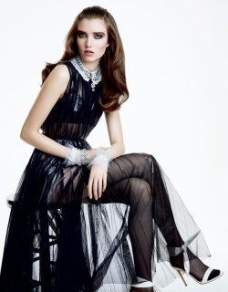
Awesome Editorial with Grace Hartzel, photographed by Patrick Demarchelier for Vogue Japan October 2015.
Fashion Editor: Giovanna Battaglia
Hair: Teddy Charles
Make-up: Gucci Westman ;Nails: Tatyana Molot
photo credits : http://elite.style/

Fashion Editor: Giovanna Battaglia
Hair: Teddy Charles
Make-up: Gucci Westman ;Nails: Tatyana Molot
photo credits : http://elite.style/
Attachments
-
 grace-hartzel-by-patrick-demarchelier-for-vogue-japan-october-2015.jpg408.6 KB · Views: 9
 -
 grace-hartzel-by-patrick-demarchelier-for-vogue-japan-october-2015-1.jpg509.5 KB · Views: 5
 -
 grace-hartzel-by-patrick-demarchelier-for-vogue-japan-october-2015-2.jpg319.1 KB · Views: 6
 -
 grace-hartzel-by-patrick-demarchelier-for-vogue-japan-october-2015-3.jpg306.7 KB · Views: 5
 -
 grace-hartzel-by-patrick-demarchelier-for-vogue-japan-october-2015-5.jpg454.8 KB · Views: 6
 -
 grace-hartzel-by-patrick-demarchelier-for-vogue-japan-october-2015-6.jpg434.2 KB · Views: 5
 -
 grace-hartzel-by-patrick-demarchelier-for-vogue-japan-october-2015-7.jpg292.5 KB · Views: 12
Last edited by a moderator:
Similar Threads
- Replies
- 22
- Views
- 5K
D
- Replies
- 40
- Views
- 8K
D
- Replies
- 70
- Views
- 19K
- Replies
- 29
- Views
- 12K
Users who are viewing this thread
Total: 2 (members: 0, guests: 2)


