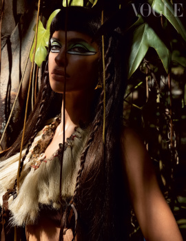
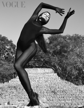
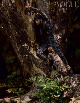
Shocking. Genuinely baffled that anyone saw the first cover image and thought it was good for publishing, let alone cover material! She looks like a frog about to be dissected! Zero elegance, zero beauty in the image. The dress looks incredibly cheap, but I guess that's just your general high fashion nowadays. It bothers me that it's sheer enough for us to see the entirety of her body, but not sheer enough to make the background visible through the back layer - it makes me think they pasted her sprawled body in the forest and forgot to edit the dress transparency.
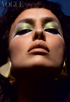
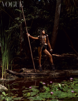
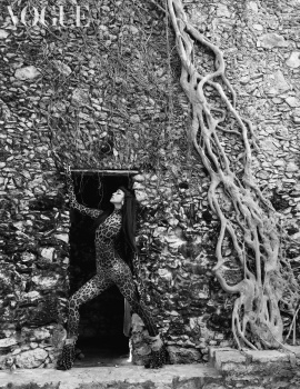
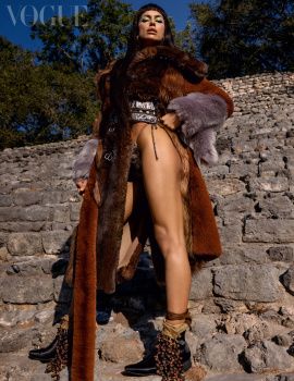
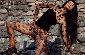
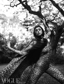
The second one is an improvement, but I'm not sold on it. The layout is incredibly weak and the shadows are extremely harsh (just like Inez & Vinoodh's British cover). I don't like it. The beauty cover is the best of the bunch, I think it's a great shot but it also could've benefited from less exposure adjustment. I do hope that the editorial won't be a complete disappointment... I generally love a good Veruschka/Rubartelli reproduction, but this doesn't look very promising.