DutchHomme
Active Member
- Joined
- Sep 29, 2011
- Messages
- 2,913
- Reaction score
- 5

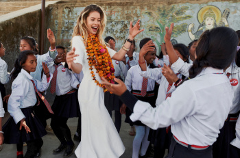
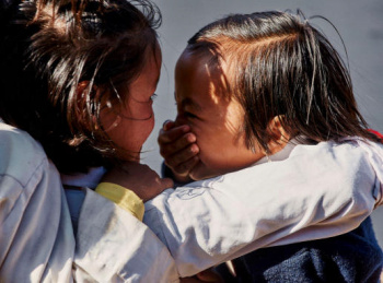
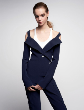
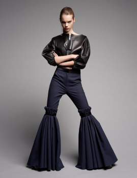
Vogue.nl
Photography: Duy Vo
Styling: Jetteke van Lexmond
Hair & make-up: Mo Karadag
Model: Doutzen Kroes
It looks awful & I find it very boring
resembling a standard holiday snap
ZZZZZZZZZZZZZZZZZZZZZZZZZZZZZZ

Her best friend/agent Mo Karadag should stay home next time because his hair/make-up performance do not make sense
It's always the same & it's terrible!
Last edited by a moderator:


 That sentence is to die for (for anyone knowing Brigitte). I could also imagine this cover as a rip-off of the visual of an album by the Wildecker Herzbübchen or the Kastelruther Spatzen... But I have to agree with HeatherAnne on the fact we need to praise Vogue Netherlands for having been able (at last) to push the door of their office and shoot outside!