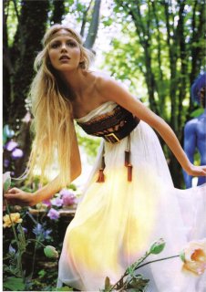
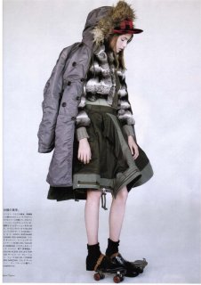
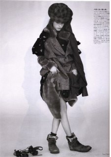
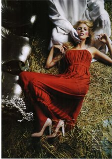
Anja looks like a goddess!
I'm very excited for this issue, Sept issues rarely dissapoint me. They're just crammed full of so much goodness and I doubt this will be an exception.
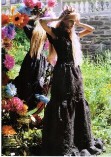
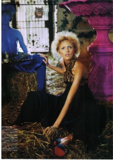
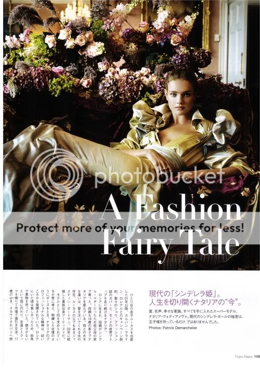
Natalia looks beautiful as well but she always looks beautiful.
the theme for this month was `PRETTY PRINCESS` so they were probably thinking that pink go along with the princess image....pink=princess. Plus they had a feature ed about the world royalty and so forth.....so I guess they were trying to use the color to fit the theme!
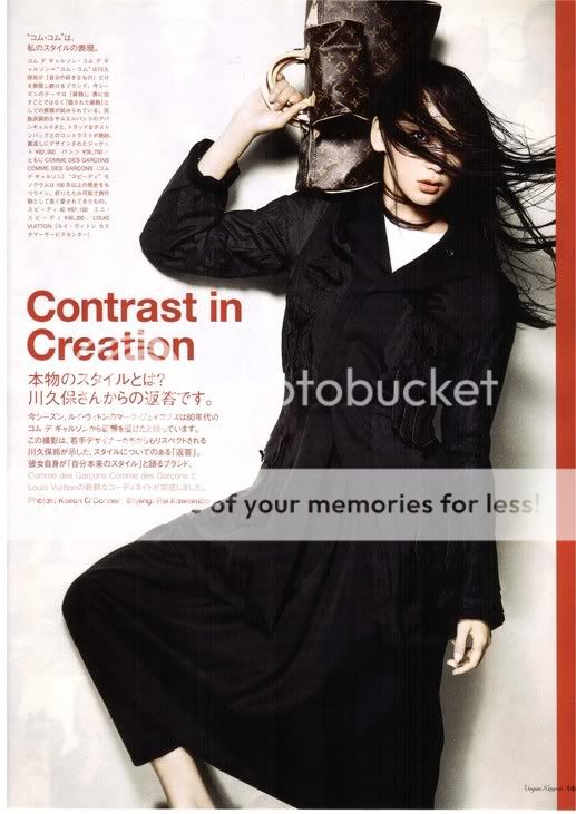
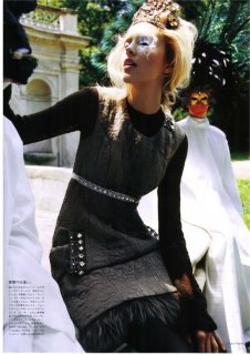
Nippon Vogue finally featured a Japanese model in one of the editorial.....finally! But I was disaapointed in that fact that they choose Anne Watanbe to modeled the special collaboration between Comme des Garcons w/ Louis Vuttion. She doesn`t shine in the ed....she have the same poses and look...everytime I see her in any fashion magazines that featured her. Sorry for all the ranting about her....I think she should stick to the runway and stay away from photo eds!!
Scan by Preahya
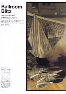
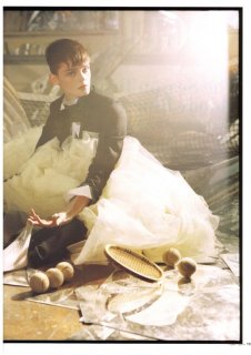
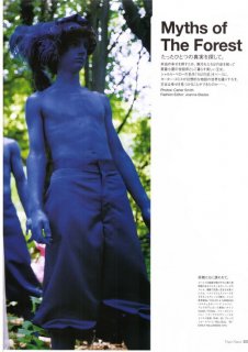
Contrast and Creation w/ Anne Watanbe- sorry this on will be a big one!!
the theme for this month was `PRETTY PRINCESS` so they were probably thinking that pink go along with the princess image....pink=princess. Plus they had a feature ed about the world royalty and so forth.....so I guess they were trying to use the color to fit the theme!
When I'm looking at the cover the fuchsia+grey combination always bothers me... You're right about pink=princess but grey? not so pretty or princess...
When I'm looking at the cover the fuchsia+grey combination always bothers me... You're right about pink=princess but grey? not so pretty or princess...
Nippon Vogue had an article about Natalia, I think it is about her `fairy tale` marriage to her husband (justin something). Can someone tell me if this photo is new or old?
This site uses cookies to help personalise content, tailor your experience and to keep you logged in if you register.
By continuing to use this site, you are consenting to our use of cookies.


 they should have used more "kawaii" font though
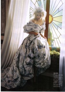
 ...I love Anja' s editorial!!. Don' t really like the cover though.