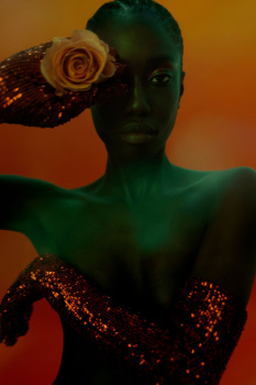
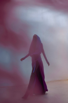
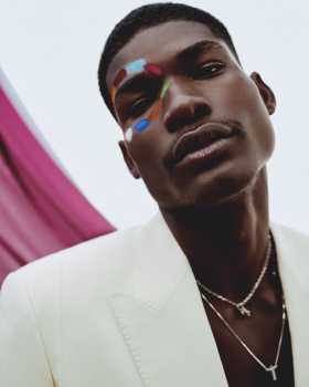
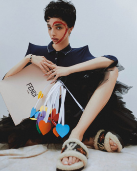
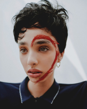
I like it. There’s something very psychological about the first cover. And that mauve masthead is just beautiful. I don’t really care about the second one. I don’t think it’s necessary, the first one is strong enough.
Very cinematic and beautiful indeed. One could argue that this isn't neccessarily fashionable, but for some odd reason it works - especially for this edition. The first cover would look beautiful on a coffee table.
This site uses cookies to help personalise content, tailor your experience and to keep you logged in if you register.
By continuing to use this site, you are consenting to our use of cookies.