You are using an out of date browser. It may not display this or other websites correctly.
You should upgrade or use an alternative browser.
You should upgrade or use an alternative browser.
Vogue Thailand July 2024 : Anika Chati, Arthit Mikhail Romanyk & Supha Sangaworawong by Thada Varish
- Thread starter vogue28
- Start date
jeremydante
Well-Known Member
- Joined
- Jul 15, 2009
- Messages
- 3,598
- Reaction score
- 1,237
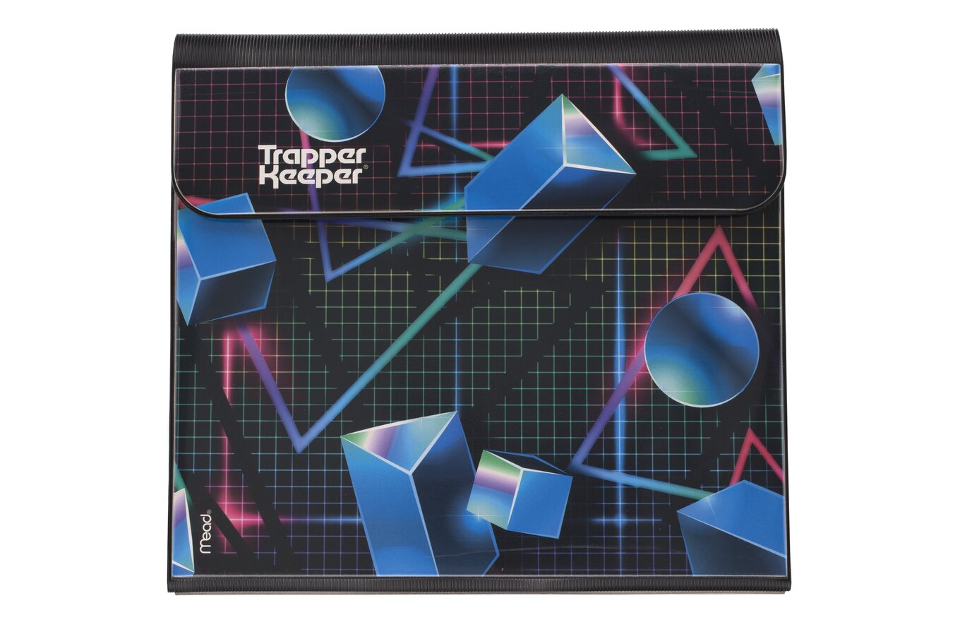
Reminds me of an 80's Trapper Keeper binder.


crmsn
Well-Known Member
- Joined
- Jun 6, 2018
- Messages
- 2,922
- Reaction score
- 9,210
Reminds me of graphing paper I used in Geometry class. Triggering.
This edition is a lost cause. They can actually follow Vogue Philippines' classy and clean format given that they also have a rich culture but they chose to be tacky and cheap-looking.
This edition is a lost cause. They can actually follow Vogue Philippines' classy and clean format given that they also have a rich culture but they chose to be tacky and cheap-looking.
Deleted member 116957
New/Inactive Member
- Joined
- Apr 4, 2009
- Messages
- 13,772
- Reaction score
- 15,809
Bertrando3
Well-Known Member
- Joined
- Mar 22, 2010
- Messages
- 5,625
- Reaction score
- 2,379
I like it, it's a bit minimalist and not so in-your-face but nevertheless it gives ''fashion x OG'' energy. They are good looking too 

Lovetojudge24
Member
- Joined
- Mar 22, 2024
- Messages
- 28
- Reaction score
- 8
looks like a teen magazine.
D
Deleted member 1957
Guest
I've neve rbeen a fan of the bathroom tiles magazine cover look.
phungnam96
Well-Known Member
- Joined
- Jul 7, 2011
- Messages
- 1,237
- Reaction score
- 923
reminds me of trash.
tigerrouge
Well-Known Member
- Joined
- Feb 25, 2005
- Messages
- 18,891
- Reaction score
- 9,728
It's like they're living in a graph paper world with giant rulers. Three students trapped in a Tron-like dimension, except here they have to escape by sitting through a series of maths exams.
Deleted member 116957
New/Inactive Member
- Joined
- Apr 4, 2009
- Messages
- 13,772
- Reaction score
- 15,809
The masthead is hardly the worst thing about this cover
jeremydante
Well-Known Member
- Joined
- Jul 15, 2009
- Messages
- 3,598
- Reaction score
- 1,237
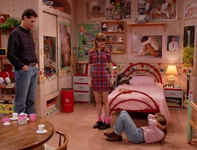
totally that wallpaper! @blueorchidIt reminds me of the bedroom on Full House!
fauxfashion
Well-Known Member
- Joined
- Oct 11, 2023
- Messages
- 991
- Reaction score
- 3,731
Time & Gems cover
fauxfashion
Well-Known Member
- Joined
- Oct 11, 2023
- Messages
- 991
- Reaction score
- 3,731
Bertrando3
Well-Known Member
- Joined
- Mar 22, 2010
- Messages
- 5,625
- Reaction score
- 2,379
^ AHAHAHA it's true, it's very ANTM lol 

Similar Threads
- Replies
- 9
- Views
- 2K
- Replies
- 6
- Views
- 2K
D
- Replies
- 68
- Views
- 21K
- Replies
- 31
- Views
- 7K
- Replies
- 3
- Views
- 895
Users who are viewing this thread
Total: 1 (members: 0, guests: 1)


