You are using an out of date browser. It may not display this or other websites correctly.
You should upgrade or use an alternative browser.
You should upgrade or use an alternative browser.
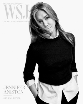
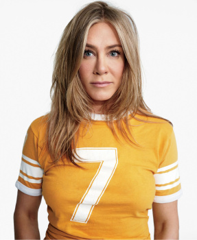
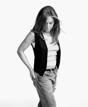
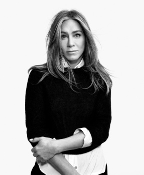
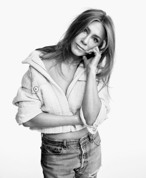
WSJ. Magazine Fall 2023 : Jennifer Aniston by Gray Sorrenti
- Thread starter vogue28
- Start date
caioherrero
Well-Known Member
- Joined
- Sep 2, 2017
- Messages
- 2,937
- Reaction score
- 1,491
Is this the first issue under the new editor?
Benn98
Well-Known Member
- Joined
- Aug 6, 2014
- Messages
- 42,530
- Reaction score
- 20,571
It's as though she doesnt age at all! Now this is what we call ageing gracefully. 
Even though it sickens me to see Gray Sorrenti shoot yet another cover (and we all know why! Spoiler alert, it's not her talent), it's good for WSJ. She's one of the few celebrities who I don't particularly want to see dolled up in the latest fashion all the time. Probably the one time I'm prepared to give Clare Richardson's dull as dishwater styling the pass.

Even though it sickens me to see Gray Sorrenti shoot yet another cover (and we all know why! Spoiler alert, it's not her talent), it's good for WSJ. She's one of the few celebrities who I don't particularly want to see dolled up in the latest fashion all the time. Probably the one time I'm prepared to give Clare Richardson's dull as dishwater styling the pass.
JPineapple
Well-Known Member
- Joined
- Jul 1, 2018
- Messages
- 2,755
- Reaction score
- 3,856
she’s gorgeous but i find her extremely boring
Benn98
Well-Known Member
- Joined
- Aug 6, 2014
- Messages
- 42,530
- Reaction score
- 20,571
Okay, where's the fashion??? I can't find it.
It's Clare Richardson, lol.
Generally love WSJ. (and Aniston) but this is not great. They just got a new EIC (cost cutting measure -- they hired the former digital director to replace Kristina O'Neill), and I hope this isn't a sign of things to come.
Bertrando3
Well-Known Member
- Joined
- Mar 22, 2010
- Messages
- 5,462
- Reaction score
- 2,129
I want to love this because I like her as an actress + I love ''The morning show'' tv series = however I can't.
It's a boring styling + amateurish photography + the selection of photos is super dull = bad result.
It's such a shame when magazines do this : they have the talent person in front of them + they have the money to produce a decent shoot = nevertheless it's most of the times plain and boring.
I also can't shake the feeling that many smaller or indie magazines can rock something much better with the same celebrities versus what big magazines produce most of the times.
Benn98
Well-Known Member
- Joined
- Aug 6, 2014
- Messages
- 42,530
- Reaction score
- 20,571
I also can't shake the feeling that many smaller or indie magazines can rock something much better with the same celebrities versus what big magazines produce most of the times.
Agreed, supplements specifically have more creative freedom and they don't need to worry about covers selling good or bad or trending on social media. Plus they generally have bigger budgets because of smaller expenses.
Maybe they're going for the quiet wealth aesthetic which is of course Clare's aesthetic, but does it have to be so dull?
- Joined
- Jan 9, 2008
- Messages
- 35,329
- Reaction score
- 20,362
This feels like a palette cleanser following the unveiling of Elle's September cover with Zendaya, and I'm not complaining. I have a massive soft spot for WSJ. Magazine (and Jennifer Aniston for that matter) and despite the laidback attitude and nonchalant styling for a fall fashion offering, it's all just so... good and instantly wins me over.
VogueDisciple93
Well-Known Member
- Joined
- Jun 24, 2011
- Messages
- 2,058
- Reaction score
- 782
It's wild how gray sorrenti keeps on getting high profile work with how pedestrian her photography is.
D
Deleted member 1957
Guest
I think this type of offbeat style editorial would look more genuine if it wasnt overly retouched. In the en dits the photographer and stylist that missed something.
PowerDroid
Well-Known Member
- Joined
- Jul 16, 2020
- Messages
- 202
- Reaction score
- 189
both the images and the styling are a miss for me, it's all so basic and clumsy, uninspiring.
Similar Threads
- Replies
- 19
- Views
- 6K
- Replies
- 9
- Views
- 3K
- Replies
- 2
- Views
- 2K
- Replies
- 37
- Views
- 9K
- Replies
- 12
- Views
- 3K
Users who are viewing this thread
Total: 2 (members: 0, guests: 2)


