You are using an out of date browser. It may not display this or other websites correctly.
You should upgrade or use an alternative browser.
You should upgrade or use an alternative browser.
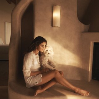
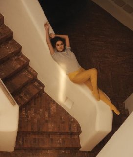
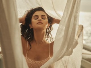
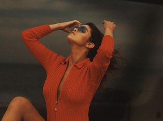
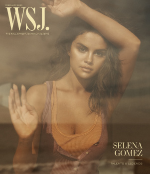
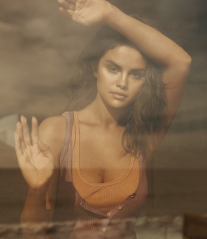
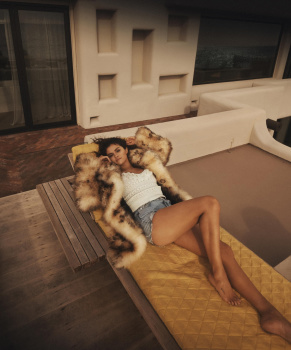
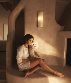
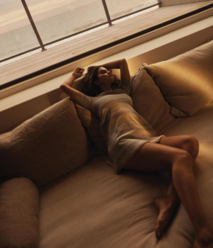
WSJ Magazine February 2020 : Selena Gomez by Lachlan Bailey
- Thread starter vogue28
- Start date
Benn98
Well-Known Member
- Joined
- Aug 6, 2014
- Messages
- 42,530
- Reaction score
- 20,571
Unimpressive cover trying to pander to this magazine's aesthetic which should be applauded. But as with most things in life, one size does not fit all.
LOL!
Selena Gomez is the Jennifer Aniston of her generation in terms of the way magazines depict her. And I can appreciate the beachy and tanned Aniston perpetually shot in black or white evening dresses against a blue sky because that image aligns with her personality. You won't see her in grungey get up and she doesn't read Dostoyevsky. With Selena it seems as if it's all smoke and mirrors. She may not be as cutesy, adorable and girl-next-door as she'd like all of us to believe.
Rachel Bilson looks great here.
LOL!
Selena Gomez is the Jennifer Aniston of her generation in terms of the way magazines depict her. And I can appreciate the beachy and tanned Aniston perpetually shot in black or white evening dresses against a blue sky because that image aligns with her personality. You won't see her in grungey get up and she doesn't read Dostoyevsky. With Selena it seems as if it's all smoke and mirrors. She may not be as cutesy, adorable and girl-next-door as she'd like all of us to believe.
- Joined
- Jan 9, 2008
- Messages
- 35,329
- Reaction score
- 20,362
Along with Marie Claire by Kai Z Feng and Vogue by Mert Alas & Marcus Piggott, this is undoubtably the best Selena Gomez has looked on a magazine cover. You can always rely on WSJ, Lachlan Bailey and George Cortina.
ellastica
Well-Known Member
- Joined
- Jul 7, 2010
- Messages
- 3,528
- Reaction score
- 341
She's unrecognizable here. The make-up looks quite tasteful and natural for once, at least from what I can see.
From a distance this looks like Anouk Lepere. I like the warmth of the first shot otherwise the posing in this edit looks super forced and contrived.
From a distance this looks like Anouk Lepere. I like the warmth of the first shot otherwise the posing in this edit looks super forced and contrived.
Phuel
Well-Known Member
- Joined
- Feb 18, 2010
- Messages
- 5,723
- Reaction score
- 8,706
^^^ The cover is lovely exactly for the reason that it bears absolutely no resemblance to her.
The remainder of the shoot does look extremely forced and stiff, and forgettable for how repetitive the poses are. But I never expectedly anything more of her. Just more disappointed in George and Lachlan.
(@Benn, She’s more like Jessica Simpsons than Jennifer Aniston. As much as I’m not too fond of Jennifer, she does at least doesn’t come off so contrived.)
HeatherAnne
Well-Known Member
- Joined
- Jan 24, 2008
- Messages
- 24,229
- Reaction score
- 975
Did American Eagle style this shoot? WTF?
Zorka
Well-Known Member
- Joined
- Jan 29, 2014
- Messages
- 16,500
- Reaction score
- 14,477
June
Well-Known Member
- Joined
- Jan 5, 2016
- Messages
- 1,952
- Reaction score
- 365
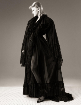
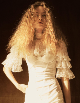
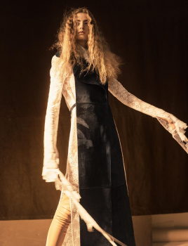
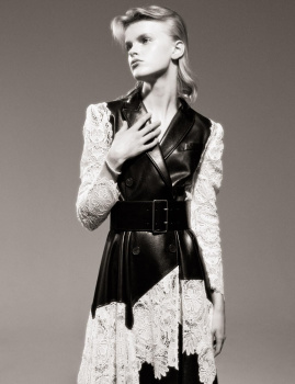
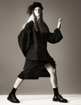
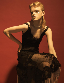
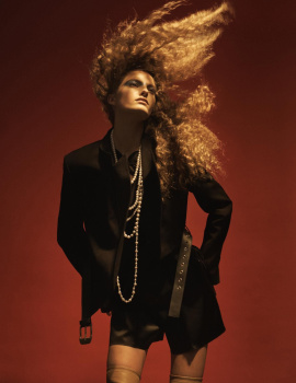
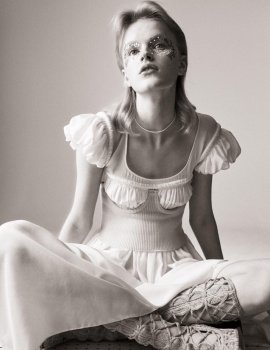
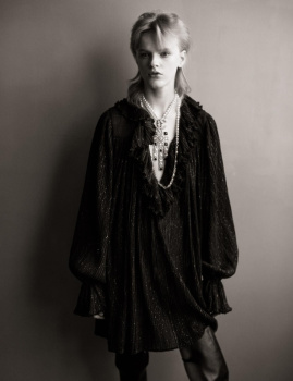
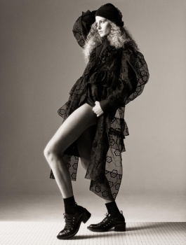
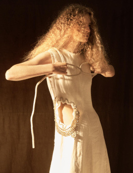
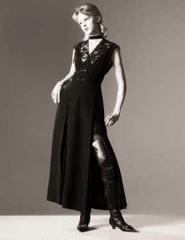
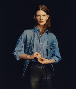
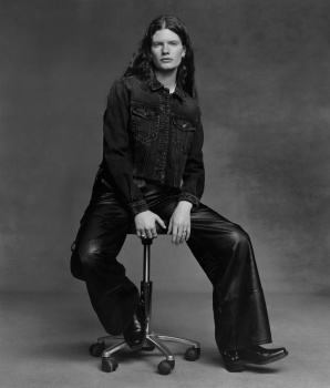
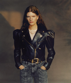
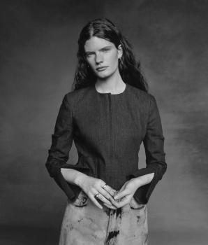
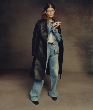
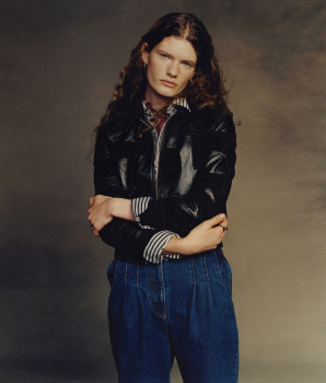
Thank you for the photos, @ZorkaROMANTIC NOTIONS
Photographer: Josh Olins
Stylist: Ludivine Poiblanc
Hair: Didier Malige
Make-Up: Diane Kendal
Models: Abby Champion & Felice Noordhoff
WSJ Magazine Digital Edition
But the first model is Hannah Motler, not Abby Champion.
littlekiki
Well-Known Member
- Joined
- Aug 14, 2010
- Messages
- 2,827
- Reaction score
- 401
Hannah Motler giving me all the Hannah Holman vibes.
Similar Threads
- Replies
- 8
- Views
- 4K
- Replies
- 1
- Views
- 2K
- Replies
- 19
- Views
- 6K
- Replies
- 9
- Views
- 3K
Users who are viewing this thread
Total: 2 (members: 0, guests: 2)


