Dolce & Gabbana (cont.)


* scanned by me
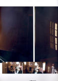
I find this editorial to be quite boring as all other editorials in this issue have beautiful colors I don't like the idea of making everything "blurry".
I will scan other editorials now.


* scanned by me
I find this editorial to be quite boring as all other editorials in this issue have beautiful colors
I don't like the idea of making everything "blurry".I will scan other editorials now.


 Fantastic! Gorgeous! Amazing!


 anyway maybe it's just me but it bugs me when I can't see the clothes or the model clearly lol it's ok if it's only a few pages but the whole ed...
