You are using an out of date browser. It may not display this or other websites correctly.
You should upgrade or use an alternative browser.
You should upgrade or use an alternative browser.
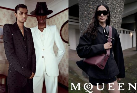
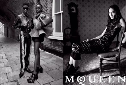
Alexander McQueen F/W 2024.25 by Glen Luchford
- Thread starter vogue28
- Start date
it looks better than the show but too much young vibes.
I like the photography style too, but yes, I'm still underwhelmed. I want depth, drama, impeccable tailoring, great modelling, and, most of all, great clothes.
It's a level up so let's hope they invest on the next show (materials, production, models and ideas-wise) to match.
I like the photography style too, but yes, I'm still underwhelmed. I want depth, drama, impeccable tailoring, great modelling, and, most of all, great clothes.
It's a level up so let's hope they invest on the next show (materials, production, models and ideas-wise) to match.
Cocteau Stone
Well-Known Member
- Joined
- Feb 12, 2022
- Messages
- 2,011
- Reaction score
- 5,026
The logo is strange. Seeing it so big and singular is just out of balance, plus it makes the images look all the more like a random advertorial as opposed to a full campaign.
The other issue is having it without the Alexander has McGirr's work look even more like diffusion McQ, or even a diffusion of the diffusion. It's just so painfully "young" and forced it's hard to find anything enjoyable about it.
The other issue is having it without the Alexander has McGirr's work look even more like diffusion McQ, or even a diffusion of the diffusion. It's just so painfully "young" and forced it's hard to find anything enjoyable about it.
chrisand489
Well-Known Member
- Joined
- Oct 23, 2022
- Messages
- 1,034
- Reaction score
- 2,048
Similar Threads
- Replies
- 6
- Views
- 3K
- Replies
- 12
- Views
- 4K
- Replies
- 36
- Views
- 14K
- Replies
- 3
- Views
- 3K
Users who are viewing this thread
Total: 1 (members: 0, guests: 1)


