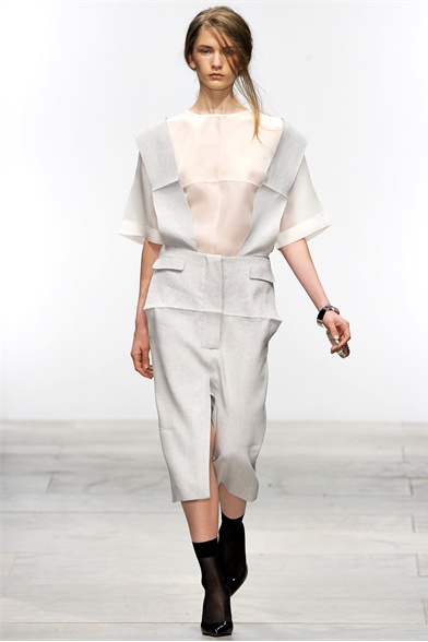
Ann-Sofie Back Atelje S/S 2012 London

Joined
Oct 13, 2009
Messages
514
Reaction score
0
Vogue.it 8 of 24

00090h.jpg


00080h.jpg


00060h.jpg


00040h.jpg


After two seasons being inspired by p*rn and cars and creating a '**** machine' for her Arnhem Mode Biennale exhibit (basically a man-sized glass lipstick-shaped water chamber with a dress suspended inside), Ann-Sofie has turned to God. Well you would wouldn't you. Oh, and, she says - spaghetti and delusions.

Those last two might be red herrings designed to throw us off the scent. But you can see the common ground - comfort food, comforting beliefs about ourselves and/or the Universe.

Hence those folds we see ironed into the apron of what we might describe as a starchy japonisme dirndl in a butcher stripe with the sleeves sloughed off, edges left raw (above) - they're inspired by the tablecloth of the last supper. No, really, they are.

I'm expecting that the spaghetti in question comes not only with sauce but with meatballs too. Ann-Sofie being from Sweden. Where I think they like meatballs. Although that visit to Ikea was a long time ago. And that damn table I got there collapsed in on itself a long time ago as well.

And if you've not seen the previous collections I mentioned. That thing you're thinking - it won't be that.
 
i have to ask...
what is the 'atelje' bit in the title pls?...
 
^Pretty sure that what's the line is called. I think one of her lines is called 'Back', the other one 'Atelje' (which is most likely a wordplay of 'atelier'?).


You sure posted the most interesting looks of the collection. It looks really cool from those pictures but the rest of the collection is quite boring. I really don't like the skinny belts.
I adore the looks in the 2nd and the 4th picture in post #1 but wish the 4th one was in a different color (maybe more of an anthracite grey) or pattern.
 
This collection isn't really my style but the first piece is gorgeous.
 
I really like this, it looks so grunge and chic at the same time.
 
yeah,ann-sofie kind of re-invented her aesthete a couple years ago after a bit of a break from designing and she sort of derived this concept label. still very much with her unconventional leanings in terms of ideas but the design is focused on specifically, constructivism.

i love it! i thought last season would be hard to top but i'm really taken with her direction here. the apron shapes remind me of something you'd probably see in a convent or a WWI british hospital,which probably speaks to the synopsis you posted about tentacl.
 
I like all the strapiness and untied ties. It is like minimalism coming undone.
 
This is awesome stuff. Love each piece, except for maybe the stripes one.

Favourite has to be the very first one, loose top and loose trousers make an excellent combination.
 
yeah,ann-sofie kind of re-invented her aesthete a couple years ago after a bit of a break from designing and she sort of derived this concept label. still very much with her unconventional leanings in terms of ideas but the design is focused on specifically, constructivism.

i love it! i thought last season would be hard to top but i'm really taken with her direction here. the apron shapes remind me of something you'd probably see in a convent or a WWI british hospital,which probably speaks to the synopsis you posted about tentacl.

Interesting eye Scott. Yes, I see what you're seeing with the sterility of habits or WW1 nurse uniforms. I feel a sort of violence, butchery, in the way the shoulders or flanks have been seemingly ripped away.

There was a bit more Swedish I wanted to google as another reference apparently was the Scandanavian concept of jantelagen. This is an imagined set of ten commandments, a literary codifying of unwritten 'law' that people must submit to control by their 'superiors'. The self-deprecating servitude of nuns or nurses would sit there well. Jantelagen was influenced by a Swedish nationalist (writing just before WW1) who challenged the Swedish people not to be so meek. Also related to Tall Poppy Syndrome.

You could think perhaps that Ann-Sofie is feeling a little like she should step out into the limelight more (hence stepping it up from a presentation). Imho she certainly deserves the plaudits and a higher profile.

I think I see some humorous deconstructive dialogue with some of last season's motifs from more high profile designers. The cross shapes - Pugh; the fluid tentrails speaking to Ackermann's languid fluidiity; the squared off shapes formed by the 'tablecloth' creases and the ripping away a kind of diy pastiche of the proposals @ Sander etc for the boxy mid-century couture silhouettes which, yes, comically, can make the wearer look like a piece of furniture. So why not literally make and mend garments by starching them to a table edge for that boxy cool.

That Swedish nationalist Gustav Sundaberg was apparently motivational for the democratic breakthrough movement in Sweden. Again, an 'industry' parallel that perhaps sometimes we take the 'commandments' of elite editors too much as gospel, that we submit to their influence all too readily. Why do we think such as Pugh, Ackermann or Raf Simons 'better' than Ann-Sofie. Isn't it just that we've bought into their elevation by the big editors (or their puppet-masters) without really too much questioning.

We see the bowing down to those wiser than we here on this site, end of season when top tens are formed. Many trot out the same old names, the houses Conde Nast routinely list. It's true that often we like what we know. And weight of advertising spend makes us feel we 'know' particular brands more, that they carry more weight and significance. I've done it myself and some seasons gotten so confused that I've not joined in with top ten threads. Or so late that nobody much would have seen.

Yes, I will post the ten commandments of Jantelagen (the relevant 'us' here being those that control the industry and our self-perceptions) -

The ten rules state:
1.Don't think you're anything special.
2.Don't think you're as good as us.
3.Don't think you're smarter than us.
4.Don't convince yourself that you're better than us.
5.Don't think you know more than us.
6.Don't think you are more important than us.
7.Don't think you are good at anything.
8.Don't laugh at us.
9.Don't think anyone cares about you.
10.Don't think you can teach us anything.
 
minimalist and sophisticated at the same time. This is not extraordinary, but this is a nice collection
 
interesting concepts, love what was posted here. but i fear it might not be enough to compete with other labels.
 

Users who are viewing this thread

New Posts

Forum Statistics

Threads
212,479
Messages
15,186,707
Members
86,362
Latest member
elscan
Back
Top
monitoring_string = "058526dd2635cb6818386bfd373b82a4"
<-- Admiral -->