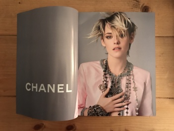
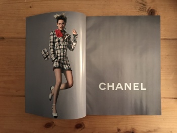
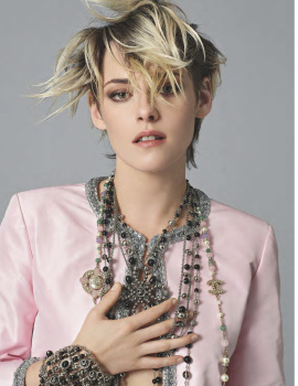
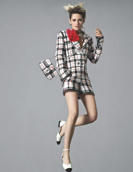
Chanel S/S 2020 : Kristen Stewart by Jean-Baptiste Mondino

Can't say that I was immediately jumping for joy over the sight of this, especially following Karim Sadli's immaculate and modern offerings for Chanel's recent advertising campaigns. This, although completely unexpected, feels immensely dated already, no?

However, I may come to appreciate the change up in both casting and photographer, because another white studio backdrop featuring a multi-girl casting and photographed by Sadli may have felt redundant. Time will tell as more images start to roll out, I guess.
 
I'm shocked they still ran this after Charlies Angels bombed at the box office. If this photo is indictive of the rest of the campaign then it should have been left on the cutting room floor. As for the actual product, it looks stiff and that tacky bubble gum pink color isn't doing it any favors. This is Chanel for Kaiser's sake! Have some imagination!
 
She is good for Chanel. At least, she had the attitude for Karl’s Chanel.
While I think she is much more of a mid 00’s Chanel girl like Cat Power or Selma Blair, The edge of Karl’s Chanel worked for her...

This sugary and conservative tragedy that is going on is not for her and she is not great enough as an actress to really embody this pink suit.
This is for the youngest daughter of Princess Caroline, not a grown woman.

I feel like this is going to be like all those movie stars at LV. They complete add nothing to the brand. The clothes don't match the attitude. They are just there for the sake of it. At least you can tell Kristen has immense respect and admiration for Karl. The way she wears Chanel and her personal style (Loubs or Converse) really make me I Karl's designs even more. Now they completely underutilizes her and make her just a corporate ambassador for a corporate collection.
 
This campaign is just awful. I just hope the fashion industry could just hire actual fashion models to make their campaigns rather than hiring these inappropriate celebrities and social media girls. They have got their movies, shows and social media to expose, which is enough. We don’t have to see them in fashion areas, as they don’t display fashion at all no matter how expensive the clothes they wear.
 
We don’t have to see them in fashion areas, as they don’t display fashion at all no matter how expensive the clothes they wear.

While it's true that many celebrities should be nowhere near fashion campaigns, I'd argue that Kristen is one of the few actresses in Hollywood with real personal style right now that is undeniably hers. So many are neutered by their stylists' choices or random paid advertisements while Kristen seems to make nearly everything work for her, be it a Chanel gown which she'd often wear with a pair of Chucks or a fabulous Thom Browne suit. I think it's very refreshing.
 
New Campaign Images:


PHOTOS TAKEN BY VOGUE28
FROM UK VOGUE FEBRUARY 2020
 
That first pic above... No comment. Sad to see how the campaign turned out.
 
Best part so far seems the grey wall and layout. Everything else can be binned.
 
Very stale and boring, nothing exciting is happening in this campaign so far. This is a prime example of the talents models bring to a Shoot, any of the Chanel girls, Vittoria, Adut, Rianne, etc. would’ve made this campaign way more intriguing
 
I like head shot photo she looks super cool but not really convince with total look and jumping doesn't really help either.
 

UK Harper's Bazaar Digital Edition
 

British Vogue Digital Edition
 
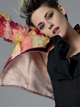
That shot with the visible jacket lining in Harper's Bazaar is so embarrassing. :shock:
 
Not sure about that particular image or the hair but I will wait for more. I think she's perfect for the brand at least a break from the 'models of the moment' brigade.
 
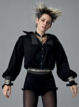
Her hair is the only element that exudes some sort of energy and life. What was the point of having her jump?

Plus the clothes look awful. The pink suit looks like tacky, shiny polyester. And the lining of the jacket taking up the biggest space in this photo? I thought that was one of the biggest no-nos when you photograph clothes.

Virginie is "Breaking the rules" and "Injecting youth into the brand". Get the Popcorn kiddies, this is going to be one ugly mess in the year(s) to come. I can't wait for the conclusion when the heat turns up and she walks. Or better yet, they put this freak show to rest and fire her ***!
 

Users who are viewing this thread

New Posts

Forum Statistics

Threads
212,593
Messages
15,190,330
Members
86,494
Latest member
Andrex
Back
Top
monitoring_string = "058526dd2635cb6818386bfd373b82a4"
<-- Admiral -->