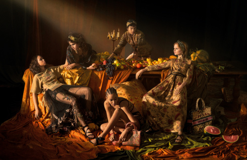
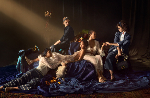
Photographer: Elina Kechicheva
Art Director: Fabien Baron
Hair: Guido
Makeup: Peter Phillips
Models: Levi Achthoven, Maryel Uchida, Sculy Mejia, Judith Frament and Holly Fischer
LOL, you'd think they'd be able to at least add something unique to such an overplayed concept. Not very impressive, and the composition is quite bad imo.
They are making an attempt at polishing up MGC’s insipid design with good campaigns now. Not the most original idea but the photography is quite exquisite.
Honestly I am in. It is far away from the very boring essence of MGC. I love Caravaggio and will always be happy to see (well executed) images from his work. It is also quite sapphic which is amusing regarding how conservative Dior is lately.
Now this looks like a REAL campaign, not a damn lookbook trying to pass as one (talking to you Vuitton, Max Mara, etc )...Lovw it, can’t wait to see more.
On the Caravaggio/bright lighting inspiration: the funny thing is, that Caravaggio, despite being the brilliant painter, was also quite the a**hole. And his work is closer connected to pain and torture, than beauty and aesthetic.
I take it over any 2021 Raf/Miuccia thing, Pierpaolo's Valentino campaign or even whatever she did before at Dior.
It's good and for her standards it's exceptional.
It's funny, that the photos look amazing on first viewing but once you get into the details, as like one would when you look into a painting, you can tell the clothes are mediocre and it's an attempt to hide the mediocrity.
This site uses cookies to help personalise content, tailor your experience and to keep you logged in if you register.
By continuing to use this site, you are consenting to our use of cookies.


 )...Lovw it, can’t wait to see more.
 And his work is closer connected to pain and torture, than beauty and aesthetic.