You are using an out of date browser. It may not display this or other websites correctly.
You should upgrade or use an alternative browser.
You should upgrade or use an alternative browser.
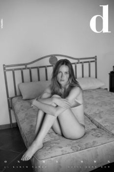
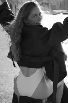
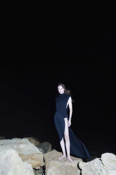
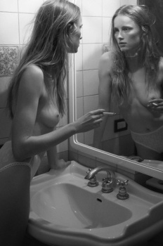
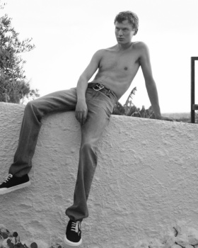
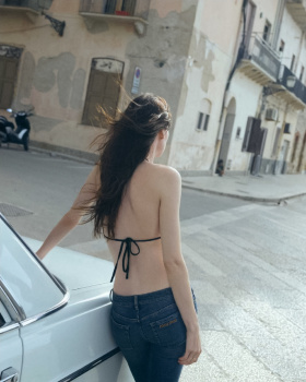
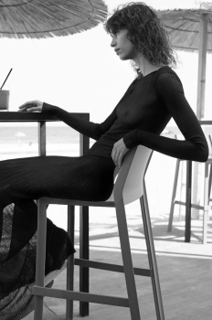
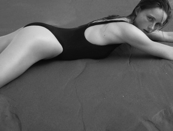
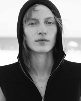
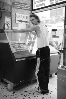
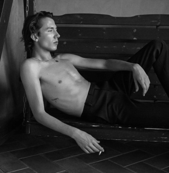
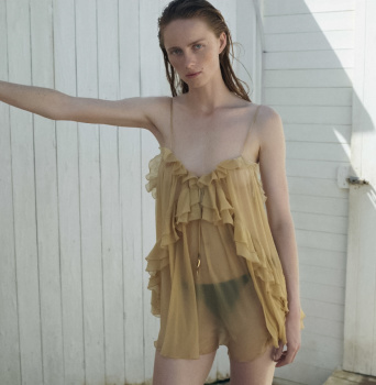
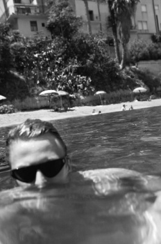
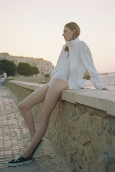
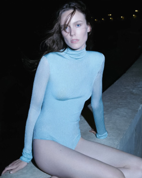
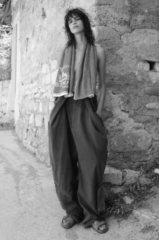
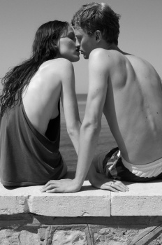
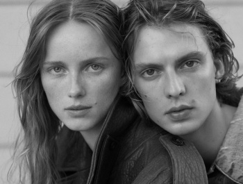
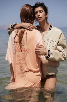
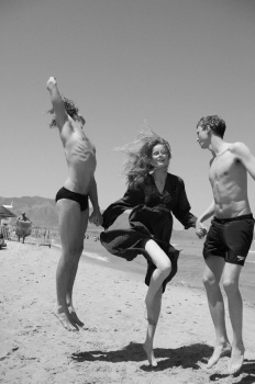
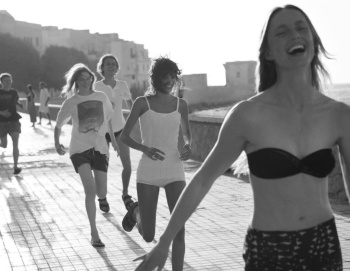
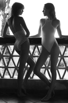
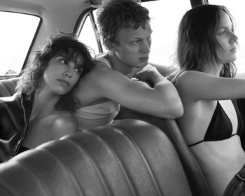
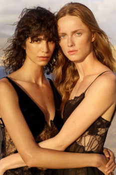
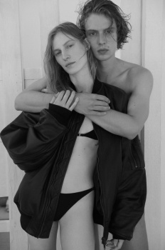
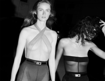
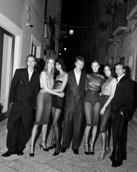
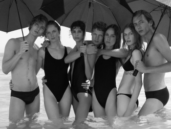
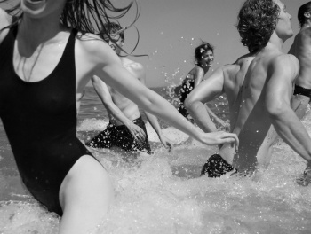
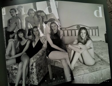
D la Repubblica ‘The Big D’ Volume #4 2024 by Karim Sadli
- Thread starter vogue28
- Start date
EDEN21
Well-Known Member
- Joined
- Apr 13, 2021
- Messages
- 198
- Reaction score
- 515
Thank you!! It's so hypocritical how people lament the death of the supermodel and how we have this revolving door of 2-3 season models, but then when we do get models who work consistently for years, people start complaining that they get too much work?!skinny besties unite ✨
Both covers are quite nice, I have no doubt that Sadli did a fantastic job on the editorial and I'm looking forward to it. However, I'll never understand the incessant need so many people on tFS have to complain about continuous exposure that top models receive each generation. Where would they be if they got discarded every year or two? There are so many new faces booking magazines and campaigns, and yet it's never enough for people to stop being annoying about the sight of experienced models who still have plenty to give. I'll never get tired of seeing Rianne everywhere, because the girl is excellent at what she does - unlike so many of her more forgettable peers. She stands apart and for that, she deserves to stay consistently booked. Kiki!! And my favourite STEM girlie Julia... y'all need to get over it.
Granted, I like some of these "top models" better than others, but it's still a fact that their longevity sets a good precedent for the modeling industry moving forward
svpernova
Well-Known Member
- Joined
- Sep 26, 2024
- Messages
- 315
- Reaction score
- 645
I have a love-hate relationship with the cover. On one hand, it feels like it was shot by an amateur, but on the other, I love the black-and-white aesthetic and its natural, spontaneous vibe.
It's wild to see people complaining about the cast, labeling it as "white mediocrity." Like it or not, Mica is an industry supermodel and an icon recognized by Models.com. She has accomplished the big four and is a muse for brands like Versace. Rianne is also a top model, and both women have been significant figures in the industry for over a decade. The same goes for Kiki. While I wouldn’t say these models are the absolute best of the past ten years, they certainly represent the top tier of the industry.
It's wild to see people complaining about the cast, labeling it as "white mediocrity." Like it or not, Mica is an industry supermodel and an icon recognized by Models.com. She has accomplished the big four and is a muse for brands like Versace. Rianne is also a top model, and both women have been significant figures in the industry for over a decade. The same goes for Kiki. While I wouldn’t say these models are the absolute best of the past ten years, they certainly represent the top tier of the industry.
D
Deleted member 1957
Guest
I think with the supermodels and the ones that followed for the next two or so generations, there was always range. You can have 10 Amber Valetta or Linda Evangelista campaigns in a magazine and literally have 10 different models. Creatives took risks and made models beautiful, ugly, evil, sexy, athletic, old etc. The blame doesn't even lie with the models, its the industry players that have gotten more and more lazy and the market that demands for only mid.Thank you!! It's so hypocritical how people lament the death of the supermodel
Mr Yayo
Well-Known Member
- Joined
- Mar 3, 2021
- Messages
- 345
- Reaction score
- 415
Rianne and Mica? MaybeRacist attitude? These are white people who, despite being mediocre at best, have been given a pass for a decade.
Kiki and Julia? No way in hell they are mediocre!
Stop generalising
Zorka
Well-Known Member
- Joined
- Jan 29, 2014
- Messages
- 18,902
- Reaction score
- 21,661
helmutnotdead
Well-Known Member
- Joined
- Jan 29, 2018
- Messages
- 2,047
- Reaction score
- 5,598
this can’t be the whole story, right? I’ve seen more pictures on Instagram
Zorka
Well-Known Member
- Joined
- Jan 29, 2014
- Messages
- 18,902
- Reaction score
- 21,661
this can’t be the whole story, right? I’ve seen more pictures on Instagram
Photography and especially fashion wise, this FIRST PART is rather underwhelming IMO; I sincerely hope the second one would be able to offer some redeeming quality.
Xone
Well-Known Member
- Joined
- Sep 1, 2004
- Messages
- 5,430
- Reaction score
- 5,059
I've got it today and its nice but that's it...both stories could have been a big store, it was unnecessary to split it in two cause it's forced.
Still thinking about this is a leftover from summer rather than a fall story...There are a couple of color shots in the second story but this is love from photographer and stylist...a better edit mixing both stories would have make it stronger...
And about the casting,it's strong...but kinda lazy as a result. Missed opportunity to create something special, it has potential but it falls flat a bit. Even if they had made one story in color and the other in bw with a good edit could have saved it a little bit...
GivenchyAddict
Well-Known Member
- Joined
- Feb 5, 2012
- Messages
- 2,546
- Reaction score
- 7,069
But… you told us to stop whining my dear . 😂Photography and especially fashion wise, this FIRST PART is rather underwhelming IMO; I sincerely hope the second one would be able to offer some redeeming quality.
vogue22
Well-Known Member
- Joined
- Jun 20, 2023
- Messages
- 700
- Reaction score
- 1,599
I would take Rianne over boring Julia and Kiki anytime, don't know about that other girl tho.Rianne and Mica? Maybe
Kiki and Julia? No way in hell they are mediocre!
Stop generalising
Mr Yayo
Well-Known Member
- Joined
- Mar 3, 2021
- Messages
- 345
- Reaction score
- 415
Imagine the French harpers bazaar story in Atrani with Kendall, Garcia, etc but with this castingI've got it today and its nice but that's it...both stories could have been a big store, it was unnecessary to split it in two cause it's forced.
Still thinking about this is a leftover from summer rather than a fall story...There are a couple of color shots in the second story but this is love from photographer and stylist...a better edit mixing both stories would have make it stronger...
And about the casting,it's strong...but kinda lazy as a result. Missed opportunity to create something special, it has potential but it falls flat a bit. Even if they had made one story in color and the other in bw with a good edit could have saved it a little bit...
D
Deleted member 1957
Guest
Editorial literally looks like some docu style photography of some backpackers moving around Europe. Not sure why they went with this concept. It's not even about the models, we have seen these models deliver better. Such a concept required some acting to make it believeable.
Zorka
Well-Known Member
- Joined
- Jan 29, 2014
- Messages
- 18,902
- Reaction score
- 21,661
Deleted member 116957
New/Inactive Member
- Joined
- Apr 4, 2009
- Messages
- 13,752
- Reaction score
- 15,826
You can’t compare this to Bruce Weber, even at his worst, it has none of the energy or warmth.
Alien Sex Friend
Well-Known Member
- Joined
- Oct 26, 2005
- Messages
- 8,596
- Reaction score
- 1,455
However everyone is trying to imitate his style nowadays: Karim Sadli started it in December 23 with big editorial in bazaar France with Loli, and continue to do it today with this story, mclellan always copied Weber style, Sean Thomas built his whole career on imitating Weber’s themes, light, casting, composition, post-production and even layout. Plus I can’t count the amount of random stories like M le Monde big season openers is September 23 and not long ago shot in Netherlands, J crew fall ‘24 campaign once they started to collaborate with Franck Durand. Photographers are different but the request on Weber aesthetic doesn’t seem to decrease.You can’t compare this to Bruce Weber, even at his worst, it has none of the energy or warmth.
Xone
Well-Known Member
- Joined
- Sep 1, 2004
- Messages
- 5,430
- Reaction score
- 5,059
And still he is almost banned from the industry...he is just doing some projects here and there....anyone have an update about his case?However everyone is trying to imitate his style nowadays: Karim Sadli started it in December 23 with big editorial in bazaar France with Loli, and continue to do it today with this story, mclellan always copied Weber style, Sean Thomas built his whole career on imitating Weber’s themes, light, casting, composition, post-production and even layout. Plus I can’t count the amount of random stories like M le Monde big season openers is September 23 and not long ago shot in Netherlands, J crew fall ‘24 campaign once they started to collaborate with Franck Durand. Photographers are different but the request on Weber aesthetic doesn’t seem to decrease.
Going back to the editorials...my biggest problem is the styling...underwhelming and lazy...Mikael Jansson and his team would have been perfect for this....
Similar Threads
- Replies
- 29
- Views
- 8K
- Replies
- 5
- Views
- 1K
- Replies
- 33
- Views
- 10K
- Replies
- 25
- Views
- 5K
Users who are viewing this thread
Total: 1 (members: 0, guests: 1)
New Posts
-
-
-
-
-
Jonathan Anderson - Designer, Creative Director of JW Anderson & Christian Dior (12 Viewers)
- Latest: yslforever

