Dries Van Noten F/W 2022.23 Paris

Great collection, don't know why he doesn't show on runways anymore :(
 
I don't know why another digital show, at this point.
There is so much (more than happens for other designers, less preoccupied with fabrics, textures, prints, subtle colour plays) that gets lost in Dries in digital format.
It definitely is an improvement on the last menswear collection, but we are still way far from the standard Dries got us used to.
 
This is decent, but it's still Dries on autopilot. It's still lacking his sensual romanticism and his colors palette in this collection are very stale and the prints are just non-event.

Again just like the past Dries presentation, it's very pretentious. I don't know why he keep insisting on those "artsy" shots in his Lookbook. They are very distracting for the viewers to see the details of the clothes. You can get creative with your Lookbook whatsoever, but please remember to focus on the clothes first.
 
It's very conventionally pretty but I need more from him.
 
I wasn´t expecting to see variations of Charles James famous padded jacket at Van Noten...they totally look out of place here.

And look 42...that dress screams Prada!
 
I remember when I used to be excited about Dries. Ever since selling, the brand is extremely depressing and feels very lost.
 
Since the pandemic, this has been his best showing. After his last menswear colleciton, I thought I would be content to never see another DVN collection again.

@donyan it feels Italian because that was the inpisration for the collection. The showing was inpart inspired by the Italian photographer Carlo Mollino.

I would love to spend hours combing through each of these pieces individually. His prints were great. That one dalmation spotted coat was a standout, and I loved his use of contrasting as it pertains to color. Only Dries can make gold and pink work so well together.

It appears he is exploring a different form of tailoring these days with emphasis placed on the shoulder and the wide, pooling trousers. A very solid showing that stands out for its engaged boldness and tactility. I hope to see these clothes in editorials very soon.
 
I wasn´t expecting to see variations of Charles James's famous padded jacket at Van Noten...they totally look out of place here.

And look 42...that dress screams Prada!

LOL I laughed a little bit seeing James’s coat recreated for this collection. Like Dries, we know your talent, of course you could recreate that coat, why do it here? Totally unnecessary but it did make me laugh.
 
There are many fabulous coats, and I particularly like the cape coat slip dress with floral lining and the white Chester coat styled with a floral turtle collar sweater and red gloves.
 
Everytime someone does the Charles James quote on quote copy, it just looks like Claude Montana. It’s funny because they always include that coat on 80’s inspired collections…

I like a lot of things I see in this collection. But the presentation is quite frustrating and annoying. We don’t need artsy lookbooks really. Let us see the clothes…

When I think about the time spend for those photos, he could have done a little presentation at his Parisian store.
 
There's definitely some great seperates in here, a lot of which I can see both new & established Dries customers ready to buy, but what leaves me feeling...meh...is how disjointed this looks. You got that white-ish rococco-print skirt + pants; the animal prints; those pink + yellow prints; the quilted pieces; the yellow trench w/ wrinkled fabric, etc etc etc. I wish he would've taken any one of those looks and totally ran with it. But who knows what's going on behind the scenes there?

Regardless, his eye for textiles is still unmatched, so that alone makes this a stand-out for me.
 
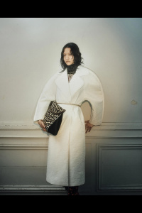
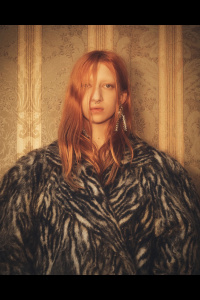
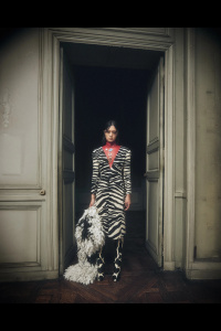
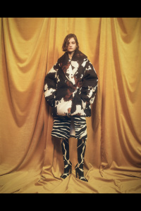
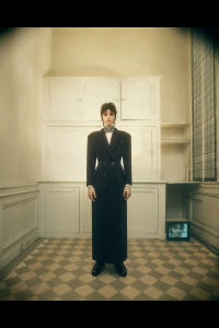
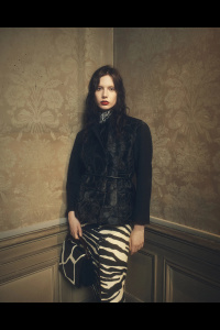
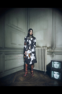
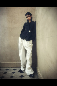
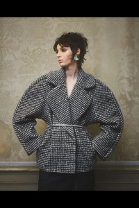
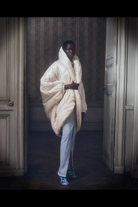
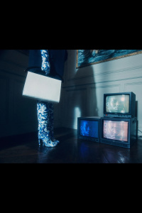
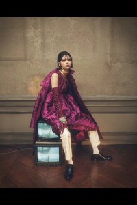
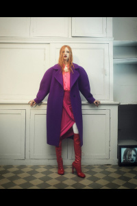
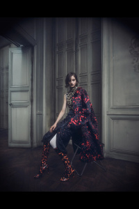
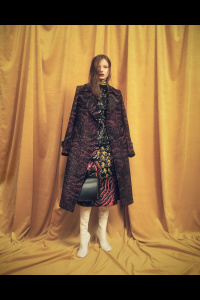
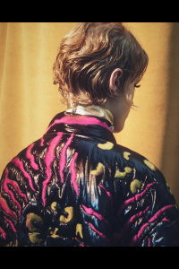
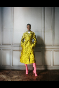
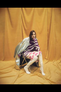
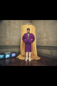
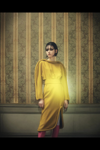
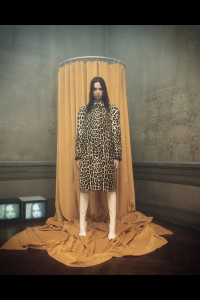
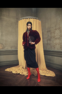
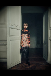
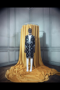
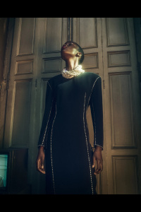
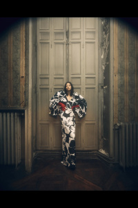
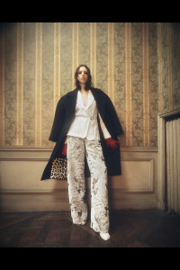
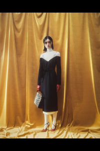
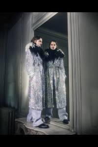
:sigh:… The visuals don’t look nor feel like heartfelt Dries. It’s more like a Dazed/i-D version of Dries.

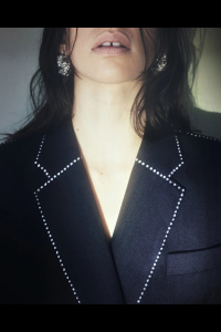
Dries mainline has fully become a diffusion line— complete with the production and casting budget-cut. These grumpy, puffy-face, mousey-looking kidz playing dressup are so contrary to the timeless image of the effortless grace of the Dries gentlewomen. Admittedly the products are better than the last few offerings since the rebranding, though the overall look would have greatly improved had they been shown on old wooden mannequins, or even just hangers. The casting does the brand absolutely no favours. So so so sick of brands/publications/campaigns casting grumpy plain-Jane kidz and styling them to resemble a tightly-wrapped burrito. These children aren’t going to buy Dries… Maybe that’s why the current YSL succeeded so wildly despite the fashions being so much on the basic side: Grown-up, womanly and unapologetically decadent (…even if it were all faux-fur…). The illusion was a reminder of what high fashion standards will always come back to: Glamour, glamour, glamour. And once not too long ago, Dries’ version of glamour was so unique and original.
 

Users who are viewing this thread

Forum Statistics

Threads
210,771
Messages
15,127,640
Members
84,505
Latest member
theaucourant
Back
Top
monitoring_string = "058526dd2635cb6818386bfd373b82a4"
<-- Admiral -->