You are using an out of date browser. It may not display this or other websites correctly.
You should upgrade or use an alternative browser.
You should upgrade or use an alternative browser.
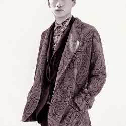
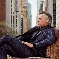
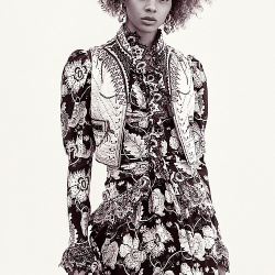
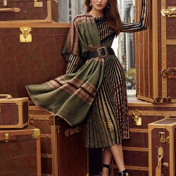
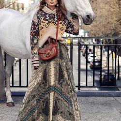
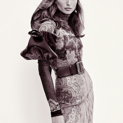
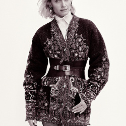
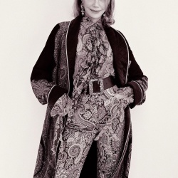
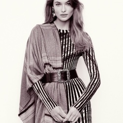
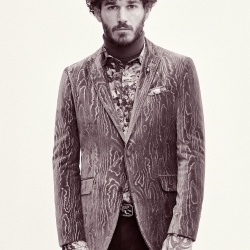
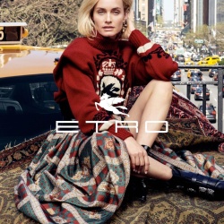
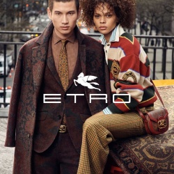
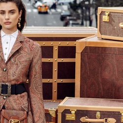
Etro F/W 2019.20 by Cass Bird
- Thread starter Benn98
- Start date
GivenchyHomme
Well-Known Member
- Joined
- Sep 3, 2009
- Messages
- 5,485
- Reaction score
- 5,394
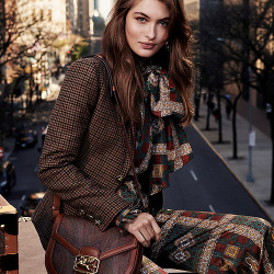
I hate this. It looks like a seasonal advertorial for an American department store. I expect more from an Italian brand. Also, what did they do to poor Grace? That is a girl that does not need retouching!
bluebanter
Well-Known Member
- Joined
- Feb 1, 2018
- Messages
- 1,132
- Reaction score
- 754
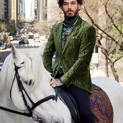
I do rather like the shot of Kohei and Hiandra
Benn98
Well-Known Member
- Joined
- Aug 6, 2014
- Messages
- 42,582
- Reaction score
- 20,782
Wow, it couldn't look more Ralph Lauren if it tried! I've always associated Etro's campaigns with a visual fluidity. Flowing paisley dresses layered on a paisley set, guys in motion in a street scene. Maybe it's the static-ness that delves this campaign so much into American 1% inspiration.
happytrail
Active Member
- Joined
- Oct 11, 2007
- Messages
- 1,989
- Reaction score
- 16
my goodness taylor hill is the most boring white girl i have ever seen.
- Joined
- Jan 9, 2008
- Messages
- 36,928
- Reaction score
- 24,873
Never been a one for Etro, couldn't even tell you what last season's campaign consisted of (even in return for the upcoming lottery numbers) but I do like this. Cass Bird isn't a fave of mine either but she's impressing me here, love the New York setting and the styling. Also like the location shots teamed with the images against the white backdrop.
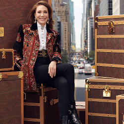
And while it's so wonderful to see Marisa Berenson, it's Grace Elizabeth who completely steals the show for me here. A real... standout!
And while it's so wonderful to see Marisa Berenson, it's Grace Elizabeth who completely steals the show for me here. A real... standout!
I like it. Beautiful people, beautiful clothes, beautiful location, beautiful horse, beautiful photos. No complaints.
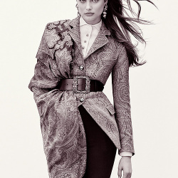
Andrea is the clear standout. She's the star here. Glad to see her having a bit of a resurrection. She deserves a bigger career.
Andrea is the clear standout. She's the star here. Glad to see her having a bit of a resurrection. She deserves a bigger career.
Similar Threads
- Replies
- 27
- Views
- 11K
Users who are viewing this thread
Total: 1 (members: 0, guests: 1)

