After having another look at this collection, I decided I liked it.
It's not Etro's best and it's not De Vincenzo's n'est either, but after reading on it, it has its appeal. The collection was rushed like most debut collections under LVMH. De Vincenzo was only given 1 month to design the collection in order to have the samples ready for Milan Fashion Week and it shows.
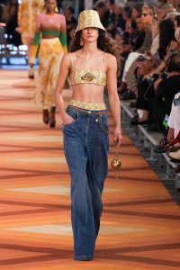
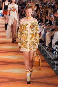
The opening look was nice on the eyes. I also liked the monochrome sculptural looks (12-15) and look 30 was really fresh and modern. The presence of fruit on clothing (20-22) and as several bag chains. showed De Vincenzo's humourous edge that I enjoyed in his eponymous work. The ombre went both ways with the more natural tones working better overall. The lack of much needed drama in the sheer looks towards the end (40, 42+44) led them to looking derivative of MGC's work at Dior (something no-one needs). The shirting was lifeless, heavy looking and could've done with a more flou application. The ankle platform boots and socks were also too heavy for spring. Platform block-heeled sandals would've done a better job.
The overall collection was good, but it lacked the drama and eccentricity expected from De Vincenzo and the romance from Etro. The promotional imagery (and the orange floor that I stared at for 15 mins as I gave myself sleep deprivation to watch the show live) suggested a push towards a more abstract 60s mod impressionist interpretation of Etro. Hopefully we get something like that next season.
Or you could simply copy Dries Van Noten's pre-Puig collections. That works too.


 Jonathan Anderson - Designer, Creative Director of JW Anderson & Christian Dior (17 Viewers)