You are using an out of date browser. It may not display this or other websites correctly.
You should upgrade or use an alternative browser.
You should upgrade or use an alternative browser.
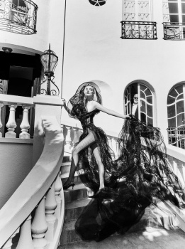
Flaunt Magazine June 2024 : Anya Taylor-Joy by Ellen von Unwerth
- Thread starter vogue28
- Start date
KoV
The Fault in Our Czars
- Joined
- Sep 17, 2009
- Messages
- 6,390
- Reaction score
- 9,888
facetuned to the gods!
I have a soft spot for EvU, she consistently tries to sell conventional glamour and sex appeal. Unfortunately for us all, the results (especially in recent years) rarely deliver on that promise.
I have a soft spot for EvU, she consistently tries to sell conventional glamour and sex appeal. Unfortunately for us all, the results (especially in recent years) rarely deliver on that promise.
D
Deleted member 1957
Guest
Curious to see the editorial before I make a conclusion but the cover seems like it was lit a tad too much even by EVU standards and I always love her work.
Deleted member 116957
New/Inactive Member
- Joined
- Apr 4, 2009
- Messages
- 13,774
- Reaction score
- 15,808
I wonder if she'll become more interesting when she's older and has had more life experience.
tigerrouge
Well-Known Member
- Joined
- Feb 25, 2005
- Messages
- 18,876
- Reaction score
- 9,684
Or she'll drop out of acting to pursue something more personally satisfying, and whatever passes for social media in ten years' time will be spammed with "vintage" images of Anya as hair and body goals.
ezacessline
Active Member
- Joined
- Oct 6, 2015
- Messages
- 200
- Reaction score
- 40
Let her scalp restingTHE ROOTS.

- Joined
- Jan 9, 2008
- Messages
- 36,850
- Reaction score
- 24,578
Not an Anya Taylor-Joy fan or an Ellen von Unwerth fan for that matter but I'm a fan of this. I love the whole old-Hollywood screen siren vibe and how just direct and downright gorgeous the cover image is. There's no denying Anya excels at this type of shoot. That black and white closeup with the black mesh is GORGEOUS! 

Similar Threads
- Replies
- 8
- Views
- 5K
- Replies
- 6
- Views
- 3K
- Replies
- 14
- Views
- 5K
- Replies
- 5
- Views
- 3K
Users who are viewing this thread
Total: 1 (members: 0, guests: 1)

