-
Share with us... Your Best & Worst Collections of Haute Couture S/S 2025
You are using an out of date browser. It may not display this or other websites correctly.
You should upgrade or use an alternative browser.
You should upgrade or use an alternative browser.
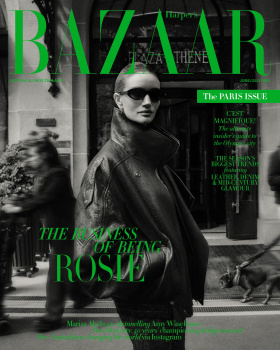
Harper’s Bazaar Australia & New Zealand June/July 2024 : Rosie Huntington-Whiteley by Darren McDonald
- Thread starter vogue28
- Start date
D
Deleted member 1957
Guest
I like how mysterious it is plus the movement at the back and the green text but the lighting on her face is somewhat off.
tigerrouge
don't look down
- Joined
- Feb 25, 2005
- Messages
- 18,427
- Reaction score
- 8,419
Coverlines on a Bazaar cover that can barely be read... the ghosts of former art directors will be gathering in the shadows with malevolent intent.
Of all titles, Bazaar is the one where you take pride with your typography. Legibility is the starting point.
Of all titles, Bazaar is the one where you take pride with your typography. Legibility is the starting point.
crmsn
Well-Known Member
- Joined
- Jun 6, 2018
- Messages
- 2,604
- Reaction score
- 7,905
I like how candid and raw this cover feels like. It almost looks unambitious, but I'd definitely take it over gloomy and uninspired fashion shoots with Vaseline filters. A very ad campaign-like photo for the cover.
I also strangely like the green color over B/W image. It's a rare combination compared to red, fuchsia, and yellow masthead colors that we've been seeing here these past couple of months. The only thing that looks distracting is the text behind the masthead.
I also strangely like the green color over B/W image. It's a rare combination compared to red, fuchsia, and yellow masthead colors that we've been seeing here these past couple of months. The only thing that looks distracting is the text behind the masthead.
blueorchid
you soft and only
- Joined
- Apr 4, 2009
- Messages
- 12,178
- Reaction score
- 12,105
I kind of like the green and the black on the cover, I bet it looks much better in print.
Regardless, this is better than Vogue Australia's offerings.
Regardless, this is better than Vogue Australia's offerings.
WAVES
Well-Known Member
- Joined
- Aug 29, 2020
- Messages
- 3,076
- Reaction score
- 3,213
love the cover and only wish Rosie was less zoomed out - a closer take would’ve made the cover even more impactful.
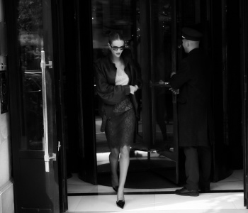
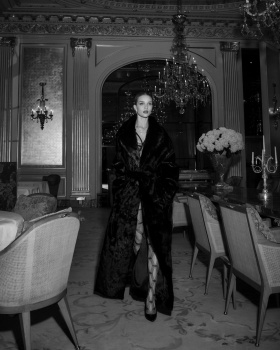
the editorial is good, a little tamed from the idea I got from the cover alone. there’s a couple of strong shots which also made me think of how good of a choice she would’ve been for a Saint Laurent campaign.
bring sultry back.
the editorial is good, a little tamed from the idea I got from the cover alone. there’s a couple of strong shots which also made me think of how good of a choice she would’ve been for a Saint Laurent campaign.
bring sultry back.
caioherrero
Well-Known Member
- Joined
- Sep 2, 2017
- Messages
- 2,966
- Reaction score
- 1,507
Does anyone know if this magazine is any good? I've never seen any editorial other than the cover. It appears that there is no online edition. Does anyone have the masthead?
Alquimista
Well-Known Member
- Joined
- Oct 1, 2023
- Messages
- 732
- Reaction score
- 1,793
Very striking cover. I can forgive the illegible bits of text.
D
Deleted member 141523
Guest
The green kills a terrific cover. I can't imagine which color match with thid photo. Maybe just white.
jeremydante
Well-Known Member
- Joined
- Jul 15, 2009
- Messages
- 3,256
- Reaction score
- 807
This should've been the cover. The cover they selected is giving catalog. Honestly, like the mailers you get for senior citizens in the mail, that sell garments that intend to keep elders fashionable. For those who remember, like the Spiegel catalogs.
- Joined
- Jan 9, 2008
- Messages
- 35,724
- Reaction score
- 21,469
Miles ahead of what Vogue Australia delivered this month. Always been a one for Rosie Huntington-Whiteley, will never tire at the sight of her, so this feels like a total win for me. Throw in Paris (including all the clichés), the Hôtel Plaza Athénée, an overload of Saint Laurent... I'm sold.
Similar Threads
- Replies
- 10
- Views
- 3K
- Replies
- 21
- Views
- 6K
- Replies
- 37
- Views
- 12K
- Replies
- 7
- Views
- 3K
Users who are viewing this thread
Total: 1 (members: 0, guests: 1)

