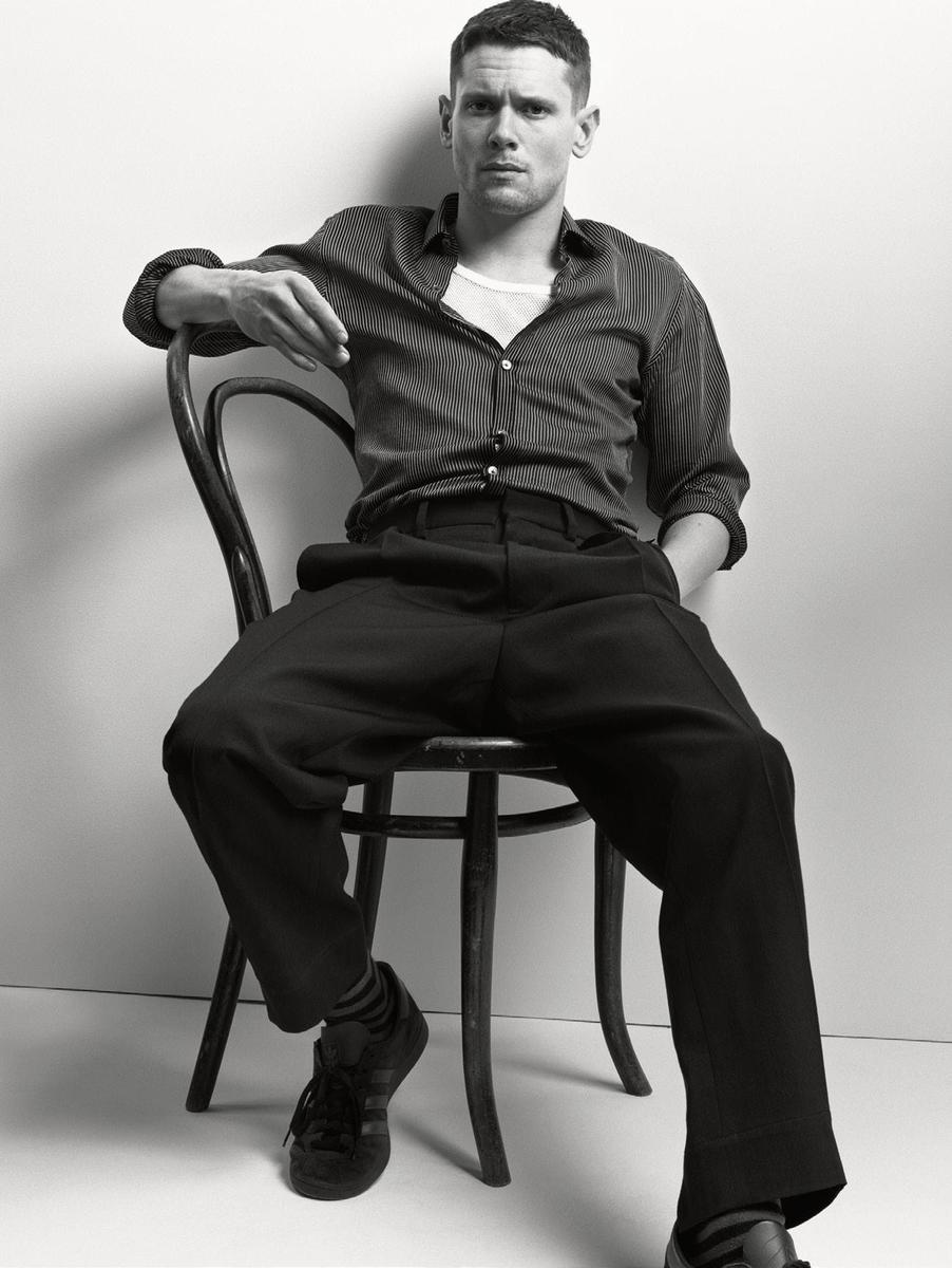
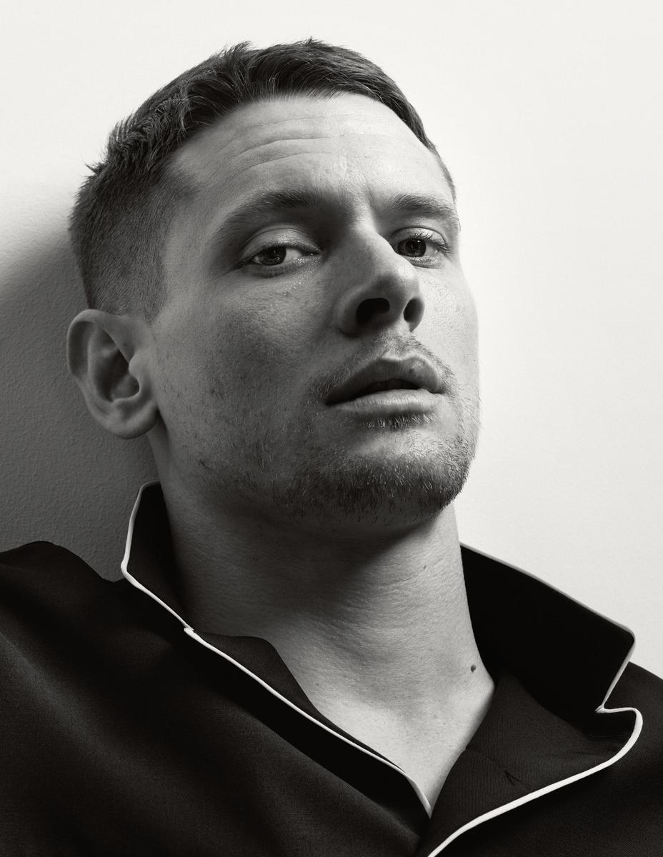
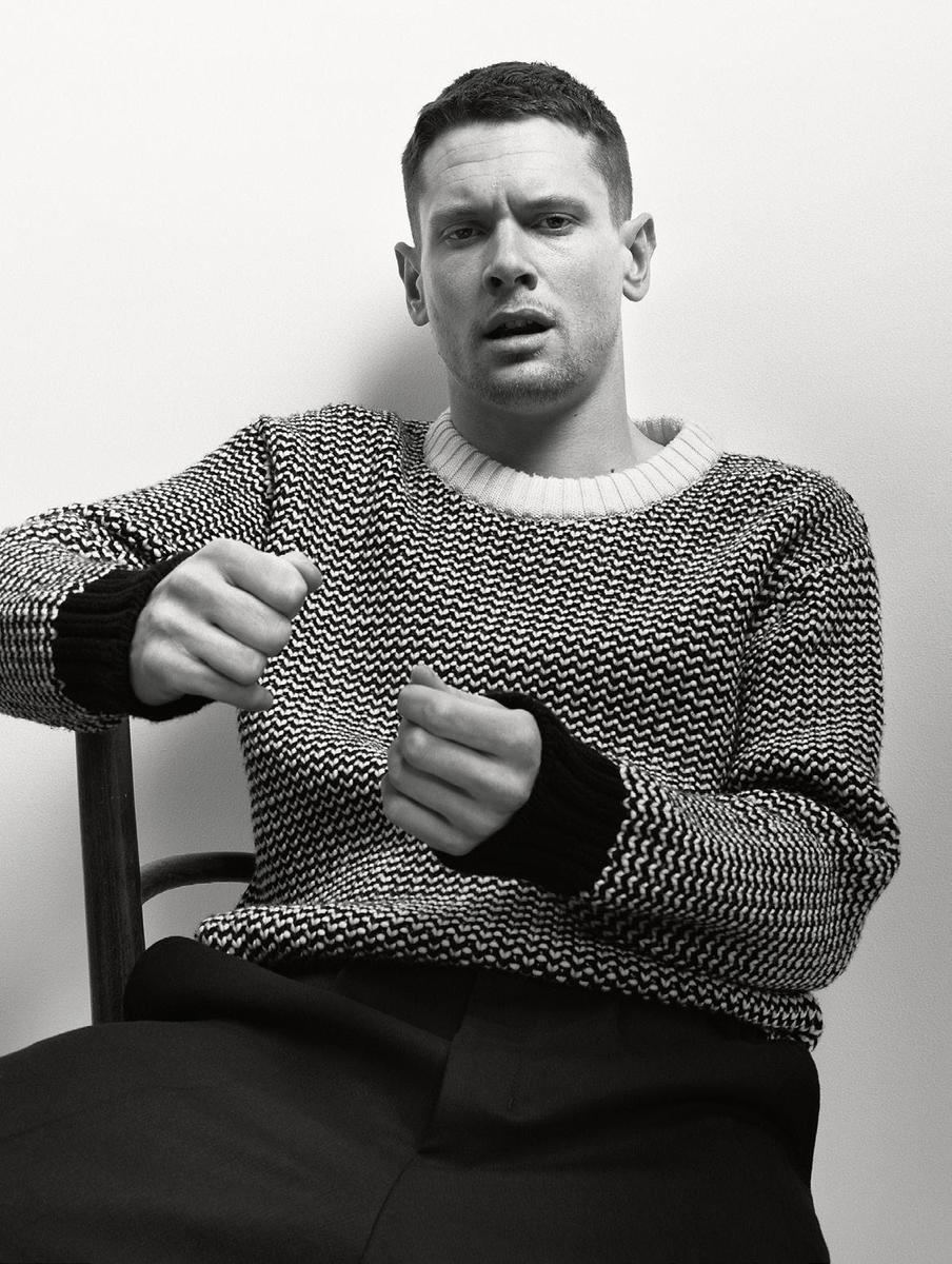
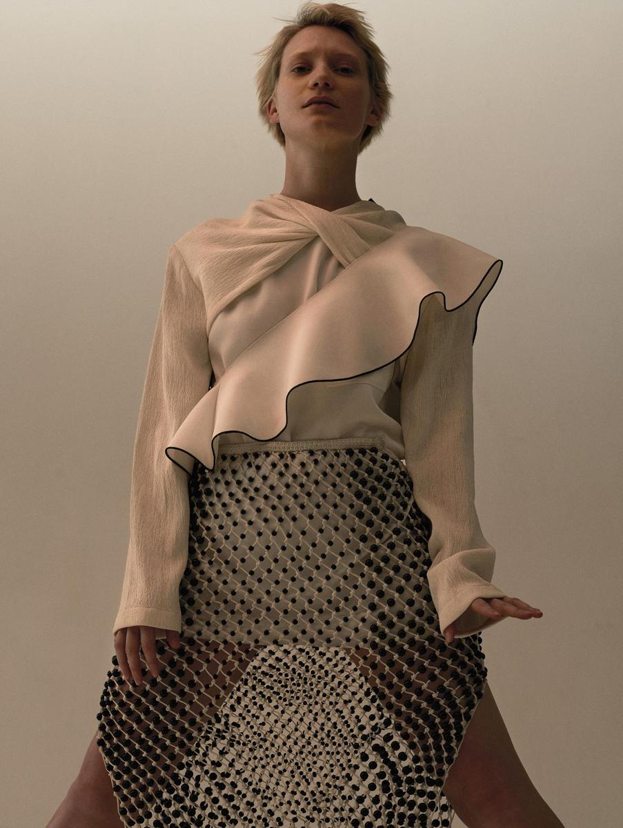
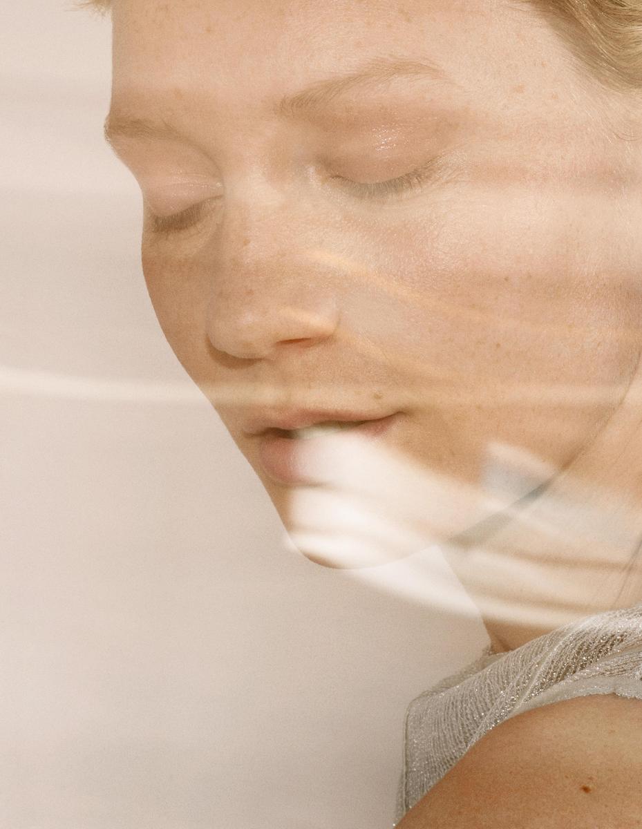
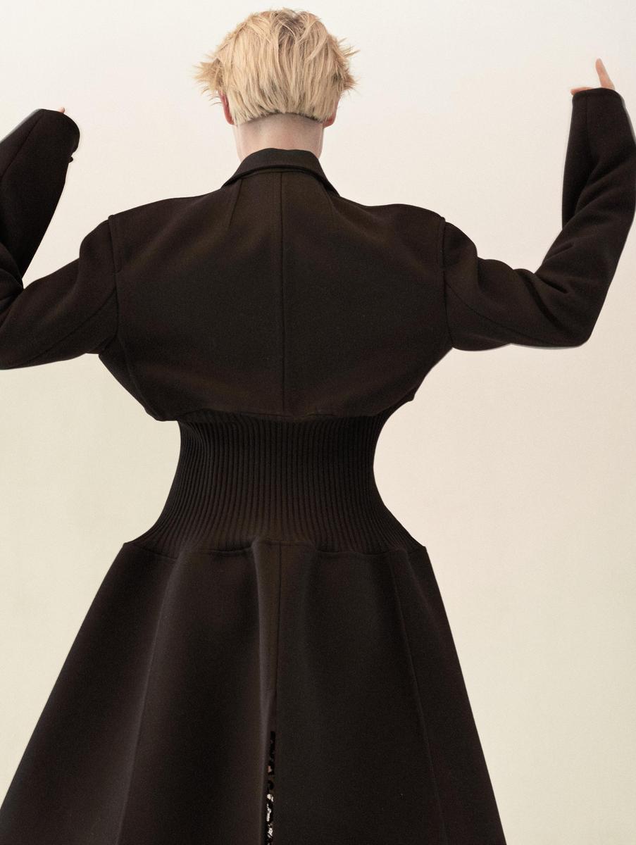
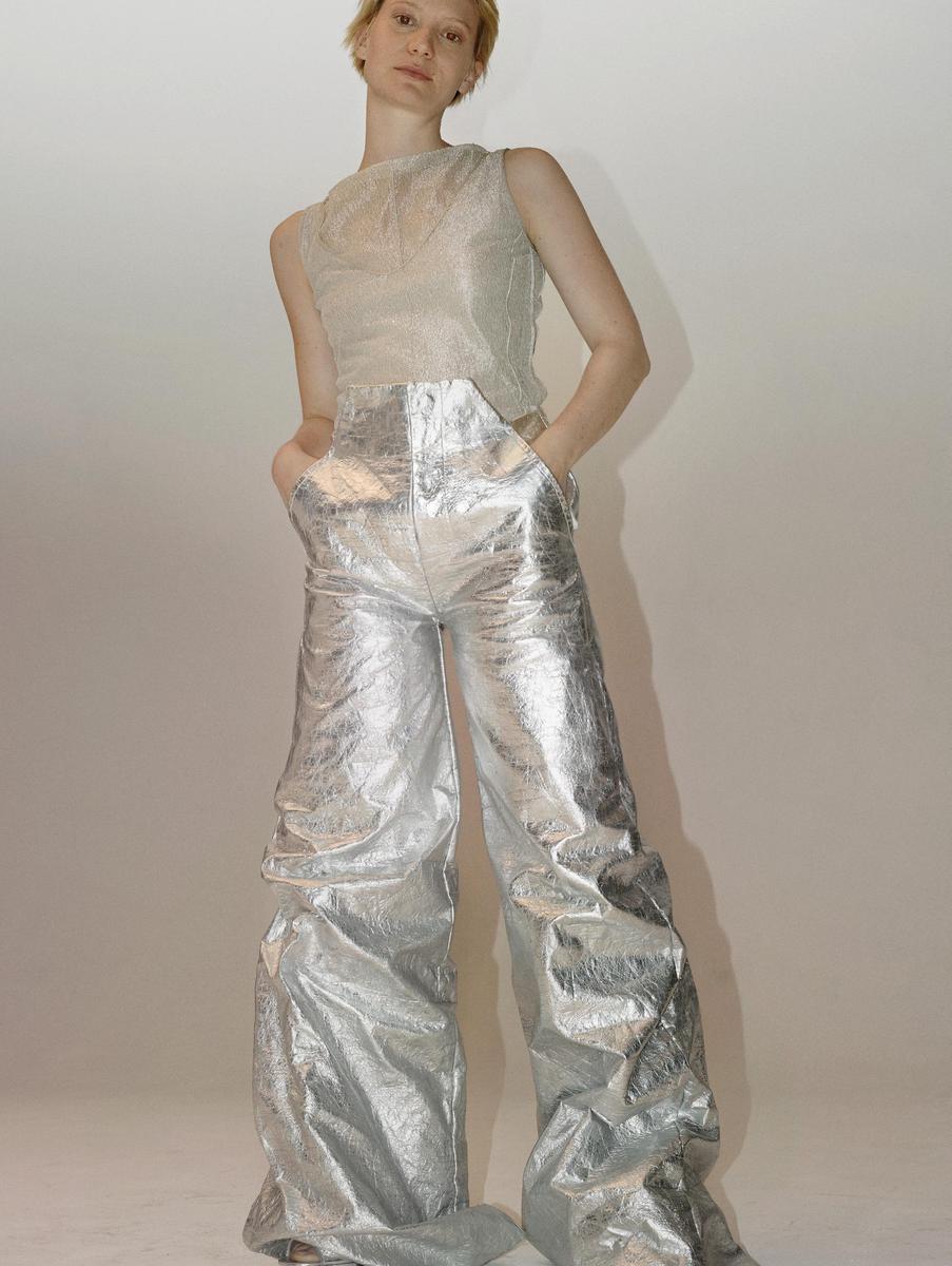
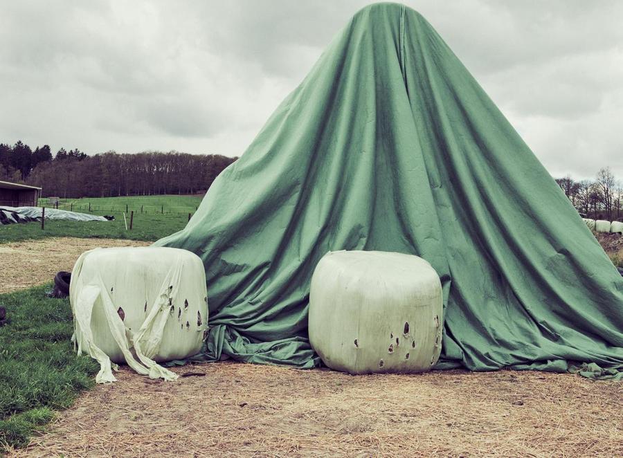
You know, I do appreciate that they’re coming into their own in the fashion and photography direction, and no longer just a German-dubbed version of their American counterpart. But…
Such consistently poor, juvenile graphic design I can't make it through an issue. Why would anyone think that this brand of generic Windows 98 spreadsheet and limited, stock typeface would in anyway enhance their brand of stark, almost German Expressionist and I have to admit, impressive fashion direction…???? I love the brand of minimalist, unfinished, no-frills graphic design that labels like the OG Helmut lang and OG Margiela had back in the day. But this isn’t it. It’s not just cheap-looking— it’s insulting: like seeing Dries and Comme hanging at Kmart (if anyone hasn’t been in a Kmart, I do highly recommend the chilling experience if you get the chance— it’s surreal if you’re used to designer shops). Just drags the otherwise strong, graphically-sharp photography down down down.
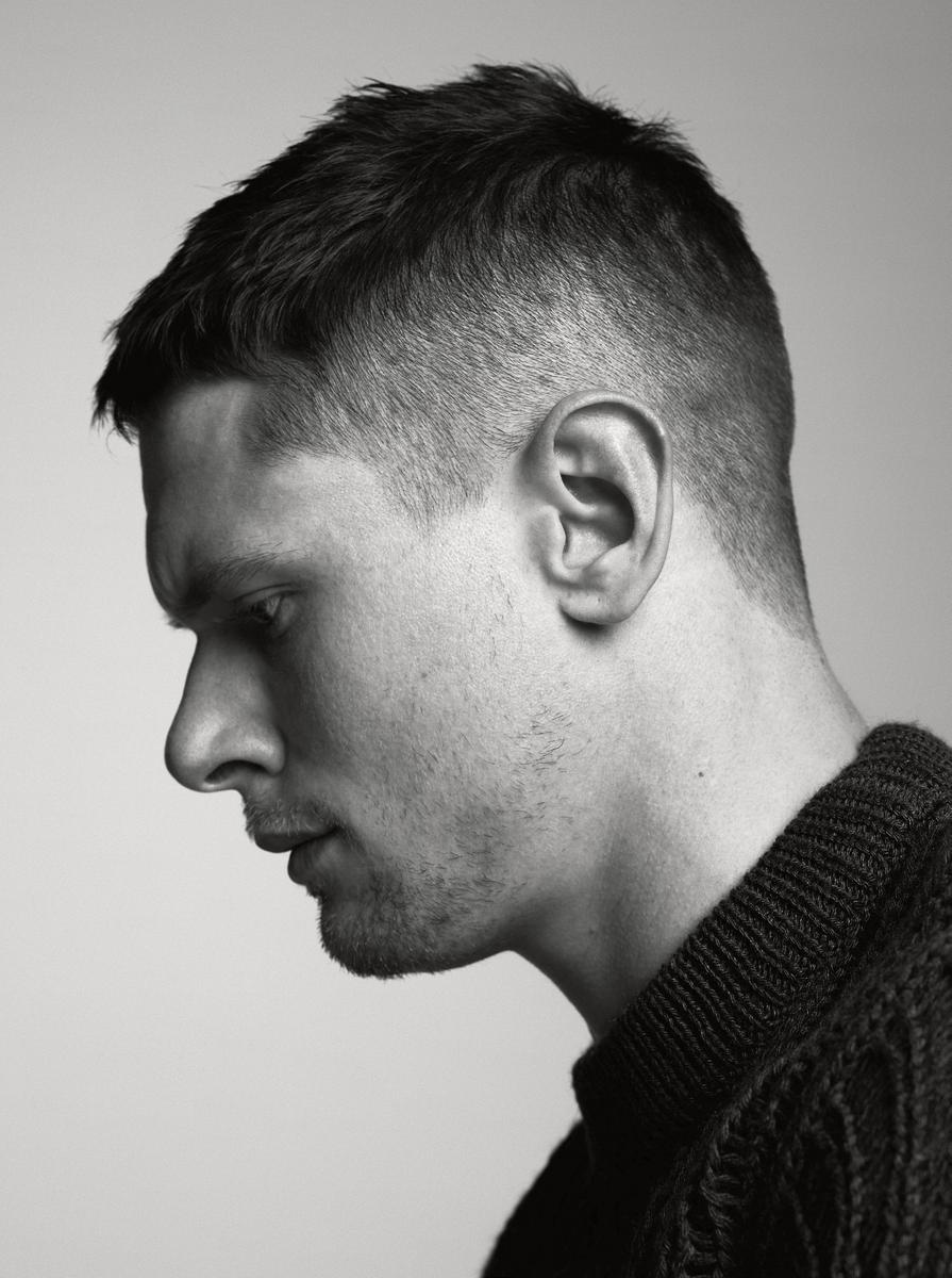
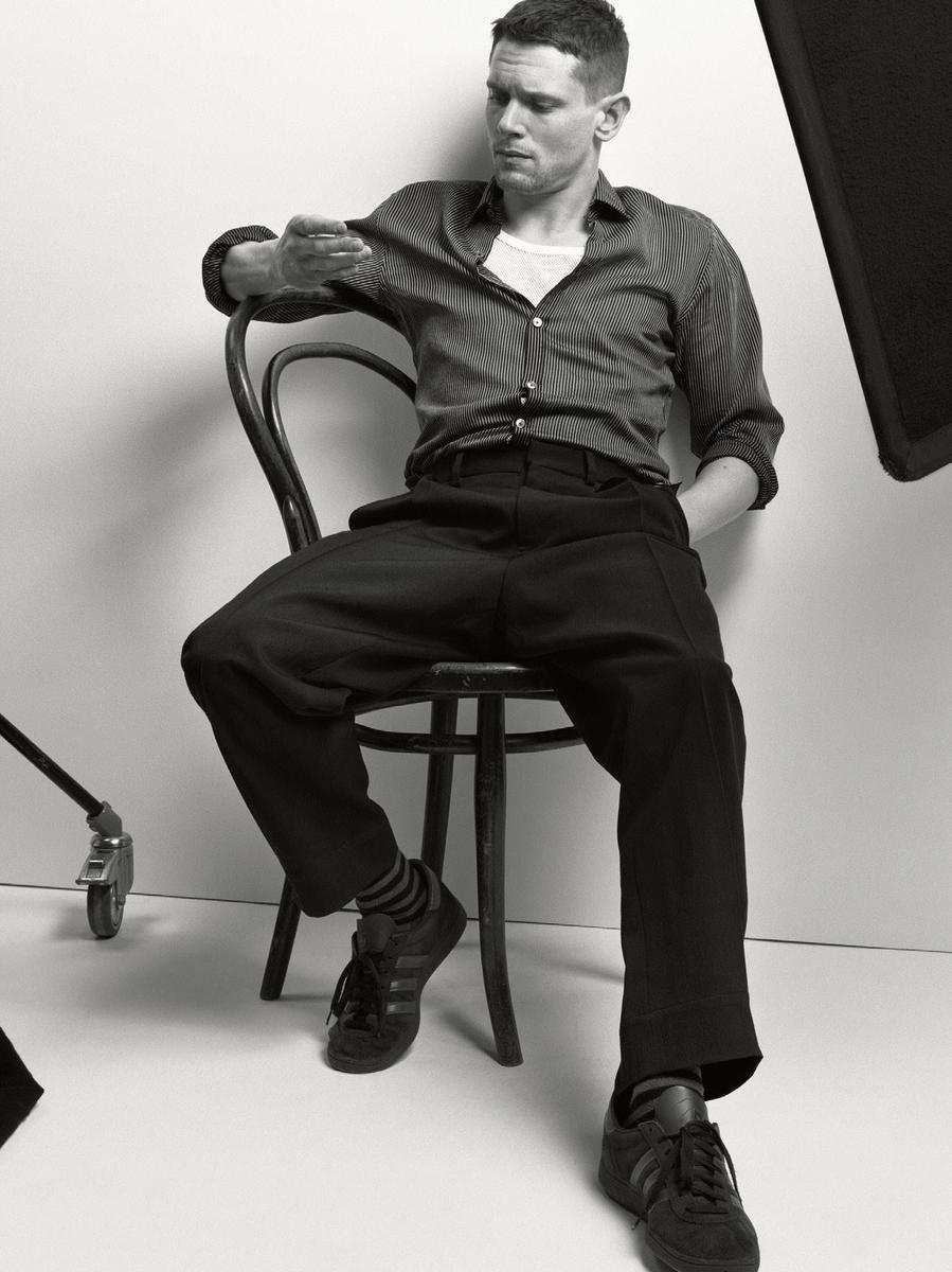
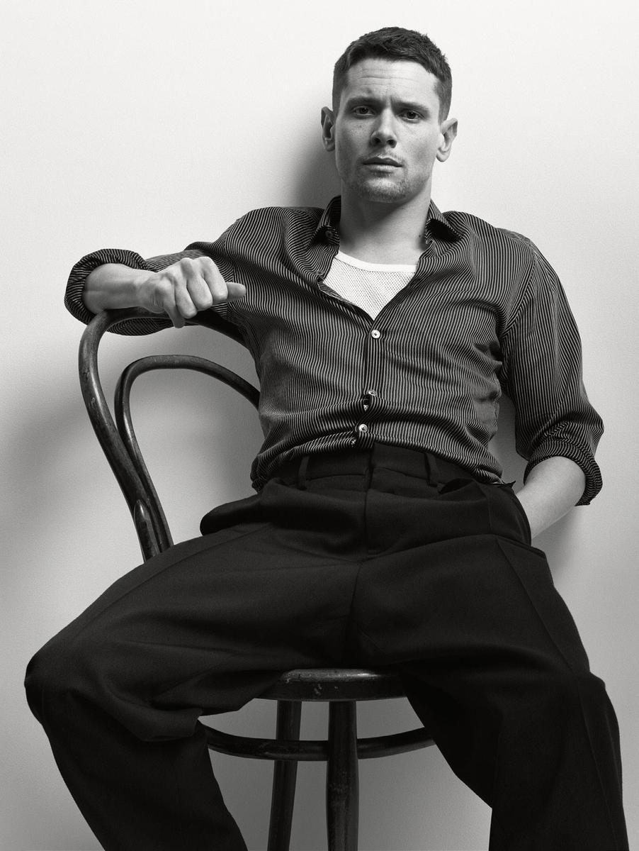
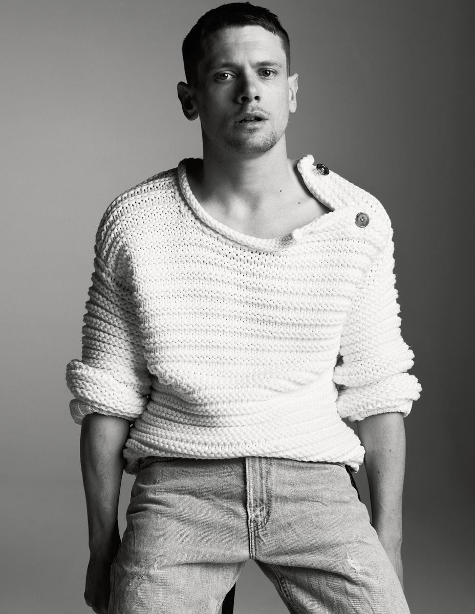
BTW, Jack looks like Jamie Dornan in the cover shot.


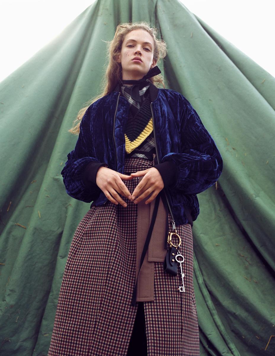
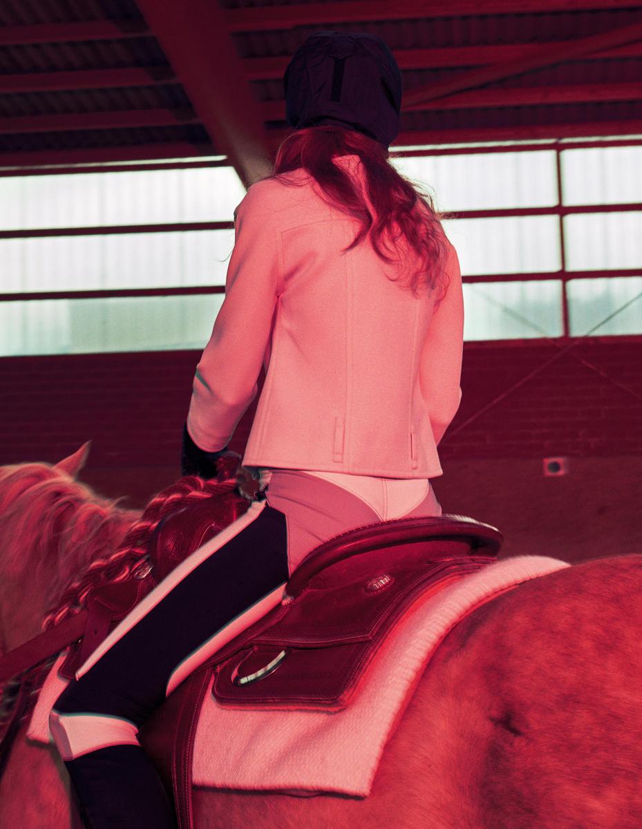
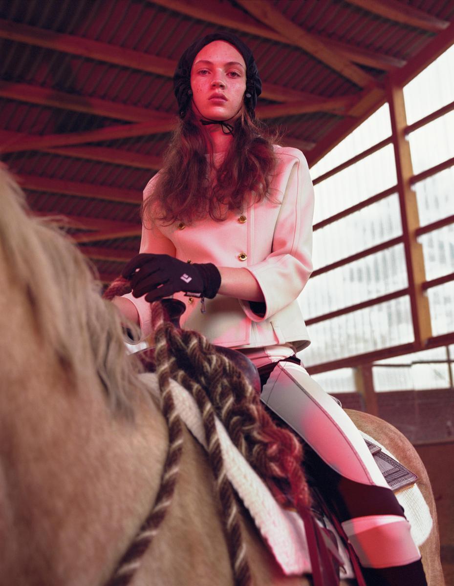


 It's bad, I know. As in Dutch Vogue bad with all those different fonts, but my bias instinctively block it out in lieu of the photography & styling.
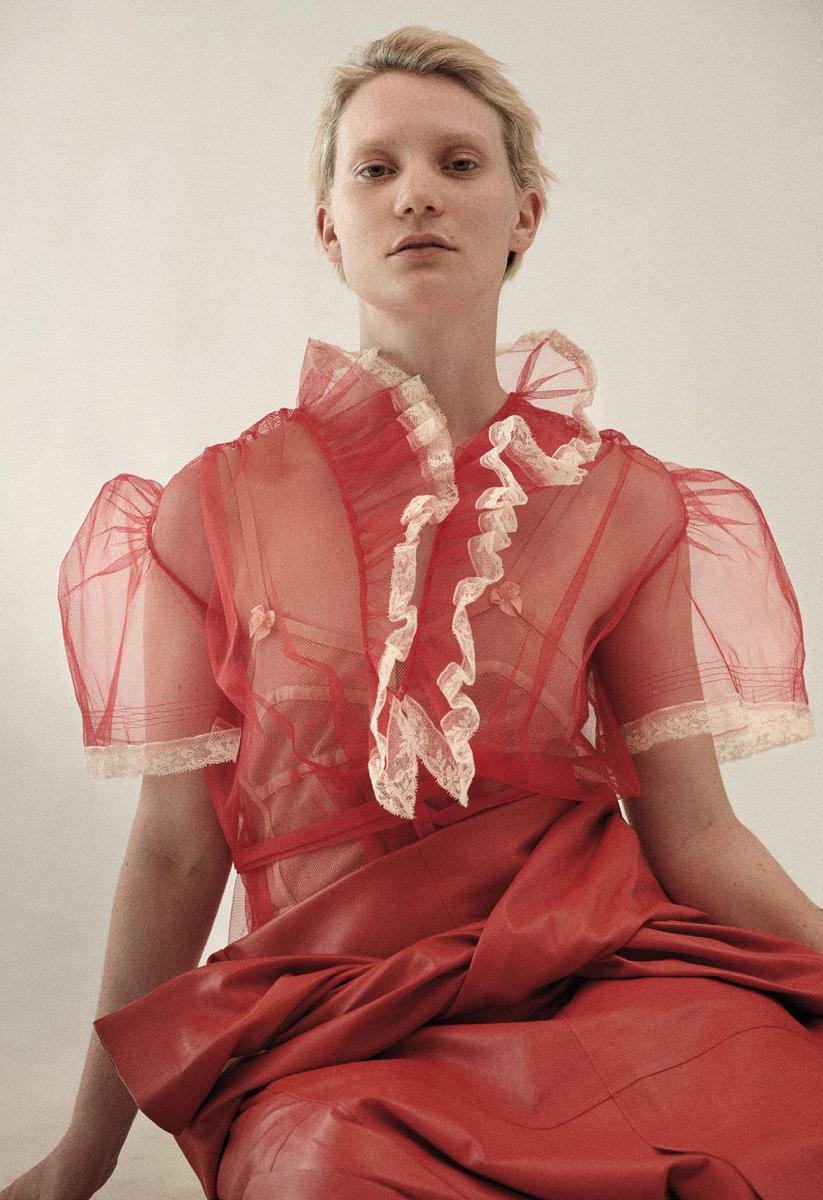
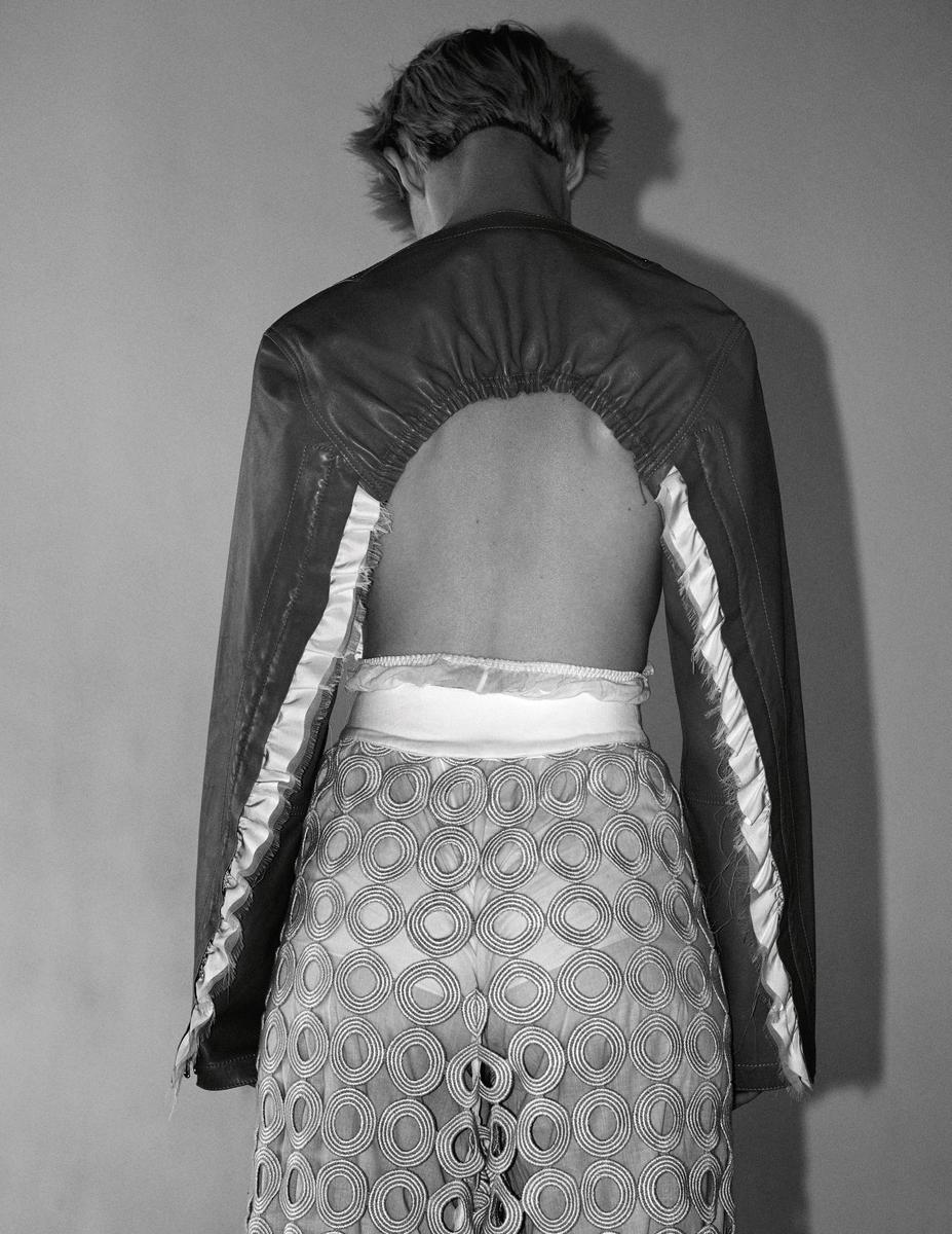
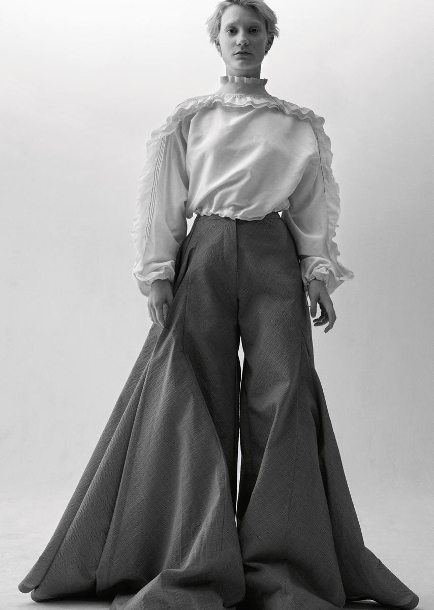
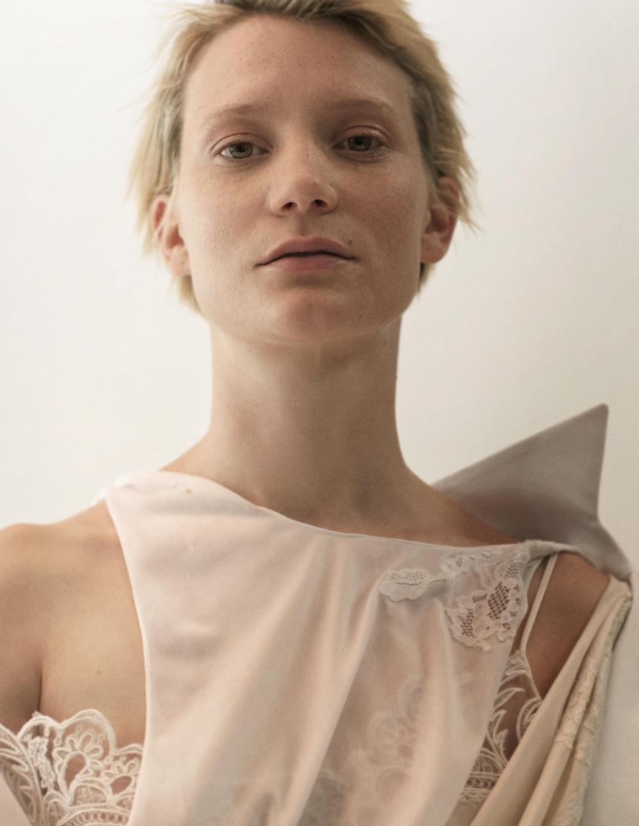
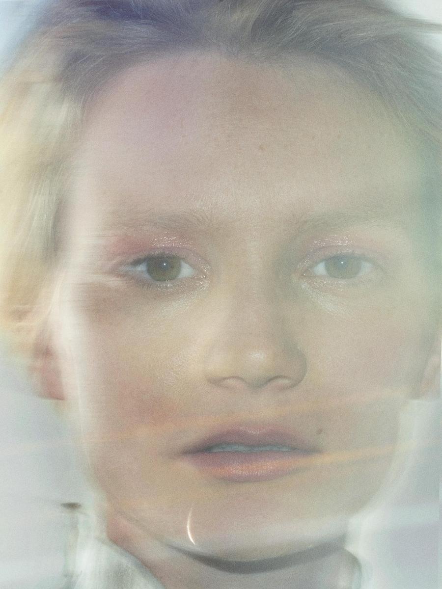
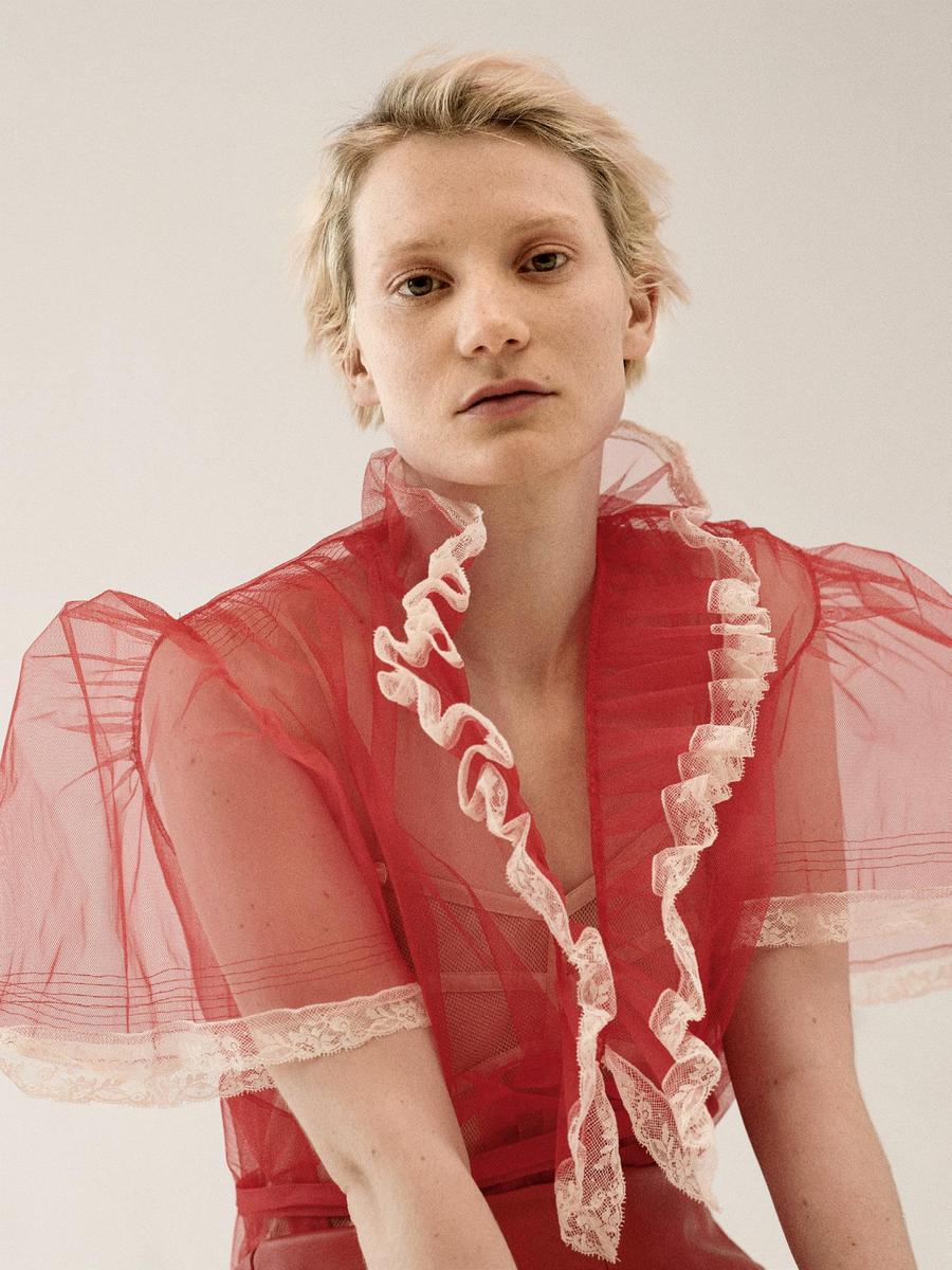
  Love Mia's ed too. Very good issue!


