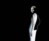
Jil Sander F/W 09.10 : Natasha Poly & Artur Daniyarov by Willy Vandeperre

Comparing to last season, obviously it's a no-brainer.......but it's got all the touches of a Jil Sander campaign.....stark, clean and stylish and it's what I've come to expect.....so yeah I think it's pretty good.
Also with Jil Sander you don't really need to see more to form an opinion as I'm relatively sure the other shots will be very similar.
 
Jil Sander is getting more boring by the season.

I was thinking of a suburban theme or Home-like theme.
My vision for the Jil Sander campaign (Sorry for the bad photoshop job! :blush::(
grizzly_toptwentycopy.jpg

Done by me

It would have been beautiful...
:heart:
 
Jil Sander ads have entered a state of languor. The menswear ad is dull, and if it weren't for Natasha, this entire ad campaign would be completely washed-out.
 
Jil Sander is getting more boring by the season.

I was thinking of a suburban theme or Home-like theme.
My vision for the Jil Sander campaign (Sorry for the bad photoshop job! :blush:).

I think I may just love you for that very random Grizzly Bear association. :lol::heart:

I can't say I'm disappointed by this.. Willy+Oliver+Peter plus Natasha have always been one of my favorite teams to watch, this is the kind of result they deliver.. I'm obviously more susceptible to sunlight and would prefer something safer, easier to delight me like the first campaigns produced under Raf that were all airy and bright but, judging by Willy and Oliver's recent works for Another Magazine and the New York Times, they're clearly in a phase of darkness appreciation and that's still interesting for me, it's more challenging in all senses but I think it's also representing Raf's current vision under Sander to perfection, the way he's been insisting on spirals, shadows.. plus the vulnerabilities of the industry in the current economy.. I don't know, I just can't imagine a different scenery for the collection. it's ideal for me.
 
I love this ad... NATASHA looks gorgeous! The effect are superb
 
it's clean and simple...but i don't like it very much
i think there should be sth new for Jil Sander
 
Absolutely stunning. The dress looks absolutely wonderful. That curling panel in the back looks like a wisp of smoke. :wub:
 
eww I'm fed up with her and her angry stare. There are models who represent Jil Sander woman way better than Natasha. but the dress looks good and less of a stiff sculpture than on the catwalk.
 
what? did they simply photoshop another dress on? LMAO

I quite like the original 2... simple, but effectively highlights what's special about the garments.
 
i looooove the concept of just changing the clothes but keeping the body picture, and even though i hate poly the pictures are really beautiful
 
I still can't see them, so the ones I found at fashionolgie could be the same, but I'll post them anyway:

 
I dunno . . I might have gone off this.
She's not even stood in the dark either. It's all photoshop.
Her hair is awful. I'd have preferred a more interesting model I think. She has great cheekbones for shadow but I still can't get over the fact that she's pretty plain . .
 
I think I liked it better when it was smaller, Natasha's face was more of a blur.
 
How boring.

Did they get so lazy, that they just photoshopped her head on all of the dresses?
-_-

What a shame. I had high hopes for this campaign.
 

Users who are viewing this thread

New Posts

Forum Statistics

Threads
210,719
Messages
15,124,950
Members
84,416
Latest member
barakz12
Back
Top
monitoring_string = "058526dd2635cb6818386bfd373b82a4"
<-- Admiral -->