You are using an out of date browser. It may not display this or other websites correctly.
You should upgrade or use an alternative browser.
You should upgrade or use an alternative browser.
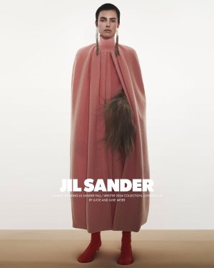
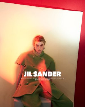
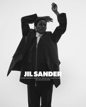
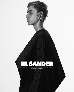
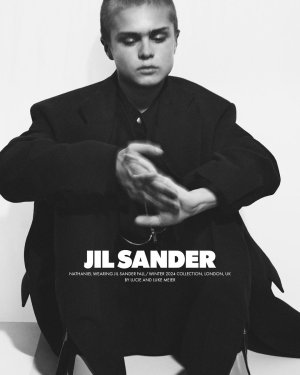
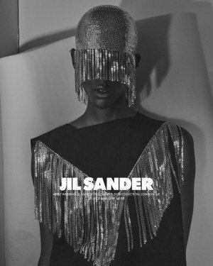
Jil Sander F/W 2024.25 by David Sims
- Thread starter prylvi
- Start date
MulletProof
Well-Known Member
- Joined
- Apr 18, 2004
- Messages
- 28,873
- Reaction score
- 7,919
I hadn't noticed they're inserting their names everywhere, even in their campaigns lol.. this brand..
Pic 1 truly encapsulates what Jil Sander became, something 'really minimal' and low-key that in reality is over-the-top, archaic in its impracticality, trendy and giving influencer/former blogger instead of modern, working woman. Pic 2 is slightly reminiscent of what Sims once did for this brand but the clothes, the model.. they're helpless.
Pic 1 truly encapsulates what Jil Sander became, something 'really minimal' and low-key that in reality is over-the-top, archaic in its impracticality, trendy and giving influencer/former blogger instead of modern, working woman. Pic 2 is slightly reminiscent of what Sims once did for this brand but the clothes, the model.. they're helpless.
philophile
Well-Known Member
- Joined
- Dec 23, 2023
- Messages
- 531
- Reaction score
- 882
Yeah, this is not good. Not the clothes nor the campaign.
Deleted member 167090
New/Inactive Member
- Joined
- Jul 7, 2020
- Messages
- 1,390
- Reaction score
- 3,263
The first outfit is like JS copying Philo copying Capucci with winter fabrics.
MModa
Well-Known Member
- Joined
- Oct 19, 2023
- Messages
- 2,146
- Reaction score
- 2,721
Although the casting could have been better, I am all for seeing new, unexpected faces in fashion advertising. I personally love the ad campaign. David Sims' photography always looks edgy and youthful. The black and white images appeal to me very much but my favorite image is the second with the striking orange light reflection.
jeremydante
Well-Known Member
- Joined
- Jul 15, 2009
- Messages
- 3,667
- Reaction score
- 1,321
I love it. Very Jil Sander for me.
Similar Threads
- Replies
- 13
- Views
- 4K
- Replies
- 19
- Views
- 7K
- Replies
- 7
- Views
- 4K
Users who are viewing this thread
Total: 1 (members: 0, guests: 1)

 and why do female models have such orphan,scary short haircuts ?