You are using an out of date browser. It may not display this or other websites correctly.
You should upgrade or use an alternative browser.
You should upgrade or use an alternative browser.
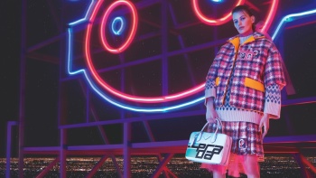
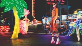
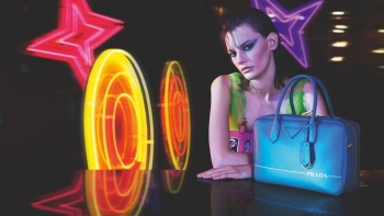
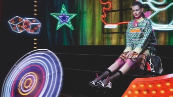
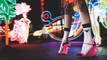
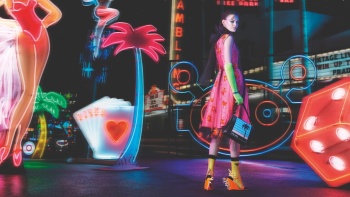
Prada F/W 2018.19 by Willy Vanderperre
- Thread starter vogue28
- Start date
It's like a caricature of Prada.
Perfect description. One that applies to the brand as a whole these days.
YohjiAddict
Well-Known Member
- Joined
- May 26, 2016
- Messages
- 3,709
- Reaction score
- 5,426
Very Vaporwave with all that neon and slight blur/chromatic abberation. At least is not as ascetic as the last few campaigns Willy's done but Glen Luchford would have been amazing for this considering how he nailed down the film noir aesthetic for Prada in the 90's and he still seems to have that cinematic element in his work.
Lola701
Well-Known Member
- Joined
- Oct 27, 2014
- Messages
- 14,822
- Reaction score
- 41,570
Yes! My S/S 2012 shoes are back in the FW 2018 Prada campaign!!!
I don't know what is the message behind them releasing those shoes when they weren't even on the runway...
I don't hate the image. It's rather interesting...But i'm confused.
But i agree, it looks like someone trying to do Prada rather than Prada itself.
Waiting to see more.
I don't know what is the message behind them releasing those shoes when they weren't even on the runway...
I don't hate the image. It's rather interesting...But i'm confused.
But i agree, it looks like someone trying to do Prada rather than Prada itself.
Waiting to see more.
D
Deleted member 119799
New/Inactive Member
- Joined
- Jun 28, 2009
- Messages
- 1,157
- Reaction score
- 992
i can't believe they put those shoes in the campaign, what is going on there?!
and even the shoe as a print on a bag, what
and even the shoe as a print on a bag, what
Last edited by a moderator:
bluebanter
Well-Known Member
- Joined
- Feb 1, 2018
- Messages
- 1,132
- Reaction score
- 754
I just cant feel any real thought or passion behind any of Willys images in the last few seasons. Its all very standard and expected.
Amanda Murphy is great though.
Amanda Murphy is great though.
Benn98
Well-Known Member
- Joined
- Aug 6, 2014
- Messages
- 42,582
- Reaction score
- 20,818
All the trimmings are winning me over. Emphasis on trimmings and not the actual photography. Because Amanda seems just dumped onto spots, there's very little energy.
I like the shoe shot, that's it. Not nearly as bad as Willy's past campaigns for Prada, but no triumph either.
I like the shoe shot, that's it. Not nearly as bad as Willy's past campaigns for Prada, but no triumph either.
Lola701
Well-Known Member
- Joined
- Oct 27, 2014
- Messages
- 14,822
- Reaction score
- 41,570
I actually like it. I hate to see that much logo but there’s something interesting in this campaign as a whole.
And I like the fact that it’s just one girl.
Maybe the most memorable effort of Willy for the brand.
And I like the fact that it’s just one girl.
Maybe the most memorable effort of Willy for the brand.
helmutnotdead
Well-Known Member
- Joined
- Jan 29, 2018
- Messages
- 2,097
- Reaction score
- 5,816
some of the shots are nice but come on! the styling is ATROCIOUS. I can't believe that I'm watching such horrible clothes/bags/shoes from Prada.
Miuccia, Olivier, Willy, Ashley and Fabio needs to go to holidays for like...10 years.
Say whatever you want about Willy but I'm starting to blame Miuccia for this. I want to believe that she has the last word about everything -in terms of design and aesthetic-. At least for me, she's the complete responsible about those tasteless collections and advertising campaigns.
dior_couture1245
Fat Karl
- Joined
- Jan 30, 2006
- Messages
- 9,225
- Reaction score
- 4,765
Possibly one of the ugliest collections of all time, parading around as something intellectual and meaningful. Totally embarrassing for Prada.
That tweet suit over the fair-isle sweater with the matching tweed skirt, decked out in the hideous silicon logo patches...I've never seen anything so atrocious.
That tweet suit over the fair-isle sweater with the matching tweed skirt, decked out in the hideous silicon logo patches...I've never seen anything so atrocious.
GivenchyHomme
Well-Known Member
- Joined
- Sep 3, 2009
- Messages
- 5,534
- Reaction score
- 5,582
It's a big improvement. The shoe shot is sick! I hope this is the only set and Amanda is og.
pivoslyakova
Member
- Joined
- Mar 14, 2012
- Messages
- 550
- Reaction score
- 3
I quite like this, at least is not boring like the past campaigns and i'm really happy to see Amanda.
LustforFashion
Active Member
- Joined
- Mar 29, 2018
- Messages
- 132
- Reaction score
- 87
I like it. It’s quite exciting copared to what Willy has been offering the past few seasons.
zacatecas570
Well-Known Member
- Joined
- Sep 27, 2008
- Messages
- 7,212
- Reaction score
- 1,119
What's the point on trying to sell the same shoes from S/S 2012?? Prada is so confusing to me, from the collections to the marketing campaign. TERRIBLE
Similar Threads
- Replies
- 121
- Views
- 18K
- Replies
- 6
- Views
- 2K
Users who are viewing this thread
Total: 1 (members: 0, guests: 1)

