Okay, here we go:
MIRRA~ I love the graphic style of this entry!! Reminds me of a twisted alice in wonderland pirate thing. The minimal color choice really lends itself to the design and I could totally see this on some media. I would almost maybe tone down the background a bit more as there is si much pattern going on, you get a bit lost in the imagery. But overall, a beautiful graphic heavy illustration!
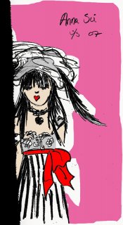
BORJACAPELLA~ I don’t know what you’re talking about! I love this one too! It reminds me greatly of Lagerfelds sketches for Chanel, light-handed pastel and very subtle emotions. It almost reminds me also of old pastel drawings by Renoir…..very romantic and feminine! My one thing is I think I would like to see her arms drawn out completely as well.
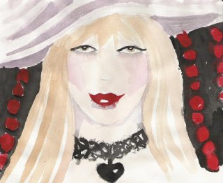
DIZZIDI~ love it! Watercolors do take a lot of patience, but I love the subtle colors you got in the hat shadow across her face and in her hair. I think if you did a few more layers here and there, this would really be spectacular. Right now I think it looks like a great start, but a bit unfinished.
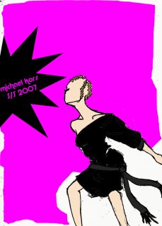
HANNA~ love it, I really think this is fun and colorful. I like the cold abstract shapes of the black and pink and how you weren’t afraid of such bold design aspects. This looks like it should be on some chic lil’ stationary thing or something. Reminds me of an illustrated childrens book a bit because of the innocence in the linework. You create a wonderfully girlish emotion with the models smile. I really love the energy in this piece!
GBART~ love it! Love it love it! You really don’t get a good sense of your delicate linework until you enlarge the image, but even in a small format, the figure gesture Is done so carefully. Your linework makes it look so delicate. What I really like is that you did it in black and white only, when the pic I chose was so graphic. Beautiful little delicate sketch!!!
And now for the winner………………………….
………….and this is really hard………………………
………….because they were all really different from one another and so strong!....................so……………………….
………………………………….
………………………………
……………………………
………………………
……………………..
……………..
……………….
……………………….
………………………….i choose
…………………..GBART!!!!!!!!
GB~ i love your linework and gesture. everything is so carefuly done and beautiful. i love the fact you stayed away from the initial reaction to do a bold, graphic sketch. you found something in this pic that really exemplifies the type of artist you are. BEAUTIFUL!


")

 congrats GBArt!