tourbillions
Well-Known Member
- Joined
- Dec 19, 2020
- Messages
- 1,728
- Reaction score
- 4,512
only thing cohesive with ancora guy is his boringness
not all stores have been updated its too soon and A level stores in key fashion cities get preference for big overhaul rest get just basic refurbishment .....this is for all brands not unique to Gucci,......traveling around i seen they have like 3 to 4 running store concepts ( Frida concept in markets that are less important, Alessandro concepts in all versions and the cleaned up version of it with more white airports are full with this concept, and the cleaned up versions with adjustment of Ancora are starting to pop up ) with like 400 stores its not possible to change all at once and it's not cost effective.Ah, so it is his touch? Pretty much confirms why it’s so bland. The stores with the gray carpet don’t look like this though, those still have the paneled walls like Alessandro store but without any of the color or patterns.
Funnily, those velvet chairs you pointed out are from the Alessandro concept stores. I’m talking about the B&B / Cassina chairs from the Milan Store which apparently is Sabato concept. Those chairs are frequently used in our projects for high end luxury condos and hotels.
I’m well aware of how store design functions - see my original post. The new opening that has the gray carpet is NOT the latest store concept, it’s a remnant of the Alessandro concept that was cleaned up since his departure. The Milan flagship is the new concept that’s moving forward, and they are different. Like I originally said, there’s a 1-2 year lag from a new CD / concept and the first stores in that concept, so many of the recent openings are not reflective of the latest.not all stores have been updated its too soon and A level stores in key fashion cities get preference for big overhaul rest get just basic refurbishment .....this is for all brands not unique to Gucci,......traveling around i seen they have like 3 to 4 running store concepts ( Frida concept in markets that are less important, Alessandro concepts in all versions and the cleaned up version of it with more white airports are full with this concept, and the cleaned up versions with adjustment of Ancora are starting to pop up ) with like 400 stores its not possible to change all at once and it's not cost effective.
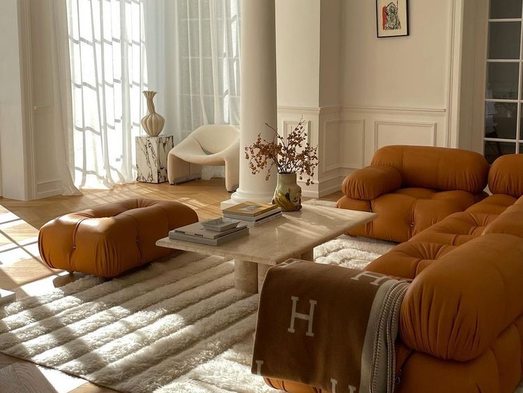
Generic / bland =/= cheap. Someone said it looked like wayfair, which is a huge insult to B&B / Cassina whose furniture is wonderfully designed and made. It’s not their fault that Sabato decided to infect their brands with his blandness, but “cheap” is not the right word to describe the furniture in the new stores......frequently used in our projects for high end luxury condos and hotel ...that's exactly the problem what most people are trying to express its so generic as a Hermes Avalon blanket in a 10 million dollars staged home...
while there is not much wrong with the blanket itself its what it stands for that has become so bland and generic tot the point of nausea and cheapness.....same as the mario bellini sofas now ever fashion or influencer has it there white on white cream beige home or copy of polar bear sofas of Jean Royere if you want to go up in price class of 300 k or more per sofa seen in ever AD cover for last 10 years

in context of the store these brands look cheap and on this point we can disagree ...i have B&B sofa´s for over 20 years now even hermes items can look cheap in certain context the chairs and bags don't have feelings its ok :-)I’m well aware of how store design functions - see my original post. The new opening that has the gray carpet is NOT the latest store concept, it’s a remnant of the Alessandro concept that was cleaned up since his departure. The Milan flagship is the new concept that’s moving forward, and they are different. Like I originally said, there’s a 1-2 year lag from a new CD / concept and the first stores in that concept, so many of the recent openings are not reflective of the latest.
Generic / bland =/= cheap. Someone said it looked like wayfair, which is a huge insult to B&B / Cassina whose furniture is wonderfully designed and made. It’s not their fault that Sabato decided to infect their brands with his blandness, but “cheap” is not the right word to describe the furniture in the new stores.
So it's the generic filler furniture for turnkey high-end.Funnily, those velvet chairs you pointed out are from the Alessandro concept stores. I’m talking about the B&B / Cassina chairs from the Milan Store which apparently is Sabato concept. Those chairs are frequently used in our projects for high end luxury condos and hotels.
I’m well aware of how store design functions - see my original post. The new opening that has the gray carpet is NOT the latest store concept, it’s a remnant of the Alessandro concept that was cleaned up since his departure. The Milan flagship is the new concept that’s moving forward, and they are different. Like I originally said, there’s a 1-2 year lag from a new CD / concept and the first stores in that concept, so many of the recent openings are not reflective of the latest.
Generic / bland =/= cheap. Someone said it looked like wayfair, which is a huge insult to B&B / Cassina whose furniture is wonderfully designed and made. It’s not their fault that Sabato decided to infect their brands with his blandness, but “cheap” is not the right word to describe the furniture in the new stores.
I think it’s pretty clear at this point that the association with Wayfair was aimed at this teal velvet sofa - And it’s in fact true that sofas and lounge chairs in that shape, upholstering and color have been around for way too long, Wayfair being among one of the places where they were shown with utmost frequency.
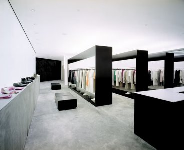
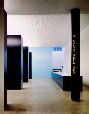
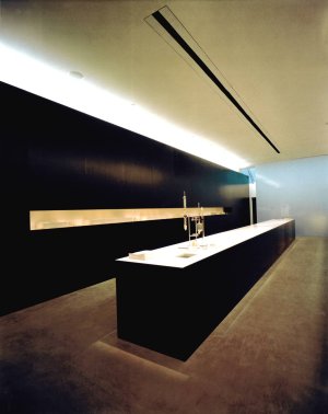
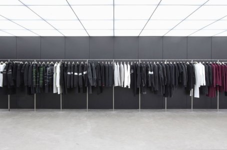
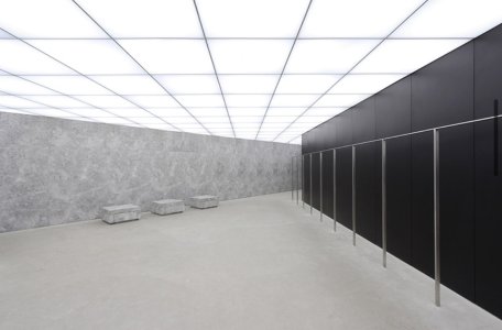
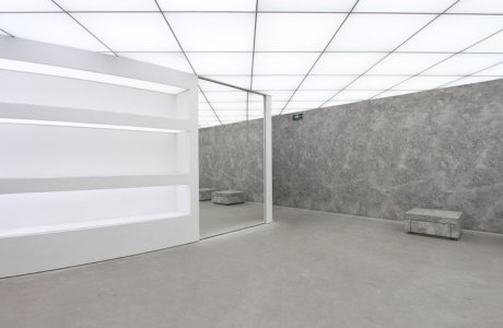
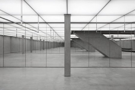
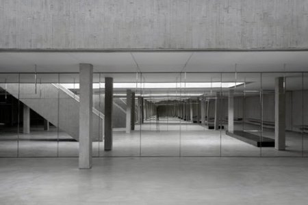
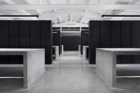
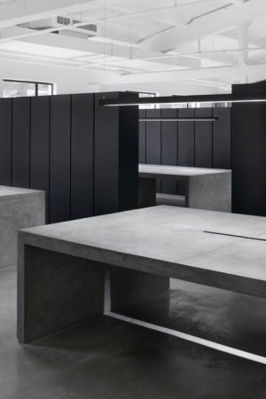
As for the interiors as a whole - I think history has shown us amazing minimal interior concepts aplenty from the likes of Helmut Lang (Gluckman), Jil Sander (Gabbelini) to more recently Nicolas Andreas Taralis' brief China venture (realized bz Bernard Dubois, as seen in Dezeen). Those were stunning spaces that remain timelessly attractive.
These ones for Gucci are a complete non-event, maybe good enough for Massimo Dutti or an upscale-but-boring department store.
As for the interiors as a whole - I think history has shown us amazing minimal interior concepts aplenty from the likes of Helmut Lang (Gluckman), Jil Sander (Gabbelini) to more recently Nicolas Andreas Taralis' brief China venture (realized bz Bernard Dubois, as seen in Dezeen). Those were stunning spaces that remain timelessly attractive.
The store is utterly devoid of fantasy and the clothing selection (at least for men) is all canal street logo. The worst part is really the use of space though. They have a full back room dedicated to ancora red (just the color, not even clothes) and exotic Jackies that no one is buying.I saw images of the new NYC Soho store and GOD its depressing!

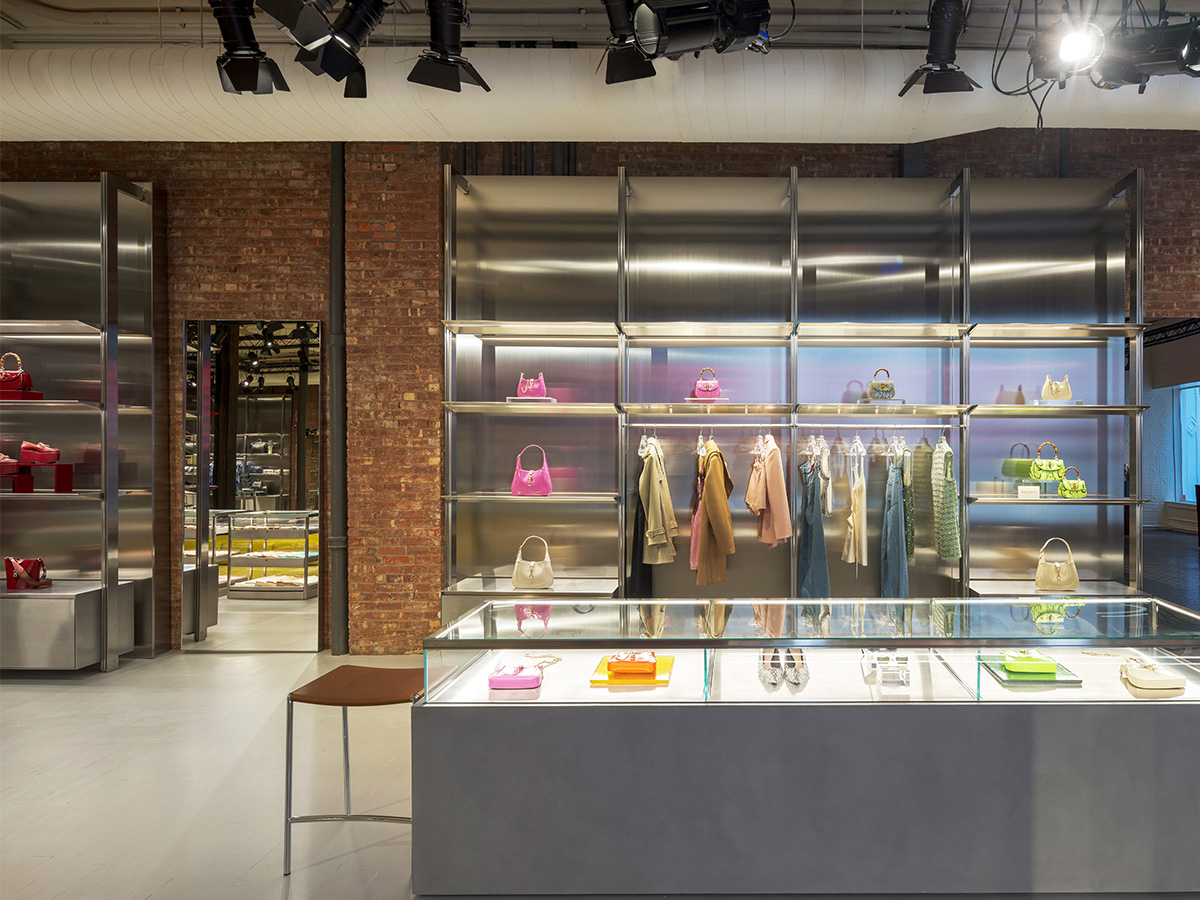
wwd.com / hauteliving.com
the whole vibe of it reminds of prada - early 10s pradaI saw images of the new NYC Soho store and GOD its depressing!
wwd.com / hauteliving.com

To be fair, there has been lots of fun Karl discussion going on in the Random Fashion Moments thread.I mean damn, even Karl and Galliano's threads have less views and comments.
 (And he has like 3 different threads lol)
Some insights into the showroom, studio and retail concept by Bernard Dubois for Nicolas Andreas Taralis - Clearly a continuation of Helmut Lang and Dior Homme’s interiors as well as a healthy dose of sci-fi (Christopher Nolan’s Batman comes to mind).
View attachment 1295480 View attachment 1295481 View attachment 1295482 View attachment 1295483 View attachment 1295484 View attachment 1295485 View attachment 1295486
This sofa haunts me in my dreams I had to google it.
I'm sure all the furnitures came from great Italian brands but just the context and taste of it doesn't say anything about the brand vision.
View attachment 1295048
It’s like the Wizard of Oz before everything turns to color. Imagine having to go to work and see that everyday.
