You are using an out of date browser. It may not display this or other websites correctly.
You should upgrade or use an alternative browser.
You should upgrade or use an alternative browser.
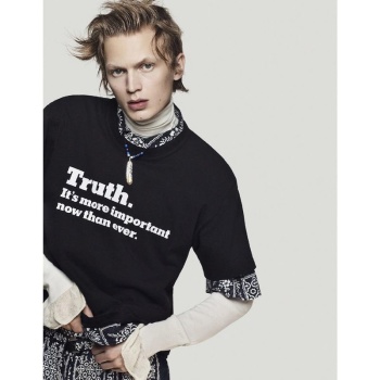
Sacai F/W 2018 : Kaia Gerber & Jonas Glöer by Craig McDean
- Thread starter simon
- Start date
Benn98
Well-Known Member
- Joined
- Aug 6, 2014
- Messages
- 42,582
- Reaction score
- 20,793
The shot and styling on Kaia looks so much like a caricature of fashion, like an ad for some small fashion college. And I can't abide this Jonas guy, so this campaign means not much to me.
McDean used to do such dynamic imagery for this brand. Even the ones with Julia Nobis looked better, which is saying much.
McDean used to do such dynamic imagery for this brand. Even the ones with Julia Nobis looked better, which is saying much.
Vitamine W
Well-Known Member
- Joined
- Oct 15, 2010
- Messages
- 2,957
- Reaction score
- 965
Kaia oversaturation in full force, Im already sick and tired of her. Decent shots tho but I much more prefer their older campaigns.
Phuel
Well-Known Member
- Joined
- Feb 18, 2010
- Messages
- 6,331
- Reaction score
- 11,600
The shot and styling on Kaia looks so much like a caricature of fashion, like an ad for some small fashion college. And I can't abide this Jonas guy, so this campaign means not much to me.
McDean used to do such dynamic imagery for this brand. Even the ones with Julia Nobis looked better, which is saying much.
High fashion is pretty much at a state of oversaturated caricature at this point, Benn.
All the current, leading tastemakers, Alessandro, Demna, Virgil— all force this cartoony image of the fashion victim. And even the dames of high fashion— Miuccia to Donetalla, are churning out designs and campaigns that resemble the cheapest knock-offs of their signatures, shamelessly pandering to the current dire state of high fashion.
Kaia may resemble some caricature of the overly-serious experiment in fashion-school pretentiousness— I’ll give you that. But she looks good and pulls it off, selling the hell out of that look. Can’t say the same for the twink. He’s so generic, androgynously pretty, he’s literally vapid. Should’ve just cast Kaia for the men’s campaign as well. She’s that strong here.
RedSmokeRise
Well-Known Member
- Joined
- May 31, 2015
- Messages
- 1,743
- Reaction score
- 1,145
Kaia looks great, even if we consider the oversaturation. Not here for Jonas....Sacai mens needs an edgier model.
Fiercification
Well-Known Member
- Joined
- Apr 17, 2008
- Messages
- 6,295
- Reaction score
- 1,517
Given the strength of the collection and the team behind every Sacai campaign I expected something much stronger. Especially given that Kaia isn't an obvious choice to front Chitose's campaign but she sold it opening the show. She deserved a strong, more high-fashion (image wise) showcase for her talent here.
Kaia's print work is getting much stronger, she's selling the clothes. I usually like Jonas but have to agree with the rest of you, she's outshining him.
I'm not a huge fan of the bland background but I'm curious to see it in person!
I'm not a huge fan of the bland background but I'm curious to see it in person!
Royal-Galliano
völlig losgelöst
- Joined
- Nov 25, 2005
- Messages
- 16,153
- Reaction score
- 914
i like jonas' image but kaia's not right for the brand. she makes it look like a diesel campaign from a decade ago. or maybe it's the fugly jacket she's wearing?
Similar Threads
- Replies
- 20
- Views
- 8K
- Replies
- 6
- Views
- 3K
- Replies
- 4
- Views
- 2K
- Replies
- 13
- Views
- 5K
Users who are viewing this thread
Total: 1 (members: 0, guests: 1)


