You are using an out of date browser. It may not display this or other websites correctly.
You should upgrade or use an alternative browser.
You should upgrade or use an alternative browser.
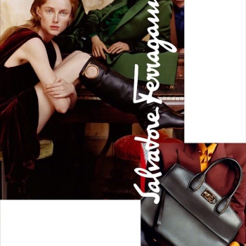
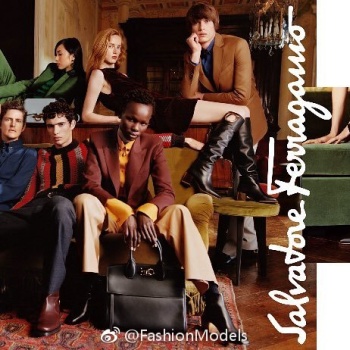
Salvatore Ferragamo F/W 2018.19 by Harley Weir
- Thread starter 9sete
- Start date
Benn98
Well-Known Member
- Joined
- Aug 6, 2014
- Messages
- 42,530
- Reaction score
- 20,571
Yikes, who is the photographer?  This is really a cluttered mess. Group imagery is clearly not his/her forte, this entire campaign looks embarrassingly amateur. To make matters worst the art department decided to go for collages and a hideous, outdated direction.
Is there a new CD or what?
 This is really a cluttered mess. Group imagery is clearly not his/her forte, this entire campaign looks embarrassingly amateur. To make matters worst the art department decided to go for collages and a hideous, outdated direction.
Is there a new CD or what?
DanielWP
Active Member
- Joined
- May 15, 2013
- Messages
- 171
- Reaction score
- 27
As I have heard they are trying to connect with younger consumers desperately. They appointed a new head of marketing, Riccardo Vannetti, as his predecessor left the sinking ship in March. They also collecting dropout "talents" from Gucci and others.
The Ferragamo family sold 3.5 percent of there stake from the company way below it's share price in June. That doesn't show confidence either. Even before this step investors thought that it's a risky investment. Imagine now.
I know this is about the campaign, but I just couldn't hold it back.
By the way, this campaign won't help. They need logo-mania lol...
Benn98
Well-Known Member
- Joined
- Aug 6, 2014
- Messages
- 42,530
- Reaction score
- 20,571
As I have heard they are trying to connect with younger consumers desperately. They appointed a new head of marketing, Riccardo Vannetti, as his predecessor left the sinking ship in March. They also collecting dropout "talents" from Gucci and others.
The Ferragamo family sold 3.5 percent of there stake from the company way below it's share price in June. That doesn't show confidence either. Even before this step investors thought that it's a risky investment. Imagine now.
I know this is about the campaign, but I just couldn't hold it back.
By the way, this campaign won't help. They need logo-mania lol...
Thanks for the info, Ed & DanielWP!

Doesn't look like Harley's style at all. Anyway, I'm not big on her work to begin with, this just proves how terribly mediocre she can be.
It's interesting that you mention logo-mania because on a layover in Dubai last winter all I could see was Ferragamo belted local men. It was all very odd because Ferragamo isn't really a hyped brand. I've never considered their logo very unique, I think there's another brand with a similar version, but over the past two or so years it really popped up everywhere.
apple
Well-Known Member
- Joined
- Jun 8, 2016
- Messages
- 2,435
- Reaction score
- 1,109
Harley is such a strange choice: I would never associate her with Ferragamo. This brand should be about class, luxury, timeless elegance. Harley's work is raw, youthful, intimate. There is something wrong when I look at the images. The colours are too warms for example.
ghostwriter10549
Well-Known Member
- Joined
- Sep 12, 2017
- Messages
- 739
- Reaction score
- 599
Well I like it. I have seen a Salvatore Ferragamo show in years, but looking at this now, I like the boots.
testinofan
███████████████
- Joined
- Aug 24, 2004
- Messages
- 7,395
- Reaction score
- 85
Look D&G by Mario Testino
YohjiAddict
Well-Known Member
- Joined
- May 26, 2016
- Messages
- 3,549
- Reaction score
- 4,809
Not strong at all, Ralph Lauren cheesy early-aughts vibe is not a look you want to aim for and it's crazy how much crap they managed to fit in a single page, feel like I'm getting a headache just looking at this mess. The collage thing is such an afterthought. I like the way skin looks with those warm colors she uses, but as mentioned above it makes her a better choice for campaigns with an intimate/artsy vibe.
TaylorBinque
Well-Known Member
- Joined
- Apr 4, 2010
- Messages
- 2,876
- Reaction score
- 1,138
The clothes are way too sophisticated for this kind of shots. I don't mind the layout they trying to achieve but I think they need one cohesive direction for the brand. It seems like they want to be young but they want to keep the older clientele.
Perickles
Well-Known Member
- Joined
- Apr 4, 2010
- Messages
- 2,361
- Reaction score
- 964
It has too much of everything. Too many models, the logotype is huge, and those detail pictures putting on top like patches don't look good. I don't see anything creative or a story, or just something fun to look. I only see clothes and accessories, but we all know that Salvatore Ferragamo sells that. They should show us more concept than products, there are thousands of other brands offering the same.
bluebanter
Well-Known Member
- Joined
- Feb 1, 2018
- Messages
- 1,132
- Reaction score
- 754
Rianne is definitely the star of this campaign, but the best picture of the lot is the solo shot of Xiao Wen.
mepps
Well-Known Member
- Joined
- Mar 31, 2014
- Messages
- 1,588
- Reaction score
- 1,596
Way too many people, and too much of everything.
The end result is dull, lifeless and dated.
Ferragamo is an ultra luxury brand, and their ads should reflect that,
not this try hard parade of youths playing dress up.
Harley Weir is probably the most over-hyped and mediocre, of this "female gaze" wave currently destroying fashion photography.
Nothing about her work should be associated with luxury and beauty.
versustito
Well-Known Member
- Joined
- Apr 19, 2006
- Messages
- 11,002
- Reaction score
- 768
Stella Tennant ! 

Royal-Galliano
völlig losgelöst
- Joined
- Nov 25, 2005
- Messages
- 15,943
- Reaction score
- 511
the cast is so random, they tried way too hard to be inclusive here. and i just wish there was some kind of a story behind this campaign, because i do like the atmosphere of the video! but come on, what's with those flats?
Similar Threads
- Replies
- 47
- Views
- 12K
- Replies
- 16
- Views
- 4K
- Replies
- 14
- Views
- 4K
Users who are viewing this thread
Total: 2 (members: 0, guests: 2)
New Posts
-
-
-
-
-
MET Gala Costume Institute Gala 2025 : Superfine: Tailoring Black Style (3 Viewers)
- Latest: tigerrouge


