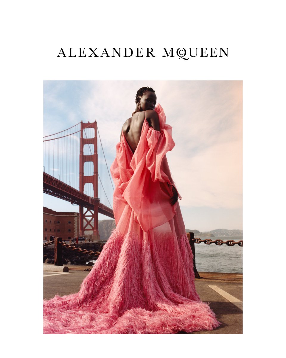
Alexander McQueen F/W 2018.19 by Jamie Hawkesworth

Stunning campaign I love how different each model is
 
They did not come to play! Stunning!
 
Beautiful and cinematic! I think I prefer Vittoria's image actually. :blush:
 
Really a stunning campaign! I'm very much intrigued by the location, which looks like San Francisco. That's not the Coit tower, is it??
Anyway, I now feel that the tower shots should've been a campaign on it's own. Would've been more cohesive, and actually less editoiral-looking.
 
Sarah Burton always has the best campaigns. Glam, expensive and not pretentious.
 
Vittoria’s shot is the best, imo. Love the shadow and the composition. She looks like a giant in it.
 
Really a stunning campaign! I'm very much intrigued by the location, which looks like San Francisco. That's not the Coit tower, is it??
Anyway, I now feel that the tower shots should've been a campaign on it's own. Would've been more cohesive, and actually less editoiral-looking.

It’s San Francisco. I believe the shoot took place in Coit Tower, Noe Valley and Palace of Fine Arts.
 
There is something quite ungainly about Vittoria in these shots. She doesn’t have the effortless elegance that the other two do.
 
Wow, what a stunning campaign all-around. Very happy for Shanelle in particular!
 
After seeing the full campaign, I think Shanelle should've been OG. Rianne's shots look beautiful, but look more like an editorial. Not a big fan of Vittoria's shots. Shanelle just sells it!
 
The entire set looks like an editorial for Vogue Germany shot by Camilla Akrans. It’s not a bad thing. I love Camilla! I just don’t see Jamie here, it’s not original.
 
Shanelle Nyasiase, Vittoria Ceretti and Rianne van Rompaey by Jamie Hawkesworth.


Love that shot and Rianne's one.
I noticed a funny thing! Look Shanelle's shot, under the bridge, near the black car, it looks like there is a shooting (someone in red in front of someone bent)
Do you guys see what i mean?
Source @mcqueen Twitter
DiX5vUMXcAA_sXN.jpg


I think that Shanelle should be the only model in this campaign. The other two models are beautiful and very professional but they are also unnecessary.
 
Beautiful campaign.... all 3 girls brought something unique and mesmerizing to it...:heart::heart:
 
I dont get a ''campaign feeling'' with this. Which is a shame cuz they got great models, a strong collection, but the overall result is underwhelming to me. This could have been a lot stronger. It does feel like an editorial.
 
Eh...looks like a Bergdorf's catalog advertorial.

You’re way way way too generous LOL

Bergdorf’s had some of the most engaging and inspiring advertorials in their collective. And they managed to showcase the collection alongside creative composition with a tight, directional eye.

This… is not neither engaging nor inspiring— and it’s all over the place. Vittoria, Shanelle and Rianne all look like they’re fronting different campaigns with 3 different concepts (Vittoria’s looks like a vintage YSL campaign. All that’s missing is the black border on a white layout). With Jamie, less is infinitely more since he’s only ever capable of 1 or 2 strong images at best, for a shoot/editorial. In this case, I stand by the first shot of Rianne as being the only fresh and strong image of this entire lot.
 
There are some great images here, I love the focus on creating a real vibe here and the choice of San Francisco as a location. However it's all so...random? What does SF have to do with McQueen? The composition of so many of the images look too editorial as many have already said, as opposed to last season where you could tell all the images flowed to create a powerful ad campaign.
 

Users who are viewing this thread

Back
Top
monitoring_string = "058526dd2635cb6818386bfd373b82a4"
<-- Admiral -->