You are using an out of date browser. It may not display this or other websites correctly.
You should upgrade or use an alternative browser.
You should upgrade or use an alternative browser.
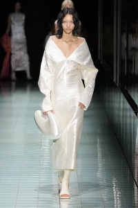
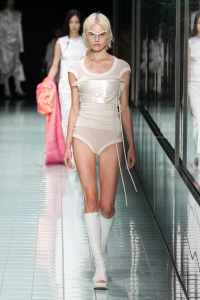
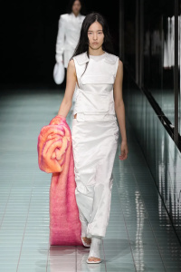
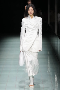
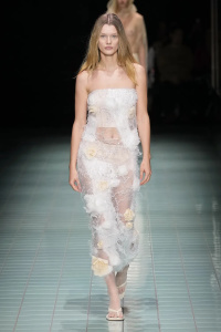
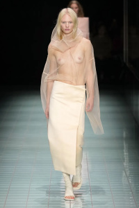
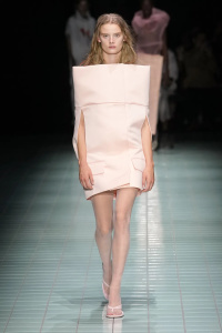
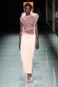
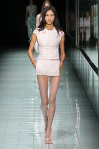
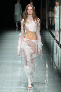
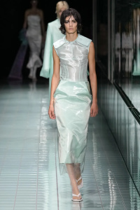
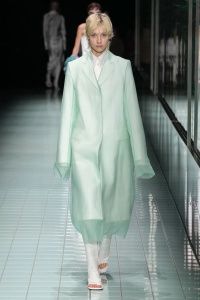
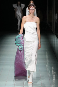
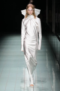
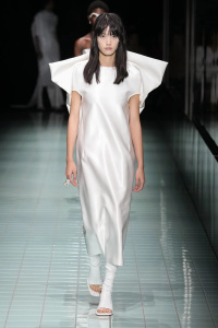
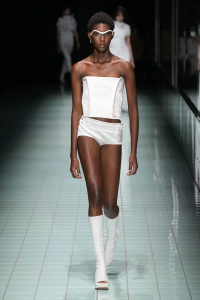
Sportmax S/S 2024 Milan
- Thread starter vogue28
- Start date
youthinasia
Well-Known Member
- Joined
- May 24, 2023
- Messages
- 280
- Reaction score
- 891
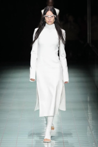
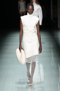
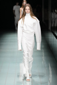
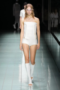
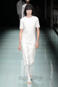
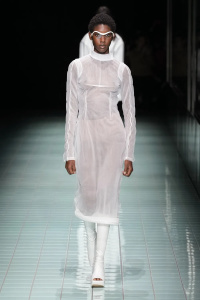
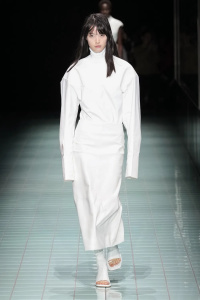
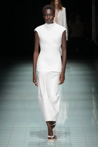
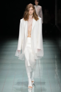
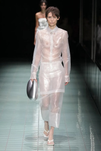
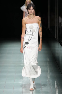
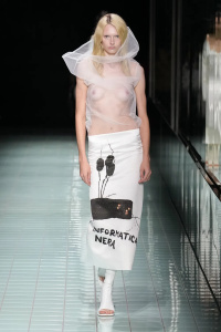
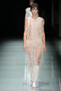
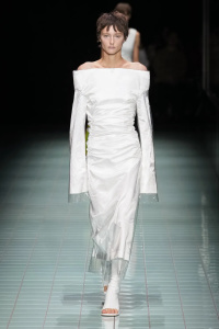
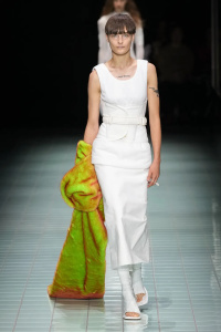
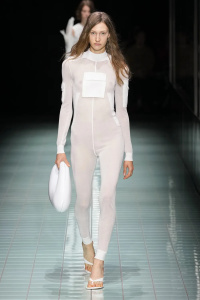
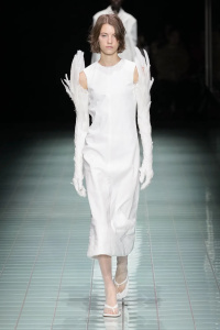
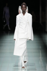
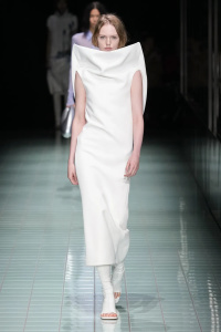
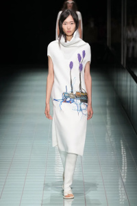
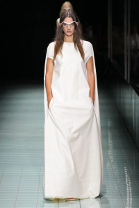
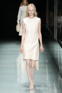
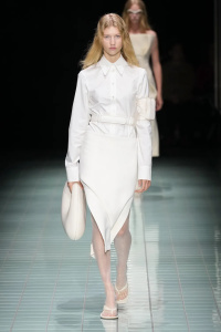
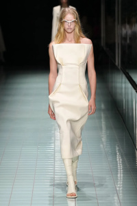
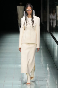
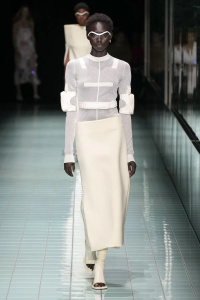
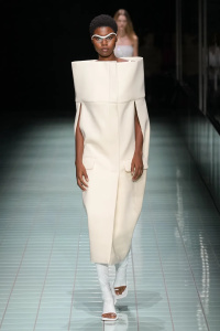
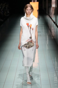
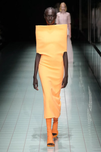
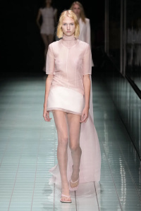
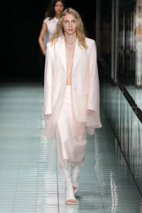
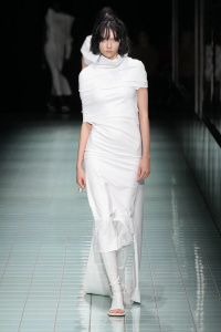
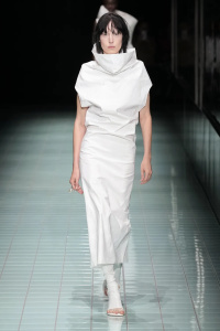
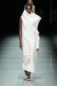
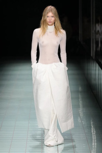
I kinda like this. A bit Rick-inspired (column silhouettes, razor sharp tailoring) and a bit of Ann D (clinical white, fencing uniform details) but I still enjoyed. Those feather gloves, I need!
Cocteau Stone
Well-Known Member
- Joined
- Feb 12, 2022
- Messages
- 1,565
- Reaction score
- 3,499
Really interesting and unexpected cuts from a brand like Sportmax. I will admit, I'm not too sure who Sportmax actually caters towards market wise but I don't mind a lot of this from a design experiment perspective. As a full collection though, the ideas altogether are just too much and looks overworked.
See some D&G Fall 1998, perhaps even Madonna's "Ray of Light" album cover and "Bedtime Story" music video may have been on the mood board.
See some D&G Fall 1998, perhaps even Madonna's "Ray of Light" album cover and "Bedtime Story" music video may have been on the mood board.
jeanclaude
Well-Known Member
- Joined
- Feb 12, 2012
- Messages
- 3,634
- Reaction score
- 8,812
60s Courrèges meets late 90s/early 00s Helmut Lang; and they hate each other...
Hello there i am looking for ref of D&G fall 1998, do you have some ? it's so poor on the internet about this collectionReally interesting and unexpected cuts from a brand like Sportmax. I will admit, I'm not too sure who Sportmax actually caters towards market wise but I don't mind a lot of this from a design experiment perspective. As a full collection though, the ideas altogether are just too much and looks overworked.
See some D&G Fall 1998, perhaps even Madonna's "Ray of Light" album cover and "Bedtime Story" music video may have been on the mood board.

Cocteau Stone
Well-Known Member
- Joined
- Feb 12, 2022
- Messages
- 1,565
- Reaction score
- 3,499
^ I’d say less the runway presentation for the collection and more so the campaign with Carolyn Murphy served as a stronger reference, which was more an exercise in styling and composition to kind of abstract the garments a little more.
brandon J pierre
Well-Known Member
- Joined
- Jul 21, 2021
- Messages
- 647
- Reaction score
- 1,128
Yes ture but I love it it feels like they had fun in the studio, feels like fashionI don’t know if this is what is needed for Sportmax. It feels very tortured and quite trying too hard for a brand like this.
tricotineacetat
Well-Known Member
- Joined
- Apr 3, 2005
- Messages
- 2,840
- Reaction score
- 2,429
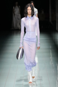
Perhaps not something you expect from this brand but it‘s undeniable it‘s quite well-accomplished design - Better than the modernism of Nicolas Di Felice's Courrèges.
However, those safety vest accents directly lifted from Helmut are a mistake.
However, those safety vest accents directly lifted from Helmut are a mistake.
Similar Threads
- Replies
- 8
- Views
- 2K
Users who are viewing this thread
Total: 2 (members: 0, guests: 2)


