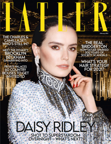
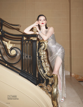
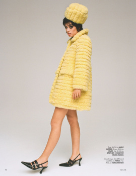
I am not a fan of yellow on a front cover. It does get used a lot on the newsstand, especially by those weekly puzzle magazines like Take a Break, Chat and That's Life, so by association, I see it as an eye-catching colour, but also as a cheap one.
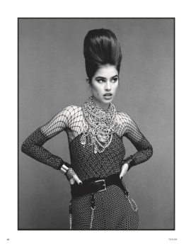
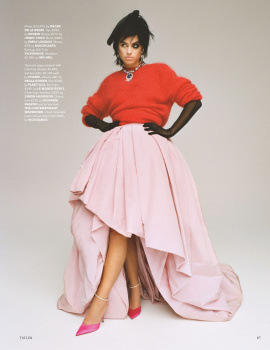
Nothing is working from the angle to the lighting to the yellow which is cray considering the expensive clothes, beautiful location and stunning cover subject.
This site uses cookies to help personalise content, tailor your experience and to keep you logged in if you register.
By continuing to use this site, you are consenting to our use of cookies.