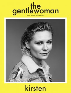
I love it, Kristen looks amazing and it's such a refreshing choice. Loved her on Fargo and the yellow behind it is such a nice balance. Excited to see more! Also is this Inez &Vinoodh or Alasdair?
I do like the yellow a lot. This magazine often feels down and so unsexy..... Is Leith Clark now working for them? That would be a really good match as the majority of their fashion contributors have been men not gentlewomen at all.
Always love to see her. Great actress, great style and very charming in all her photographs. This is another great cover for Gentlewoman! Whoever is in charge of selecting the cover subjects always gets it right.
Always love to see her. Great actress, great style and very charming in all her photographs. This is another great cover for Gentlewoman! Whoever is in charge of selecting the cover subjects always gets it right.
Penny Martin, the editor-in-chief, goes on phone calls with many of the magazine's subjects. I think she talks about it in her SHOWstudio (where she used to work) interview!
Great cover, as usual. love the contast between the yellow and the b/w. Looking forward to the contents, this magazine is always among the best out there
Kirsten looks very nice and prettily shot-- but it's that kind of generic, middle-of-the-road Sears portrait nice, complete with that Midwest jean jacket.
I get that the banal art direction is intentional, but when it looks as bland as the typical flyer hanging at a community centre, is that a good thing?
I usually look forward to Kristen on covers but this is kinda disappointing. The hair, the styling, just looks too ordinary. She could have jumped in a photo booth and got the same results.
This site uses cookies to help personalise content, tailor your experience and to keep you logged in if you register.
By continuing to use this site, you are consenting to our use of cookies.