You are using an out of date browser. It may not display this or other websites correctly.
You should upgrade or use an alternative browser.
You should upgrade or use an alternative browser.
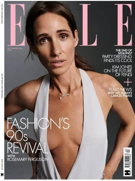
UK Elle December 2023/January 2024 : Rosemary Ferguson by Liz Collins
- Thread starter vogue28
- Start date
kokobombon
Well-Known Member
- Joined
- Oct 7, 2007
- Messages
- 18,836
- Reaction score
- 2,372
Terrible imo... who thought that that styling and expression for cover material?!
Bertrando3
Well-Known Member
- Joined
- Mar 22, 2010
- Messages
- 5,615
- Reaction score
- 2,351
Another hairdresser that should go back to school.
tigerrouge
Well-Known Member
- Joined
- Feb 25, 2005
- Messages
- 18,867
- Reaction score
- 9,652
This cannot be the best shot they had, from whatever they decided to do.
I can see the digital copy, 198 pages. The editor's letter contains the concept that "a woman over forty on a runway, or in her fifties going make-up free, shouldn't be groundbreaking".
There's an advert for the Elle Collective, "become a founding member for £125", as if you're an investor getting in on the ground floor. I could subscribe to TEN Conde Nast magazines for that money... if there still are ten Conde Nast print magazines.
The cover story is slightly better than the cover shot suggests, but it's still... There are fashion editorials, HOUSE PARTY, then ME AND MR JONES, part-interview with Kim Jones, part-fashion shoot, BLUE IS THE WARMEST COLOUR (denim in winter), plus an interview with Michael Kors.
The cover concept seems designed to speak to women at a different age than the rest of the contents do. Being of that age, I would never wear what's being shown on all the other pages, or be at the life stages being discussed - yet the editor is also trying to speak to me, but it doesn't fit, it doesn't work. If I want to see accomplished women who can remember the 90s, I would turn to Bazaar because they do it better, I'm not interested in this chilly nipple nonsense.
kokobombon
Well-Known Member
- Joined
- Oct 7, 2007
- Messages
- 18,836
- Reaction score
- 2,372
The digital issue is out and honestly, the whole editorial is terrible 

D
Deleted member 141523
Guest
Looks more 70s than 90s
Toni Ahlgren
Well-Known Member
- Joined
- Aug 29, 2020
- Messages
- 1,597
- Reaction score
- 4,740
Not hating it. It has some sort of 90's Corinne Day vibes.
MagFan
Well-Known Member
- Joined
- May 16, 2006
- Messages
- 4,438
- Reaction score
- 2,068
her ed is on the site: The Rosemary Revival: The Original Nineties Cool Girl On Her Grand ReturnDoes anyone have access to the entire editorial (and possibly other editorials in this issue)?
MModa
Well-Known Member
- Joined
- Oct 19, 2023
- Messages
- 2,010
- Reaction score
- 2,487
The cover photograph is very unappealing! She could look so much better. The angle, facial expression, and hairstyle are a big NO for me. The image should not have seen the light of day. The cover does not encourage me to look inside.
Deleted member 116957
New/Inactive Member
- Joined
- Apr 4, 2009
- Messages
- 13,777
- Reaction score
- 15,808
her ed is on the site: The Rosemary Revival: The Original Nineties Cool Girl On Her Grand Return
Oh, her daughters are trying their hand at modeling now... that explains this mess, imo.
- Joined
- Jan 9, 2008
- Messages
- 36,837
- Reaction score
- 24,547
What an unflattering cover image! Goodness grief, cannot believe the magazine thought this was a good idea, even more so to be worthy of sitting on newsstands for a whole two months (and over the festive holiday season). Dumbfounded, to be honest.
WilliamsLe010919
Well-Known Member
- Joined
- May 26, 2010
- Messages
- 648
- Reaction score
- 156
This cover..... And they wonder why readers left them??
Similar Threads
- Replies
- 39
- Views
- 12K
Users who are viewing this thread
Total: 1 (members: 0, guests: 1)

